Two colors can look beautifully simple in a saved image and unexpectedly busy in another. Three colors can feel calm. The difference is often where each color goes—and how much room it gets.
Think of a palette as a small cast of characters. One color sets the scene, another catches your attention, and a third, if you use it, adds a small detail. When every color tries to take the lead, the design can feel louder than you intended. That is a layout decision, not a sign that you picked the “wrong” colors.
These 15 two- and three-color nail palettes give each shade a specific job: base, accent, and detail. You will find warm browns, soft pinks, muted greens, blues, and purples, with reference wording you can save beside each idea. The aim is to choose a combination you enjoy and explain how you want to use it.
The images are AI-generated design concepts. Color names describe visual directions, not verified polish shades. Screens, lighting, and finishes can change how colors appear; these concepts are not product swatches or guaranteed color matches.
Browse the two-color ideas, the three-color ideas, or the same-palette placement comparison.
Base, accent, detail: what those roles mean
Here, base means the visual background or dominant color in the design. It does not mean a base-coat product or an application step. The accent is the noticeable secondary color. The detail is a small mark, line, center, or boundary.
| Role | Visual job | Example |
|---|---|---|
| Base | Provides the background or most of the color across the set | Oatmeal covering each nail |
| Accent | Creates a focal area or repeated secondary shape | Chocolate tips or one chocolate accent nail |
| Detail | Adds a smaller mark with a specific purpose | One fine rust line beside a chocolate band |
For two-color designs, leave out the separate detail shade or reuse a color you already have. There is no requirement to fill all three roles with three different colors. A pale background and one dark tip can be a complete idea.
Across a set, a color can be an accent even when it fills an entire nail. Within one nail, the accent might be just a small corner. Be specific about whether you mean the arrangement of the whole hand or the layout of one nail.
Choose the kind of contrast you want
| What you want to notice | Try | Why this arrangement helps |
|---|---|---|
| A clear dark edge on a pale background | Oatmeal + chocolate | The light background separates the tip from the rest of the nail |
| A small change among muted colors | Mushroom taupe + dusty rose | The accent changes hue without a dramatic light-dark jump |
| A connected light-and-dark color family | Navy + pale blue | Depth changes while blue remains the common thread |
| Autumn pattern colors with distinct jobs | Oatmeal + chocolate + rust | Background, main bands, and fine line stay separate |
| A small bright note within softer colors | Lilac + plum + butter yellow | A tiny yellow center supplies the contrast without taking over |
These are starting points rather than rules about who can wear which colors. Choose the relationship you like looking at, then decide its placement.
Seven two-color palettes
1. Oatmeal + chocolate
Base: Oatmeal. Accent: Chocolate. Detail: Repeat chocolate, or leave out.
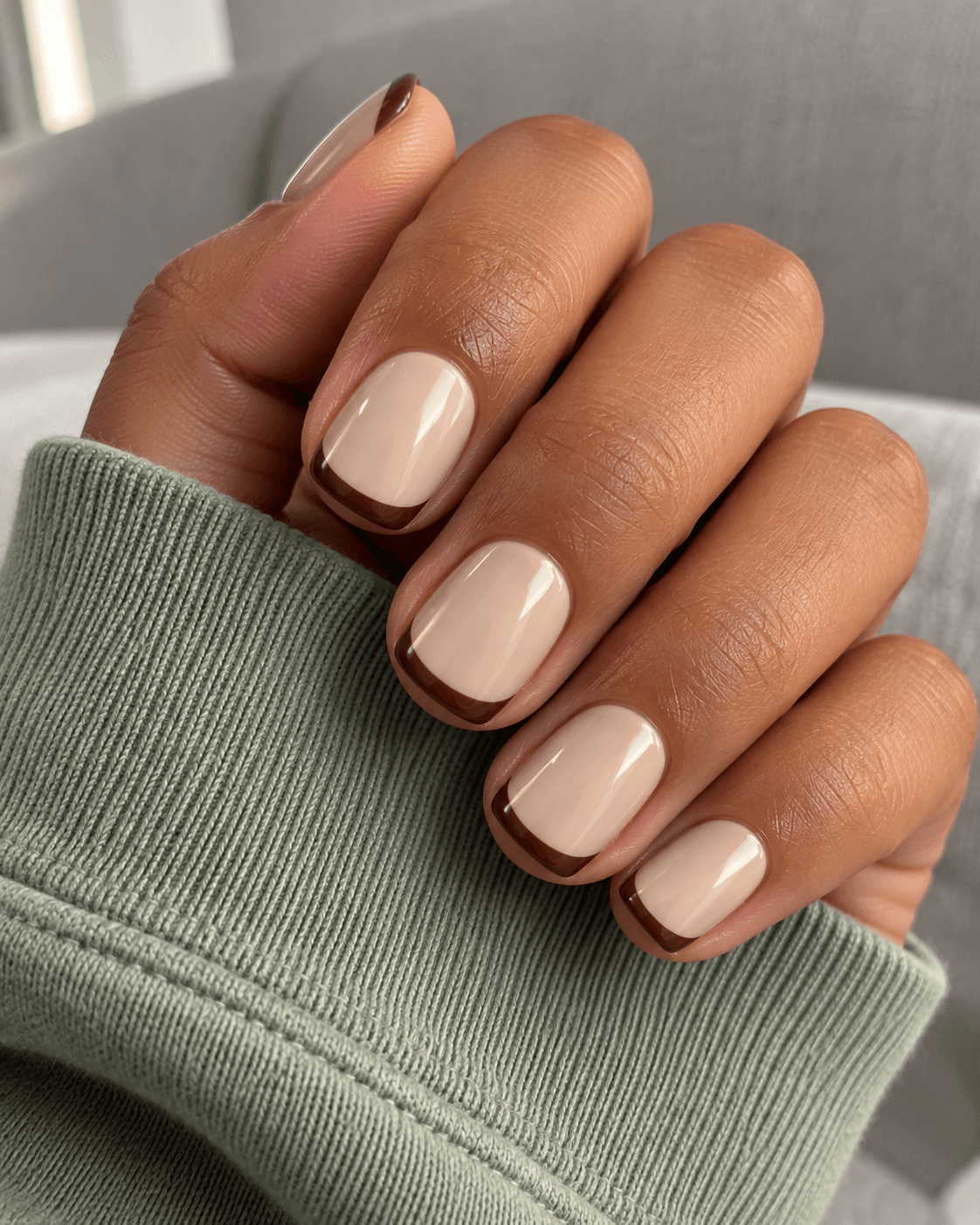
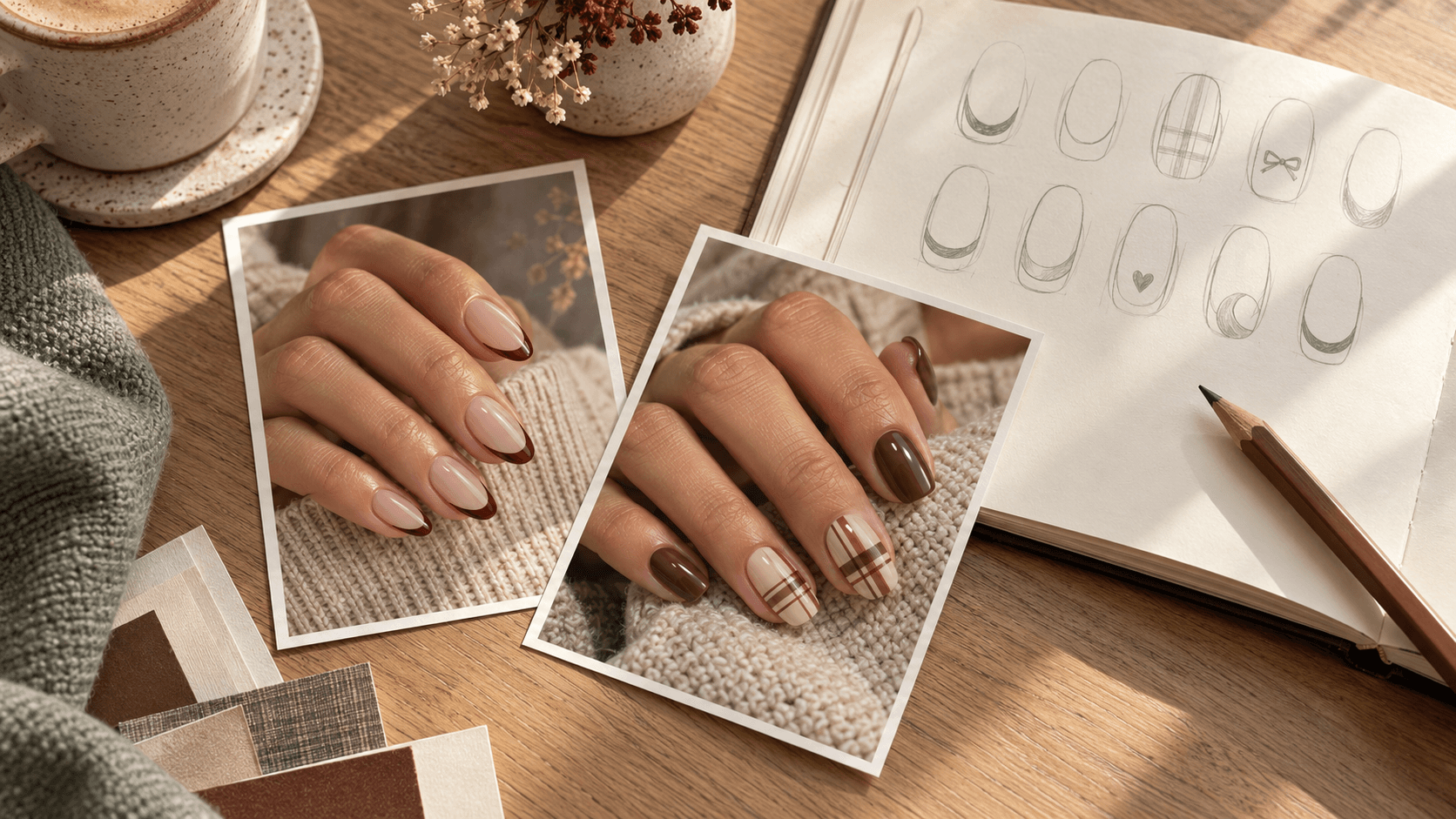
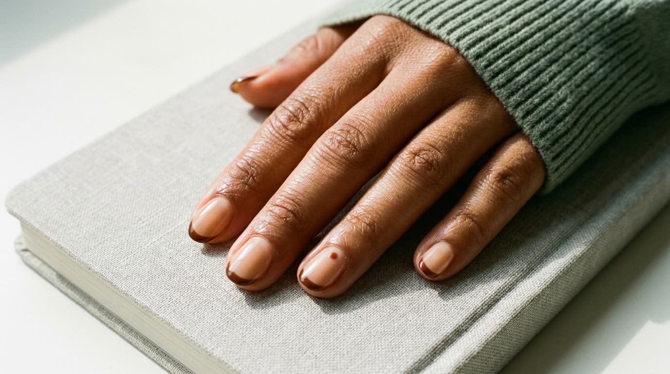
This is a useful starting point if you love brown but do not want it covering every nail. Oatmeal provides a light background; chocolate gives a tip, stripe, or small shape enough contrast to remain easy to see. Think of a dark pencil line on warm paper: the pale area is doing as much work as the mark.
For the pictured version, keep oatmeal across the set and use chocolate only at the tips. A full chocolate ring nail would make the same two colors feel more substantial. Neither version needs a third shade to look complete.
The choice to make is coverage. Save this palette when you want clear light-and-dark separation, then decide whether the chocolate should be a fine edge or a larger block. That decision is more useful than adding another brown just because one is available.
Save this reference wording: Oatmeal background with narrow chocolate tips; keep the center of each nail plain.
2. Blush pink + black cherry
Base: Blush pink. Accent: Black cherry. Detail: Repeat black cherry, or leave out.
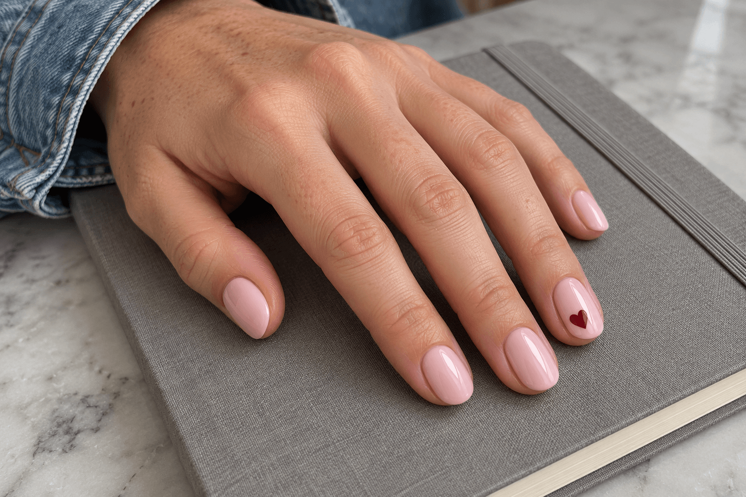
Blush and black cherry create a different kind of light-and-dark pairing. The pale pink leaves the design soft around the edges, while the deep red gives a small motif a distinct center of attention. A tiny black-cherry heart on one ring nail can be enough.
Keep that dark accent visibly red-leaning in the reference if you do not mean black. A very dark mark photographed in shadow may lose that distinction. The words alongside the picture help: “deep red detail, not a black detail.”
If the heart is not your style, use the same colors for a thin curved tip. The palette stays the same; the motif changes the mood. Choose one of those ideas rather than feeling obliged to combine them.
Save this reference wording: Blush pink throughout; one small black-cherry heart on each ring nail, all other nails plain.
3. Mushroom taupe + dusty rose
Base: Mushroom taupe. Accent: Dusty rose. Detail: Repeat either existing color.
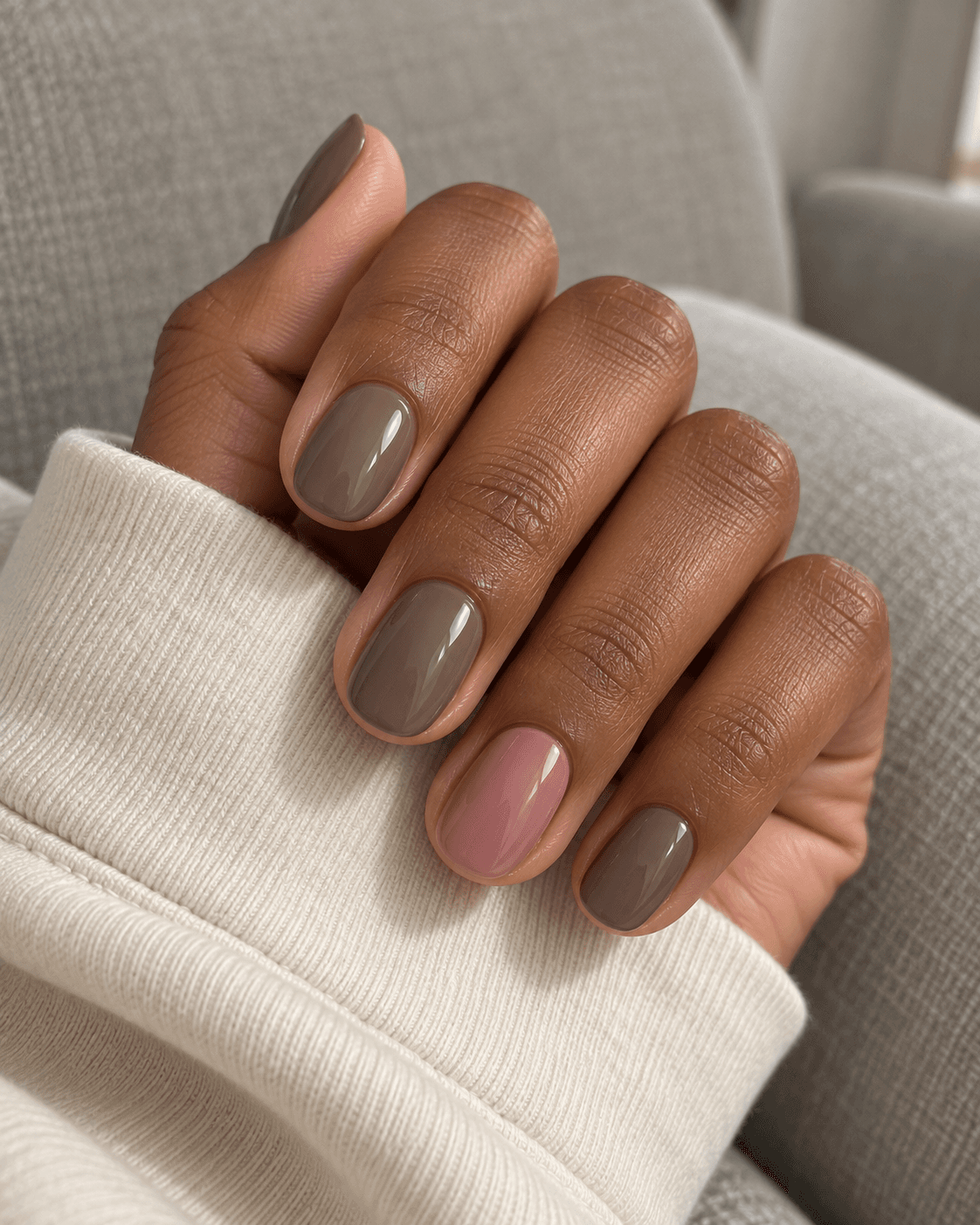
This pair is for the days when a sharp contrast feels like too much punctuation. Taupe and dusty rose can sit close in depth while still looking different in hue. Use taupe on most nails and dusty rose on the two ring nails for a small, quiet change across the set.
The risk is making the two shades so similar that the accent becomes hard to distinguish. If that happens in your reference, choose a slightly lighter rose or a slightly deeper taupe. You do not need to introduce bright white just to announce that there are two colors.
This combination also gives you a reason to keep the finish consistent. Matching glossy appearances let the color difference remain the main detail instead of turning the comparison into a lesson in shiny versus matte.
Save this reference wording: Mushroom taupe on most nails; dusty rose ring nails; the same finish throughout.
4. Olive + cream
Base: Olive. Accent: Cream. Detail: Repeat cream, or leave out.
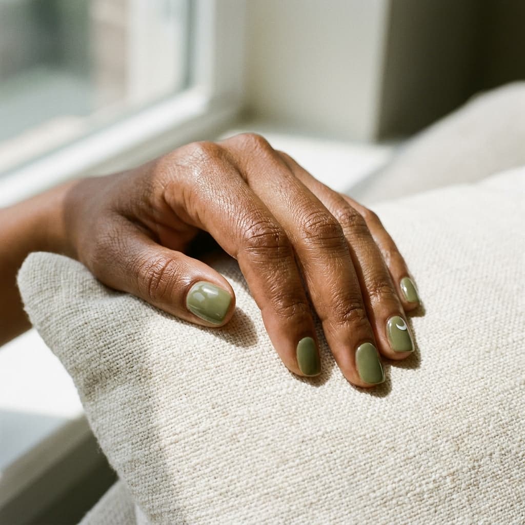
Olive makes a change from an all-brown autumn folder without losing that muted feeling. Cream adds a small light mark against it. In this version, the mark is a simple crescent near the base of one nail, leaving the other nails solid olive.
A pale cream accent reads differently from a bright white one. Cream keeps the contrast a little warmer; white would make it crisper. Neither is a correction. They are two distinct directions, so choose the one you actually mean.
If you prefer a full cream accent nail, use it in place of the crescent rather than automatically adding it as well. A little restraint here keeps the green as the main color and gives the pale detail a clear role.
Save this reference wording: Olive solids with one small cream crescent near the base of the ring nail.
5. Navy + pale blue
Base: Navy. Accent: Pale blue. Detail: Repeat pale blue, or leave out.
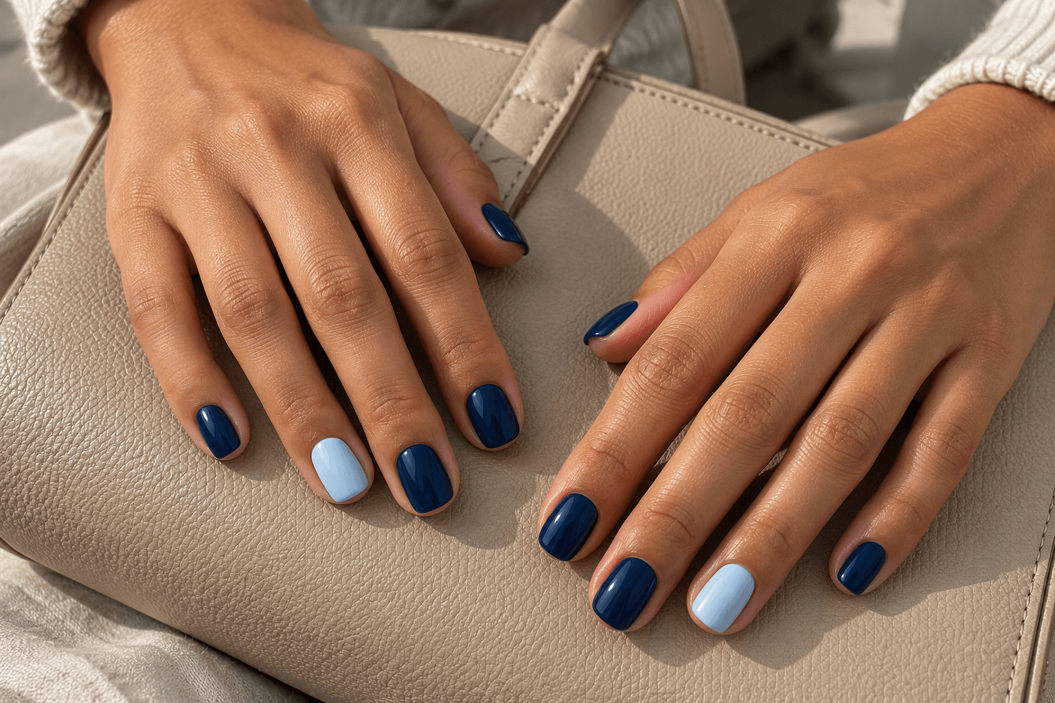
Navy and pale blue keep the hue family connected while changing the depth. The navy gives the set its dark foundation; pale blue can appear as a full accent or a thin tip. The contrast is clear without needing a second unrelated hue.
Try navy on the thumb, index, middle, and little nails, with pale blue on the ring nail. If you would rather keep the whole set dark, shrink the pale blue to a small corner instead. That version contains the same palette but reads very differently from a light accent nail.
Keep the pale shade blue enough to see. If it is almost white, write that down as the actual preference. A color name should help explain the picture, not argue with it.
Save this reference wording: Navy on four nails per hand; pale blue ring nails; no extra pattern.
6. Plum + soft lilac
Base: Plum. Accent: Soft lilac. Detail: Repeat either existing color.
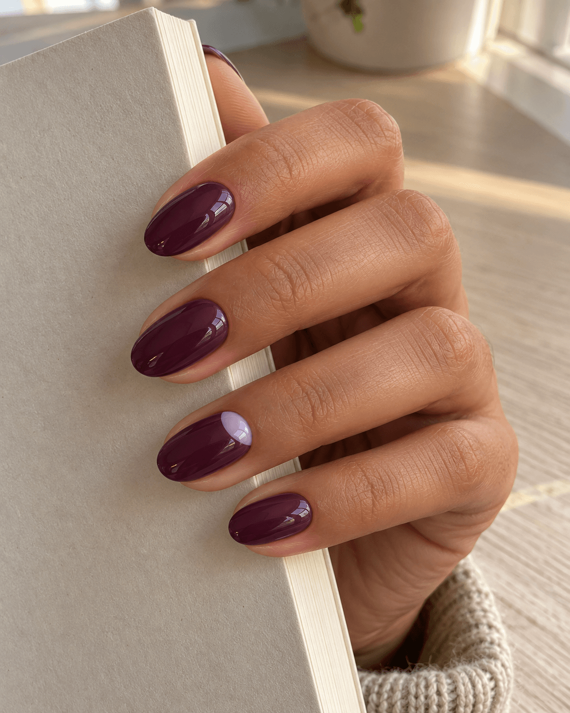
Plum and lilac make a purple palette with room for a light area. Use soft lilac as a half-moon-shaped patch at the base of a plum ring nail, or reverse the roles and let plum become a thin tip over lilac. The first arrangement feels darker overall; the second gives the pale color more room.
Avoid treating “purple” as a precise shade instruction. A red-leaning plum and a blue-leaning lilac create a different relationship from two closely related purples. If you like the contrast between them, keep both references visible rather than describing everything as matching.
This is a good example of a two-color palette that already has plenty to say. A metallic border is an option, not a missing ingredient.
Save this reference wording: Deep plum set with a soft lilac half-moon patch on one ring nail; no metallic border.
7. Terracotta + peach
Base: Terracotta. Accent: Peach. Detail: Repeat terracotta, or leave out.
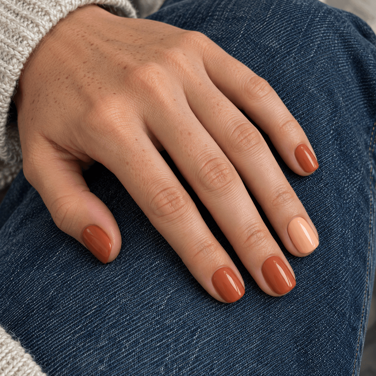
Terracotta and peach let warmth do the connecting. Choose terracotta for most nails and peach for one accent, keeping both colors softly muted. The peach lightens the set without introducing a pale neutral that feels separate from the rest.
This pair changes noticeably when the peach moves from an accent to the dominant background. Peach with a small terracotta edge is a lighter design; mostly terracotta with one peach nail has more visual weight. Decide which of those you want before deciding on a pattern.
If your saved example is strongly orange-lit, look for another view before assuming the colors themselves are that warm. The scene around the hand may be contributing to the impression.
Save this reference wording: Muted terracotta on most nails with one peach accent per hand; consistent glossy appearance.
Eight three-color palettes
8. Oatmeal + chocolate + rust
Base: Oatmeal. Accent: Chocolate. Detail: Rust.
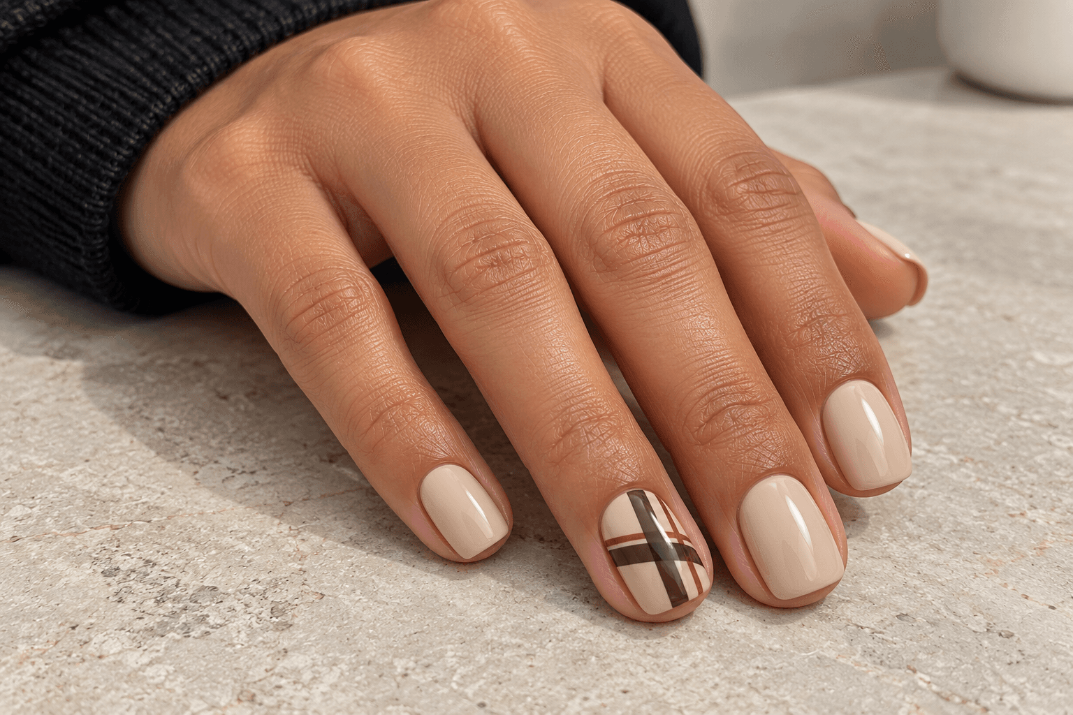
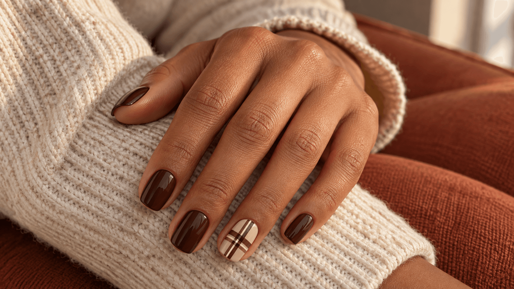
Here is the first three-color palette, and the third shade has a small job. Oatmeal remains the background, chocolate builds the pattern, and rust adds a fine companion line. It is especially useful for a plaid accent because the colors have separate responsibilities instead of fighting for equal space.
On the ring nail, picture broad chocolate crossings with one slim rust line. Leave the other nails oatmeal. You still get the autumn combination without turning every nail into a miniature scarf.
If the rust grows as broad as the chocolate, the balance changes: it becomes a second main pattern color. That may be exactly what you want, but it is a different brief. Our fall plaid article explores those coverage choices in more detail.
Save this reference wording: Oatmeal throughout; ring nail chocolate plaid with one fine rust companion line.
9. Blush + burgundy + cream
Base: Blush. Accent: Burgundy. Detail: Cream.
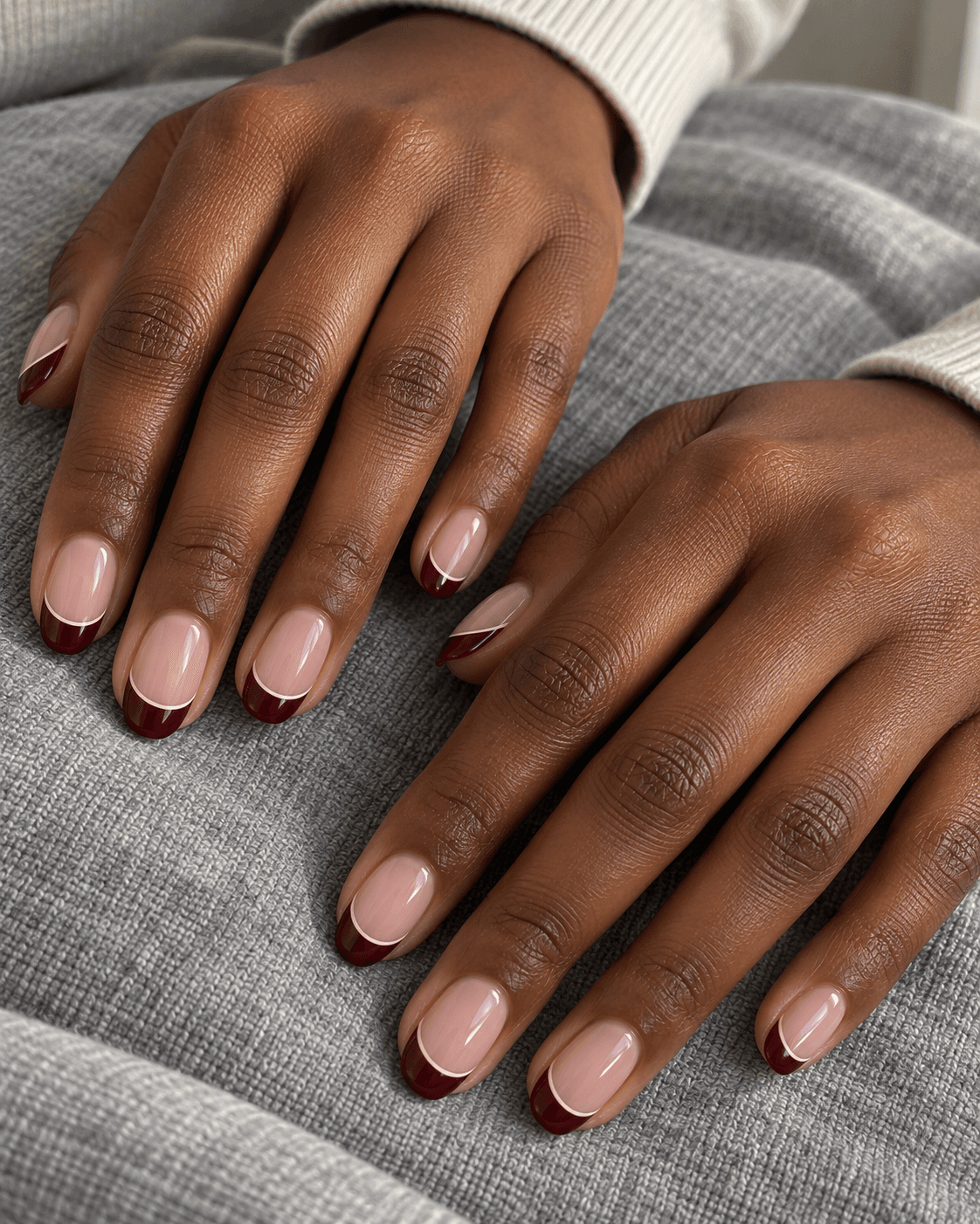
A blush background gives burgundy room to appear as a defined tip. Cream then acts as a fine separator along that tip’s inner edge. Each color is doing a different job: background, colored edge, and small boundary detail.
The cream line should stay visibly finer than the burgundy area. If both are the same width, you have made a two-band tip, which has its own appeal but a stronger graphic effect. The brief should say whether you want a delicate separator or two equal stripes.
For a quieter variation, keep the outlined tip on two nails and leave the rest blush. For more repetition, carry it across the set. You can change distribution without inventing another color combination.
Save this reference wording: Blush background, burgundy tips, a much finer cream line along the inner edge of each tip.
10. Cream + olive + muted gold
Base: Cream. Accent: Olive. Detail: Muted gold.
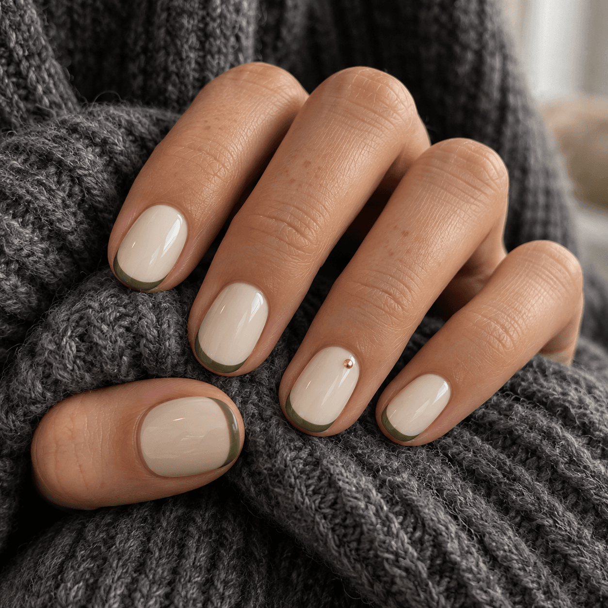
Cream and olive already work as a pair. A tiny muted-gold detail adds a warm focal point, but it should earn its place. Try olive tips on a cream background with one small gold-colored dot on each ring nail. Repeating that dot on every nail would make the detail more insistent.
The word “gold” needs clarification here. A flat golden color and a reflective metallic appearance are not the same thing. The concept pictured uses a small metallic-looking detail; it is not a product swatch or a promise of a particular reflection.
If the shiny dot distracts from the green tips, leave it out. A third color is useful when it adds a clear relationship, not simply because the design has room for one more thing.
Save this reference wording: Cream bases and olive tips; one tiny muted-gold metallic-looking dot on each ring nail.
11. Mushroom taupe + dusty rose + espresso
Base: Mushroom taupe. Accent: Dusty rose. Detail: Espresso.
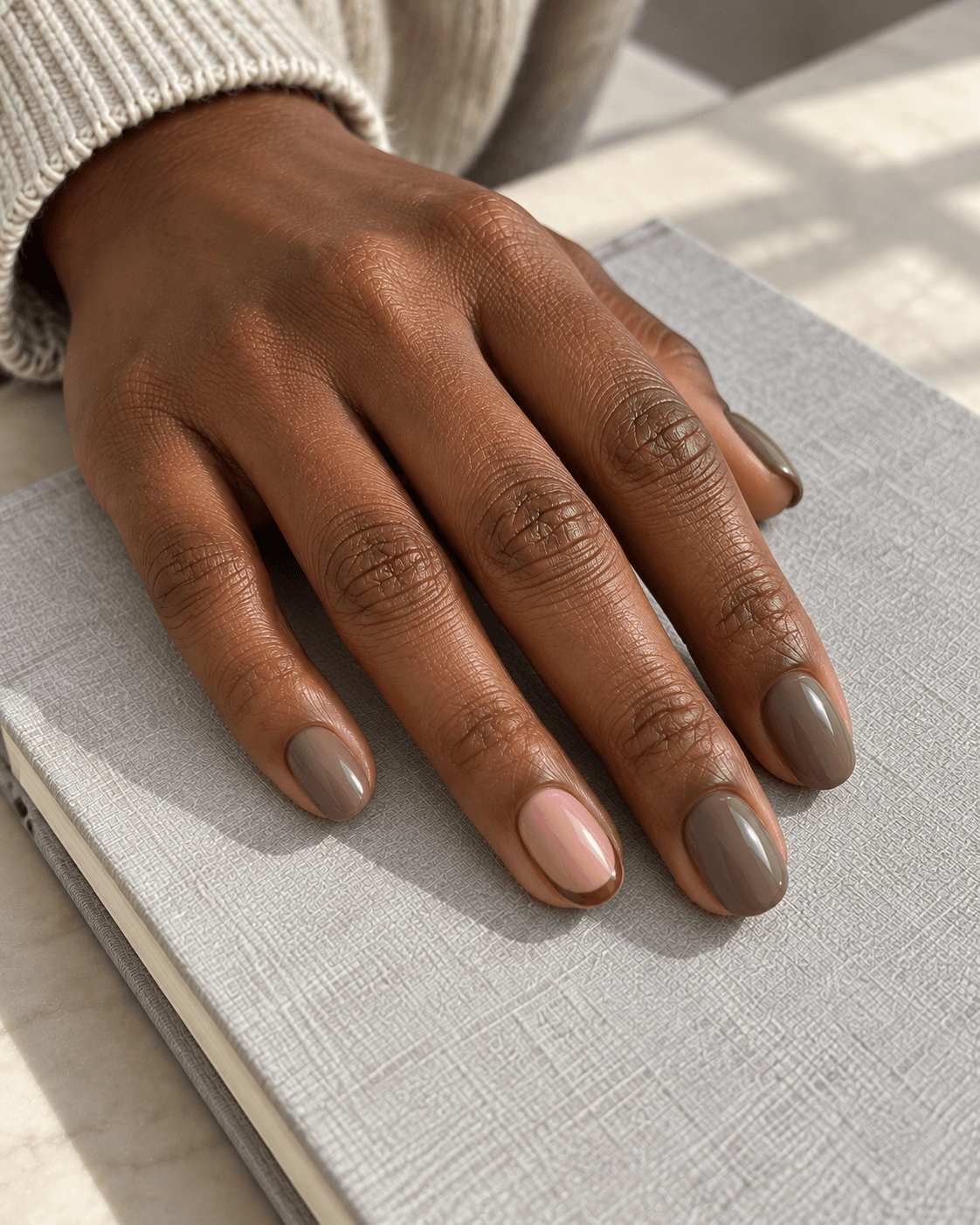
Adding espresso gives the softer taupe-and-rose pair a small dark mark. Try a dusty-rose ring nail among taupe solids, then place a fine espresso arc near the edge of that rose nail. The dark detail makes the accent easier to notice without requiring another full dark nail.
Keep the espresso line narrow if you want the quieter colors to remain dominant. A thick dark border would turn the shape of the accent into the main event. Again, that is not wrong; it simply changes what catches the eye first.
This palette is useful when two muted colors feel a little indistinct together. The answer does not have to be a brighter hue. A small change in depth can provide the separation you wanted.
Save this reference wording: Taupe solids, dusty-rose ring nail, one fine espresso arc on that accent only.
12. Navy + pale blue + silver
Base: Navy. Accent: Pale blue. Detail: Silver.
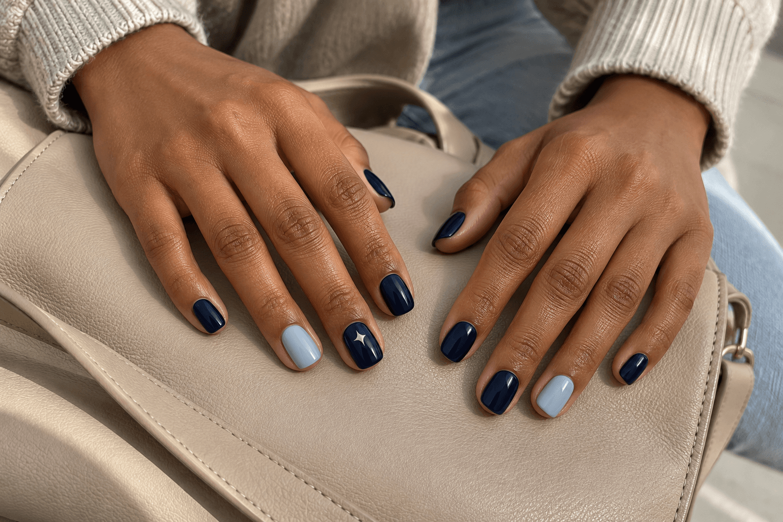
Navy provides the dark field, pale blue gives a light accent, and a small silver-colored mark supplies the detail. Keep the pattern simple: pale blue ring nails among navy solids, with one tiny silver-looking star on each navy middle nail.
The pale blue and silver do not need to occupy the same nail. Separating their roles across the hand gives the set a different rhythm from stacking all the decoration on one accent. A whole-hand reference will communicate that much better than a close crop of a single star.
If the star becomes large, bright, or surrounded by extra dots, it may overtake the pale blue accent. For the balance described here, the star is the small detail and the light-blue nail remains the larger interruption in the navy.
Save this reference wording: Navy solids with pale-blue ring nails and one tiny silver-looking star on each navy middle nail.
13. Soft lilac + plum + butter yellow
Base: Soft lilac. Accent: Plum. Detail: Butter yellow.
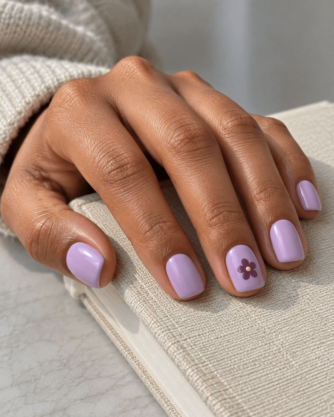
This palette introduces a small change of hue rather than another purple. Use lilac as the background, plum for a simple flower on each ring nail, and butter yellow for the flower’s tiny center. The yellow has a precise reason to be there.
Because the center occupies so little space, it can add a bright note without making the whole set yellow. Moving butter yellow onto two full nails would create a much more colorful arrangement, even though the palette list would be identical.
Keep the flower uncomplicated if you want the colors to stay readable. One plum motif with a single yellow center gives a clearer palette example than several overlapping flowers, outlines, leaves, and dots. You can always choose a busier pattern later, after deciding that you like the combination.
Save this reference wording: Lilac bases; one simple plum flower with a tiny butter-yellow center on each ring nail.
14. Peach + terracotta + cream
Base: Peach. Accent: Terracotta. Detail: Cream.
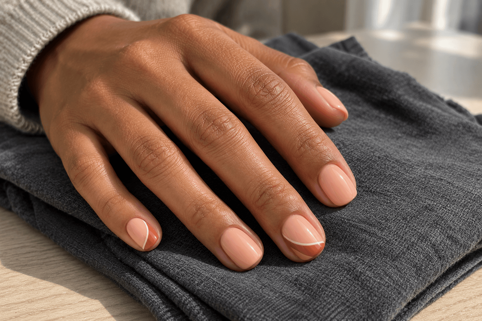
This time the lighter warm color leads. Peach covers the nails, terracotta forms a small curved corner, and cream traces a thin boundary on that corner. Compared with the earlier terracotta-dominant pair, this arrangement gives much more space to the pale color.
Keep the cream line slim enough that it reads as a detail rather than a third block. If you would rather avoid a border, use one tiny cream dot within the terracotta corner instead. Choose one treatment so the third color has a clear task.
The pattern can sit on just two nails per hand. Leaving the others peach makes this a gentle introduction to three-color designs: you see the complete combination in a small area, while the rest of the set stays simple.
Save this reference wording: Peach throughout; terracotta corners on index and ring nails, each with one fine cream boundary line.
15. Pale gray + charcoal + copper
Base: Pale gray. Accent: Charcoal. Detail: Copper.
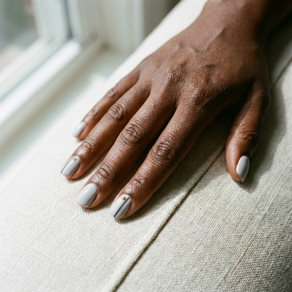
This combination begins with cool-looking neutrals, then places a small warm-colored detail between them. Pale gray forms the background, charcoal makes a narrow side stripe, and copper appears as a tiny dot beside the stripe on one accent nail.
A copper color does not have to mean a mirror-like finish. In this concept it is a flat warm copper-brown dot. If you prefer a reflective detail, describe that separately instead of expecting the name alone to specify the surface.
The charcoal stripe gives direction; the copper dot gives a small stopping point. Keep those jobs distinct. Repeating many copper dots along every stripe would create a dotted-border pattern rather than the spare arrangement described here.
Save this reference wording: Pale-gray bases with charcoal side stripes on two nails; one small flat copper-brown dot on the ring accent.
The same three colors can produce three different designs
Keep oatmeal, chocolate, and rust fixed for a moment. Now change only their distribution. This comparison makes the important point easier to see: a list of colors is not yet a finished design brief.
| Arrangement | Dominant area | Secondary area | Small detail | Overall emphasis |
|---|---|---|---|---|
| Light with a dark edge | Oatmeal on every nail | Narrow chocolate tips | One tiny rust dot on each ring nail | Pale space with a crisp boundary |
| Dark with a pale accent | Chocolate on most nails | Oatmeal ring nails | A thin rust line on each oatmeal nail | Deep color with one light focal point |
| Warm color leading | Rust on most nails | Oatmeal ring nails | A fine chocolate grid on each oatmeal nail | Rust carries the set; the pale pattern interrupts it |
All three use the same named palette. Yet choosing the first when you actually wanted the second would be a substantial mismatch. Save the arrangement along with the colors.
You can compare this on paper without drawing realistic hands. Make three rows of five simple nail outlines. Give each row one of the layouts above, using colored pencils or rough labels. The exercise is about how the colors are distributed, not your drawing skills.
When to keep two colors—and when a third earns its place
Start with two when you already have the contrast you want. Blush with one black-cherry heart does not need another shade just to make the palette sound more interesting. It has a background and a focal point.
Add a third when you can finish the sentence “This color will…” with something specific: separate the tip from the base, form the center of a flower, or create one fine companion stripe. “Make it prettier” is a feeling, but it does not tell you where the color should go.
A useful editing test is to imagine removing the third shade. If the design loses a detail you care about, keep it. If the design becomes clearer and you miss nothing, the two-color version may already be the one you wanted.
A third color can also change the whole balance if you give it a full nail. That is not a tiny finishing touch anymore; it becomes a larger accent. Decide deliberately rather than letting a small detail grow by accident.
Keep color, finish, and lighting separate in your notes
A flat golden dot and a reflective gold-looking dot may share a color name while giving different visual effects. The same is true of a glossy chocolate background and a matte-looking one. Describe the shade and surface separately when both matter.
For example: “Cream base, olive tips, one tiny muted-gold dot. I like a reflective appearance for the dot, but I want the rest to look simply glossy.” That is more informative than “cream, green, and gold nails.”
The images here are concepts, not a shade-matching system. Even real photographs show colors under particular lighting and through particular cameras and screens. A warm-looking image does not establish that a polish will look equally warm in a different setting.
Use names such as chocolate, plum, and dusty rose to describe direction, then discuss available colors using an actual reference where possible. Do not infer an exact product or shade code from a generated image.
Turn your chosen palette into a usable reference
Save one image that shows the whole layout, then add a short note with the color roles. If the image is cropped to a single nail, explain what the remaining nails should look like.
“I like the oatmeal, chocolate, and rust combination. Oatmeal should be the main background. I want chocolate only as narrow tips, with one small rust detail on each ring nail. Keeping most of the pale base visible matters more than matching an exact brown shade.”
That note already answers several questions a palette list leaves open. It says which shade leads, where the dark color goes, how the third color is used, and which part of the idea matters most.
For a fuller note—including the outline, both-hand layout, priorities, and questions to discuss—use our nail reference brief before an appointment. If your main uncertainty is the brown itself, return to the mocha, chocolate, and espresso comparison. For pattern distribution, the fall plaid guide shows how an accent differs from a repeated full pattern.
If your saved dark shades move between red and purple, the related burgundy, black cherry, and plum comparison is the next topic to explore.
Questions about combining nail colors
Do all three colors need to appear on every nail?
No. One can be the main color across the set, another can fill an accent nail, and the third can appear as a small mark elsewhere. The navy, pale-blue, and silver example separates those roles across different nails.
Does the accent have to be the darkest color?
No. A cream nail among olive nails is a light accent; a black-cherry heart on blush is a dark one. “Accent” describes its role, not its place on a light-to-dark scale.
Do I need a neutral color?
No. Navy with pale blue and plum with lilac are examples built around related colors. A neutral can provide a quieter background, but it is one option rather than a requirement.
Can I use a clear-looking area as the base?
Yes, as a visual planning choice. Describe whether you mean a clear-looking area, a sheer pink appearance, or an opaque pale shade. They leave different amounts of the underlying nail visible in a reference, so “nude” alone may be too vague.
What if two muted colors disappear into each other?
Try changing their relative lightness or using a larger accent area in your concept. You can also decide that the nearly blended look is what you enjoy. Separation is useful when it serves your goal; it is not a rule that every palette must be high contrast.
Are these exact polish combinations?
No. These are original visual palette concepts and placement suggestions, not tested products or verified shade pairings. Use them to explain a direction, then compare actual available colors rather than expecting a screen image to function as a physical swatch.
Choose one palette, then give its colors room
If you are unsure where to begin, start with oatmeal and chocolate for a clear contrast, or taupe and dusty rose for a quieter difference. Choose where the accent goes before deciding whether a third color is needed.
The useful question is not simply “Do these colors go together?” It is “What do I want each color to do?” Once you can answer that, your saved image becomes much easier to adapt, compare, and explain.