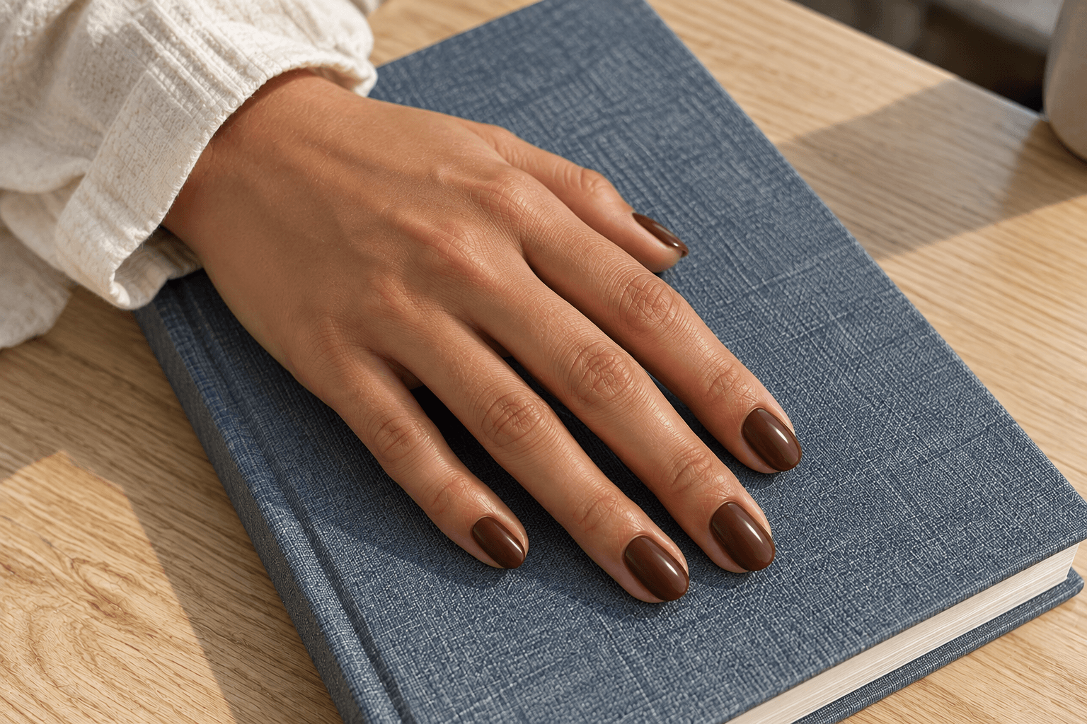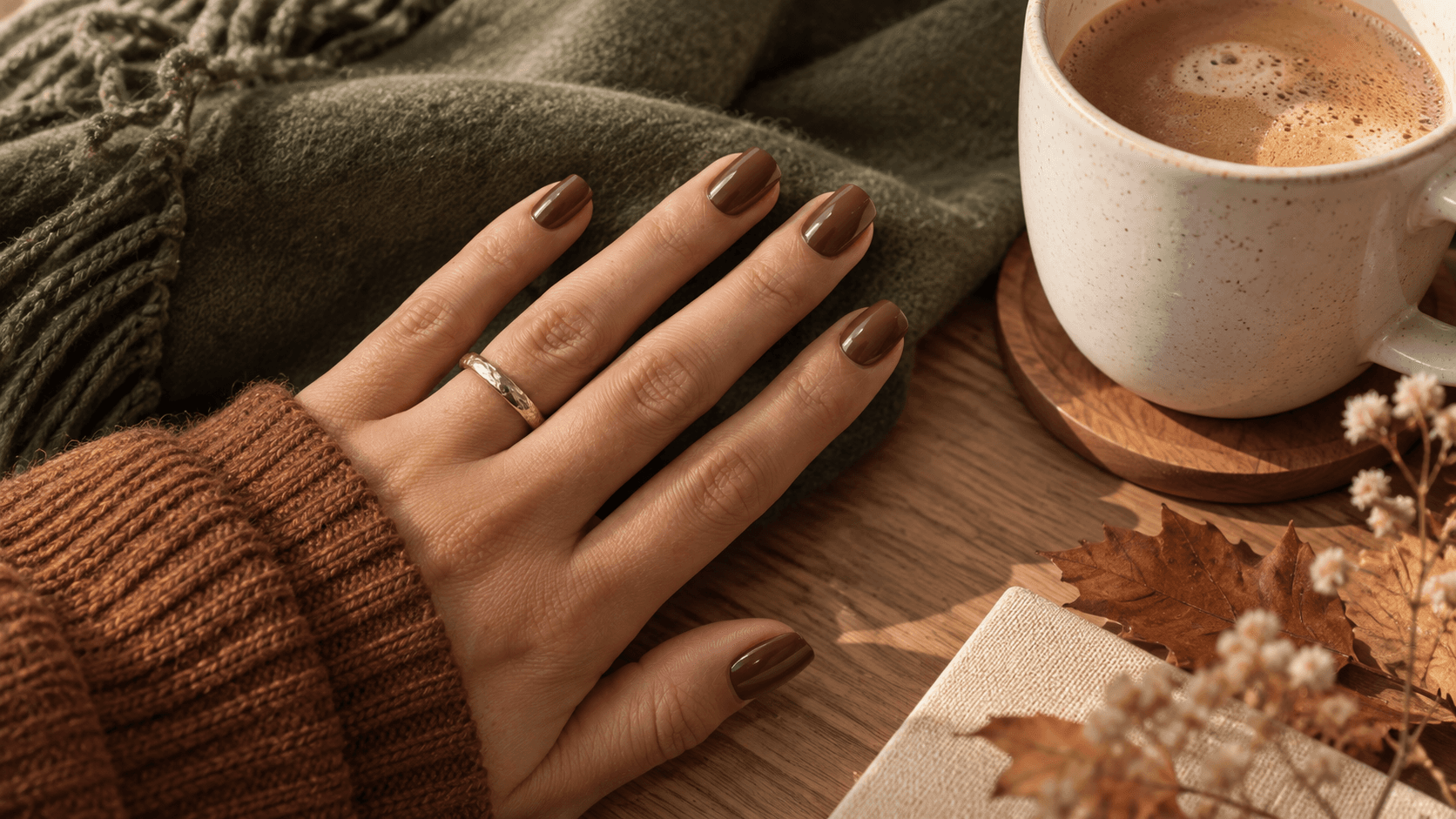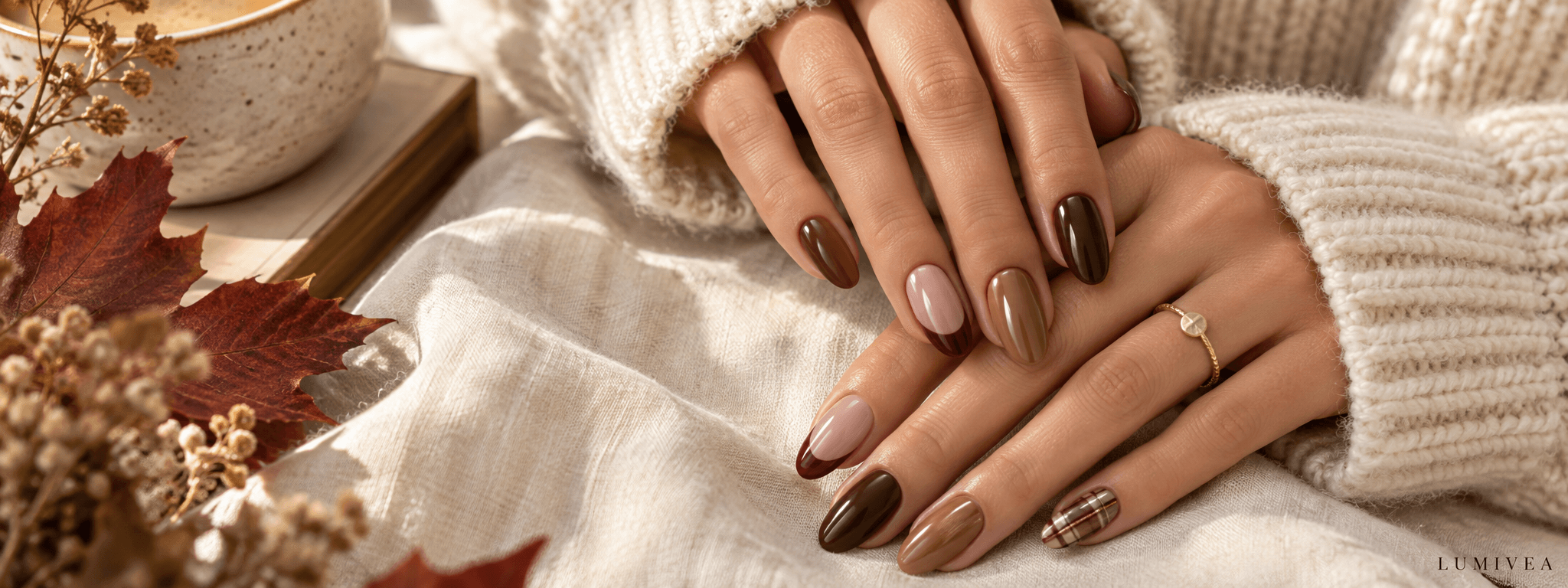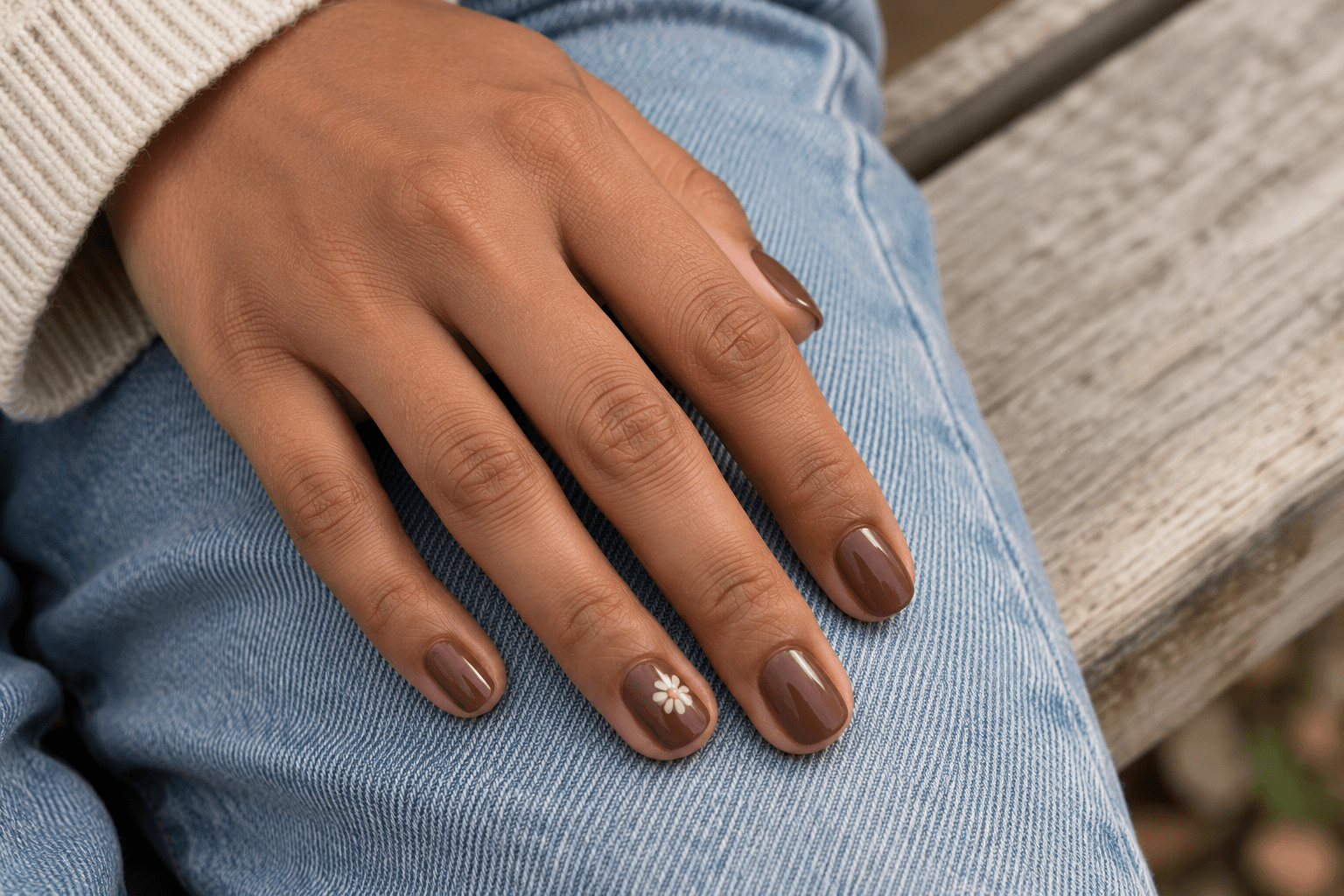
You save a nail design for the tiny flowers. Then you look again: the flowers have leaves, the leaves have gold outlines, and there is a French tip behind the whole arrangement. On a long nail, every detail has its own seat. On a shorter one, someone may end up standing in the aisle.
That does not mean the idea belongs only on long nails. It means the useful question is which part of the design do you want to keep? A single flower might carry the feeling of the reference. A few plaid lines might say more than a miniature copy of the entire pattern. A narrow colored tip might be all the contrast you wanted in the first place.
This guide looks at six short nail design ideas through placement: where a detail sits, how much space surrounds it, and how often it repeats. There is also a comparison sheet and a simple way to adapt a saved reference without trying to squeeze every part of it onto a smaller surface.
The goal is a design you enjoy at the length you choose. Making nails look longer is not an entrance requirement.
The nail photographs in this article are AI-generated design concepts. The comparison sheet is an illustration of layout choices. Neither represents tested products or work performed on clients.
Jump to the part you need
- The three placement decisions
- Choose a design direction
- Six ideas, with the details explained
- Compare crowded and open layouts
- Adapt a longer-nail reference
- Write a short nail reference brief
Start with the motif, the space, and the repeat
A short nail is a small canvas, but “make everything tiny” is not always a useful instruction. Tiny details can turn into an indistinct patch when viewed at ordinary hand distance. Sometimes the clearer adaptation uses one recognizable shape with more space around it.
Think of moving a poster onto a postcard. You might keep the main illustration and remove three lines of small print. Shrinking the complete poster preserves every element, but not necessarily the reason you liked it.
1. Decide what needs to be recognizable
For a daisy, that might be the center and a few rounded petals. For plaid, it could be crossing lines in a familiar color combination. For a French tip, it is the relationship between the colored edge and the base beneath it.
Try describing the design in five words: “one white flower on brown,” or “a thin dark curved tip.” If your description needs an inventory, decide which element leads and which ones can become optional.
2. Decide where the open space goes
Open space does not have to mean an unpainted nail. A plain colored base can provide it. What matters here is the area without additional pattern: the beige around a dot, the chocolate around a flower, or the pale base below a tip.
When that area is intentional, the motif has somewhere to stand out. If you want a densely patterned look, you can choose that too. It helps to know whether your aim is “recognize this little flower” or “see an overall floral texture.” Those are different visual jobs.
3. Decide how far the detail repeats
A single dot on every nail creates rhythm. One patterned nail beside plain ones creates a focal point. A full set of checks creates a continuous graphic effect. None is the compulsory answer for short nails.
The decision becomes easier when you separate the individual nail from the whole set. A detail can be simple on one nail and still feel busy when it repeats across every finger. Conversely, a detailed accent can feel quite contained when everything around it is plain.
Which short nail design matches the detail you like?
| Design | What draws the eye | Placement to preserve |
|---|---|---|
| Thin French tips | A colored outline at the edge | A narrow band with a generous visible base |
| One dot per nail | A repeated point of contrast | Similar position and clear space around each dot |
| One flower accent | A recognizable little motif | Room around the petals; plain neighboring nails |
| Sparse plaid | Crossing lines and color contrast | Visible gaps between the lines |
| A corner of color | A simple off-center shape | One clear boundary and a larger plain area |
| A checkerboard accent | Alternating light and dark blocks | Checks large enough to read as separate shapes |
1. Thin French tips: let the edge do the talking
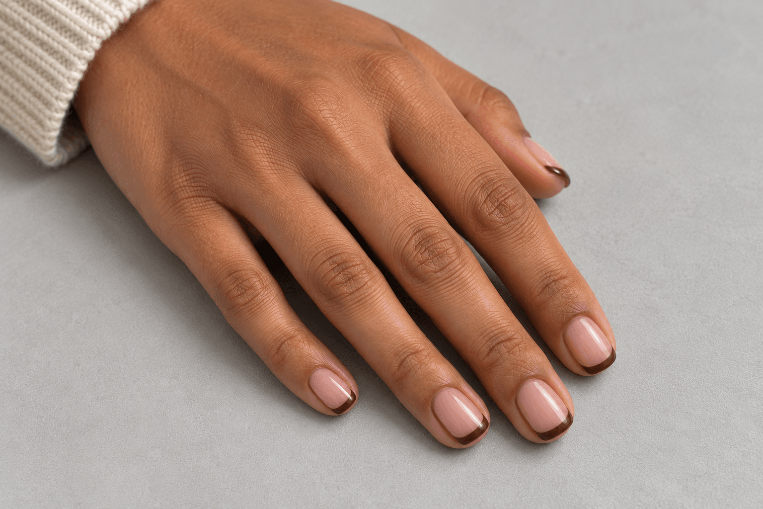
A French tip gives you a useful starting point because the main relationship is easy to see: colored edge, then base. In this concept, the dark brown stays in a narrow curved band, leaving most of the pale pink-beige visible.
That proportion is the detail to save. If a reference feels light and restrained, a much thicker band would change the effect even if the color stayed identical. “Brown French tips” names the ingredients; “a fine brown arc with lots of base showing” describes the composition.
Look at the smallest visible nail in the reference, too. The tip does not have to be an identical measured width on every nail to look like a coordinated set. The visual aim is a similar balance between band and base.
Curved and angled edges are separate choices, so keep the line shape in your notes. An angled tip can be a deliberate graphic feature; it should not arrive by accident because a cropped screenshot hid the other side. Compare thin, curved, and angled French-tip designs when the edge itself is your main interest.
Reference wording: “Short nails with a pale base and a narrow curved brown tip. Keep the base dominant; no extra pattern.”
2. One dot per nail: a small detail with a clear rhythm
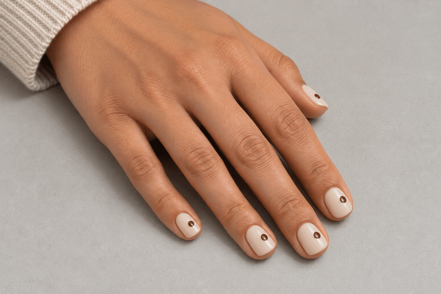
A single dot is simple enough that placement becomes the design. Put it near the center and the set feels different from a row of dots positioned toward one side. In this example, each dot sits slightly toward the outer half of the nail, with a clear margin around it.
The appeal comes from repetition with room to spare. The base stays plain, and the dark point gives your eye one thing to find on each nail. You do not need to add a second dot to prove there was an idea.
If a tiny dot disappears when you stop zooming in, choose what you want from it. Perhaps you enjoy a detail visible only close up. If you want it to read immediately, a slightly more distinct dot may serve the idea better than several smaller ones.
Color contrast matters as much as size. A brown dot on a pale base makes a different statement from a similar brown dot on mocha. One is a clear mark; the other may feel like a quiet tonal detail. Choose that relationship intentionally.
Reference wording: “One dark brown dot on each pale beige nail, placed consistently off-center, with no other decoration.”
3. One flower accent: keep the motif, edit the bouquet
A floral reference can contain several ideas at once: the petal shape, the flower color, a trail of leaves, and the way the flowers are scattered. You can keep the part you love without importing the entire garden.
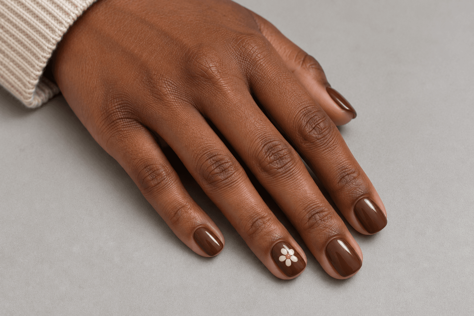
Here, one simple cream daisy sits on a chocolate-brown accent nail. The other nails stay plain chocolate. That makes the flower the obvious focal point, while the repeated background color keeps it connected to the rest of the set.
Look for a little room between the petals and the nail’s edges. If the flower fills the whole surface, it becomes a large graphic shape. That can be attractive, but it is different from a small, self-contained motif with space around it.
For a shorter version of an elaborate floral reference, you might keep the flower center and rounded petals while leaving out a stem, leaf veins, and scattered dots. Imagine the motif as a little badge: what must stay for someone to recognize it without leaning in?
Reference wording: “One simple cream flower on a brown accent nail; matching plain brown on the others. Leave space around the petals.”
4. Sparse plaid: preserve the crossing lines, not every stripe
Plaid is a pattern of relationships: lines cross, some areas stay open, and the colors repeat. A fabric reference might contain far more stripes than you want on a small nail. You can borrow its color story and a few crossings without treating the fabric as a blueprint.
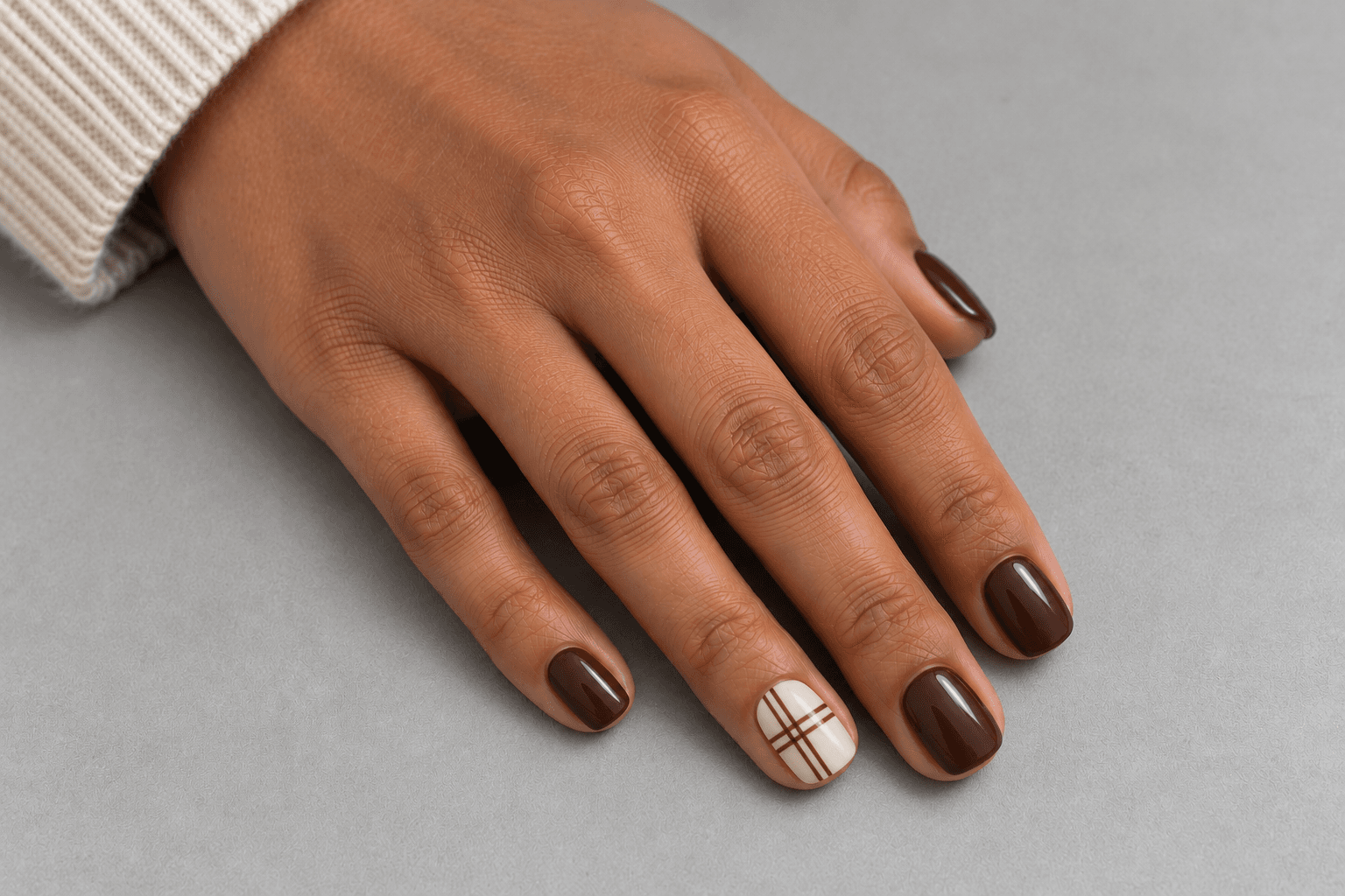
In this concept, a cream accent nail carries a small number of brown lines, while the neighboring nails stay brown. The open cream areas are part of what lets the pattern read. If every gap is filled by another stripe, your eye begins to register texture instead of individual crossings.
When discussing the look, identify both the line color and the base. “Brown plaid” could mean brown lines on cream or cream lines on a dark background. Those versions reverse which part is most noticeable.
You can also ask for an off-center section of the pattern instead of a full repeated grid. That is a layout choice, not an admission that the canvas is missing something. A small window onto a pattern can be enough to suggest the whole thing.
Reference wording: “A cream accent with a few fine brown crossing lines. Keep visible gaps; the remaining nails are plain brown.”
5. A corner of color: one shape can carry the design
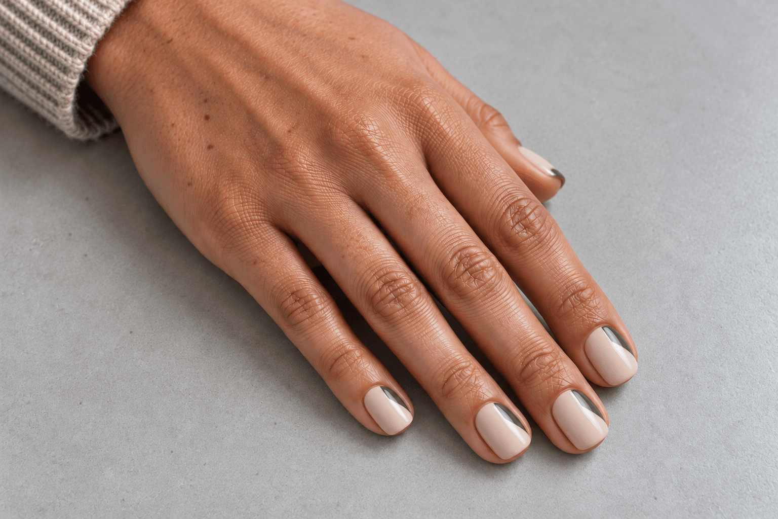
A small diagonal block at a tip corner gives the nail a clear division: colored shape on one side, open base on the other. It is a useful direction when you like graphic designs but do not want several separate marks.
The version here uses muted olive over a pale beige base. The corner occupies a small portion of each nail, and the diagonal boundary is the feature. A second outline, glitter border, or contrasting dot would each introduce another element to read.
Pay attention to what repeats across the set. You may prefer the same corner position on every nail, a mirrored arrangement between hands, or just one corner accent. A reference showing only a single nail cannot answer that question for you.
This idea also shows why open space is not always a matter of using a sheer base. The beige can have visible color of its own and still act as the quiet area around the olive shape.
Reference wording: “A small olive diagonal corner at the tip of each pale beige nail. Keep the rest plain and use the same placement across the set.”
6. A checkerboard accent: fewer clear blocks, or a deliberate texture
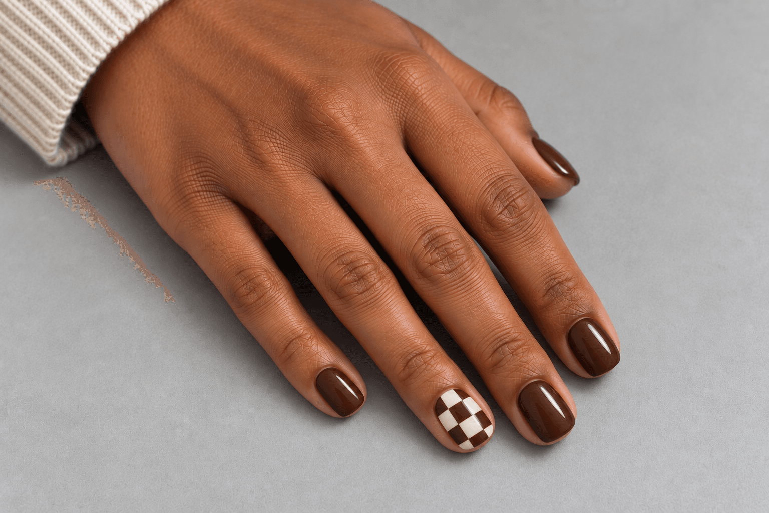
Checkerboard is a good test of what you mean by detail. Large checks read as individual blocks. A dense group of very small checks can read more like an overall texture. Both are possible design directions; decide which one you saved the picture for.
This concept uses a cream-and-brown checkerboard on one accent nail, with plain brown alongside it. Keeping the palette to two contrasting colors makes the repeating structure easy to follow. The plain nails give the pattern a defined place in the set.
If you love the checks themselves, preserve a size that remains recognizable in a normal view of the hand. Shrinking a complex reference until it contains the same number of squares may preserve the count but lose the effect.
A cropped check at the edge of the nail is not necessarily a design mistake; repeating patterns often meet a boundary halfway through a shape. What matters is whether the layout feels deliberate and the blocks remain distinct in the reference.
Reference wording: “One cream-and-brown checkerboard accent with clearly readable checks. Matching solid brown elsewhere; no extra motifs.”
Compare the layouts before choosing the detail
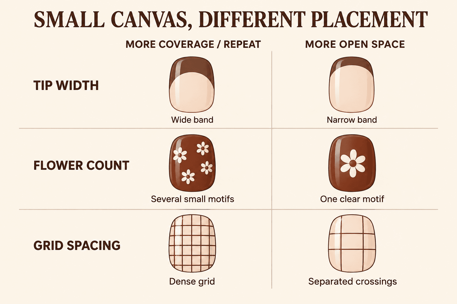
The comparison sheet isolates three decisions that can get lost in a beautiful hand photograph. The nail outlines stay the same while the pattern changes. This makes it easier to see whether you are choosing a motif, a pattern density, or an amount of coverage.
- Tip width: a wider band covers more of the base; a narrow band leaves more base visible. Choose according to the balance you want, not a rule that every short nail needs the thinnest possible line.
- Flower count: several small flowers create a scattered pattern; one larger, simple flower creates a focal point. The second version can be clearer without making the flower itself tiny.
- Grid spacing: closely packed crossings create density; fewer separated crossings make the individual lines easier to follow.
Neither column is a universal “before” or “after.” The more open examples serve the particular goal of keeping individual details recognizable. If the dense floral texture is the thing you like, that is useful information too.
The broader question of pattern scale and placement across nail lengths is about those changes in composition. This guide keeps the focus on selecting a readable short-nail reference.
How to adapt a longer-nail reference without losing its character
Picture a saved set with long almond nails, brown French tips, cream flowers, gold dots, and little leaves. You like it, but you prefer short rounded nails. Start by asking what you would notice first if the image flashed past for a second.
If the answer is “brown and cream flowers,” you already have a direction. The almond silhouette and the gold dots may be supporting details rather than essentials. Here is a practical way to sort them.
Keep the main relationship
Write down the color pairing and main motif: brown background, cream flower. That is the part the shorter concept needs to preserve. Avoid changing the colors, pattern, shape, and finish all at once; you may end up saving an entirely different idea.
Choose one kind of emphasis
You might keep the flower on one nail and use plain brown elsewhere. Or keep the French tip across the set and omit the flowers. Both borrow something recognizable, while giving the shorter layout a clearer focus.
Trying to keep the tip, flower, leaf, and gold dot on every nail may still be a design you want. Just recognize that it asks for a much denser result than a single flower accent. A screenshot does not establish how every detail can be reproduced with real materials.
Match the reference to your preferred outline
If your saved image shows a pointed shape, find a second reference for the short outline you prefer. Label it “shape and length only.” Rounded and softly squared outlines frame a design differently, so separate that choice from the pattern.
Use the visual guide to nail shapes for the vocabulary. You are describing an outline, not trying to correct the appearance of your fingers.
Check the design at an ordinary viewing size
Zooming in is useful for seeing what a mark actually is. Then zoom back out. Look at the set in roughly the way you would see a hand resting beside a keyboard or holding a cup.
Can you still tell that the accent is a flower, or has it become a pale patch? Are the checks separate shapes, or a texture? The answer is not automatically good or bad. It tells you whether the reference is doing the job you wanted.
When a saved design feels busy, change one thing
It is tempting to respond to visual clutter by changing the whole design. Often, one smaller decision gives you a more useful comparison. Keep the original beside the revised idea so you can tell what actually helped.
| What you notice | One change to consider | What that preserves |
|---|---|---|
| The motif is hard to recognize | Use fewer motifs, each with more room | The main flower, dot, or shape |
| The base almost disappears | Reduce the area covered by the tip or corner | The color pairing and edge idea |
| Every nail competes for attention | Keep the pattern on one accent nail | The detailed pattern itself |
| The fine lines merge visually | Use fewer crossings or wider gaps | The plaid or grid structure |
| The whole set feels disconnected | Repeat one base color across plain and patterned nails | Different details within a shared palette |
For a warm palette, the mocha, chocolate, and espresso guide can help you choose the shared brown before adding the pattern. Deciding on a color direction first makes it easier to compare layouts without being distracted by a new shade in every image.
A short nail brief that explains the actual idea
A useful reference brief does more than name the motif. It says where it goes, what surrounds it, and what you are happy to leave out. Here is the flower concept from this guide in a form you can save:
Shape and length: Short, softly rounded nails.
Base: A visible chocolate brown, rather than an almost-black brown.
Main detail: One simple cream flower on one accent nail.
Placement: Inside the nail outline, with clear space around the petals.
Rest of the set: Plain matching brown.
Finish: Glossy.
Optional to leave out: Leaves, gold outlines, and extra dots.
If you discuss the idea with a nail professional, ask what can be adapted at your chosen length with the materials they use. Bring the image and the description together. The description explains your priorities; the conversation can address what a real result would involve.
For your own saved board, a shorter note works: “one flower, brown base, plain neighbors.” It may look less impressive than a folder named “ultimate nail inspiration,” but it will probably be easier to use on a Tuesday.
Quick questions about short nail patterns
Does every detail have to be miniature?
No. One simple, recognizable motif can make a clearer reference than several miniature versions. Decide whether you want to recognize the individual detail or enjoy an all-over texture.
Can a full set have a pattern?
Yes. The single-accent examples here are options for creating a focal point, not a rule. For an all-over pattern, compare the number of colors, the spaces between marks, and how the design reads across the whole hand.
Do all nails need exactly the same layout?
No. A shared base color, repeated motif, or consistent edge treatment can connect different layouts. The useful question is what makes the set feel related. You can decide that before choosing which finger carries each detail.
What if the reference shows much longer nails?
Borrow the part you actually want: color, motif, or placement. Add a separate reference for your preferred length and outline. Treat the original as inspiration to interpret rather than a complete design that has to be reduced unchanged.
Save the detail, the placement, and the space around it
Before saving your next reference, add three words or phrases: what the detail is, where it sits, and what stays plain. “Brown tip, curved edge, pale base.” “Cream flower, one accent, plain brown elsewhere.” That is enough to turn an attractive picture into a usable idea.
You can bring those decisions into a seasonal palette with the fall nail guide to color, finish, and detail. Start with the layout you like, then choose whether you want brown, olive, a deep red, or something lighter.
A smaller canvas can still carry a very particular idea. Give the detail you love enough space to be noticed, and let the rest of the set support it.