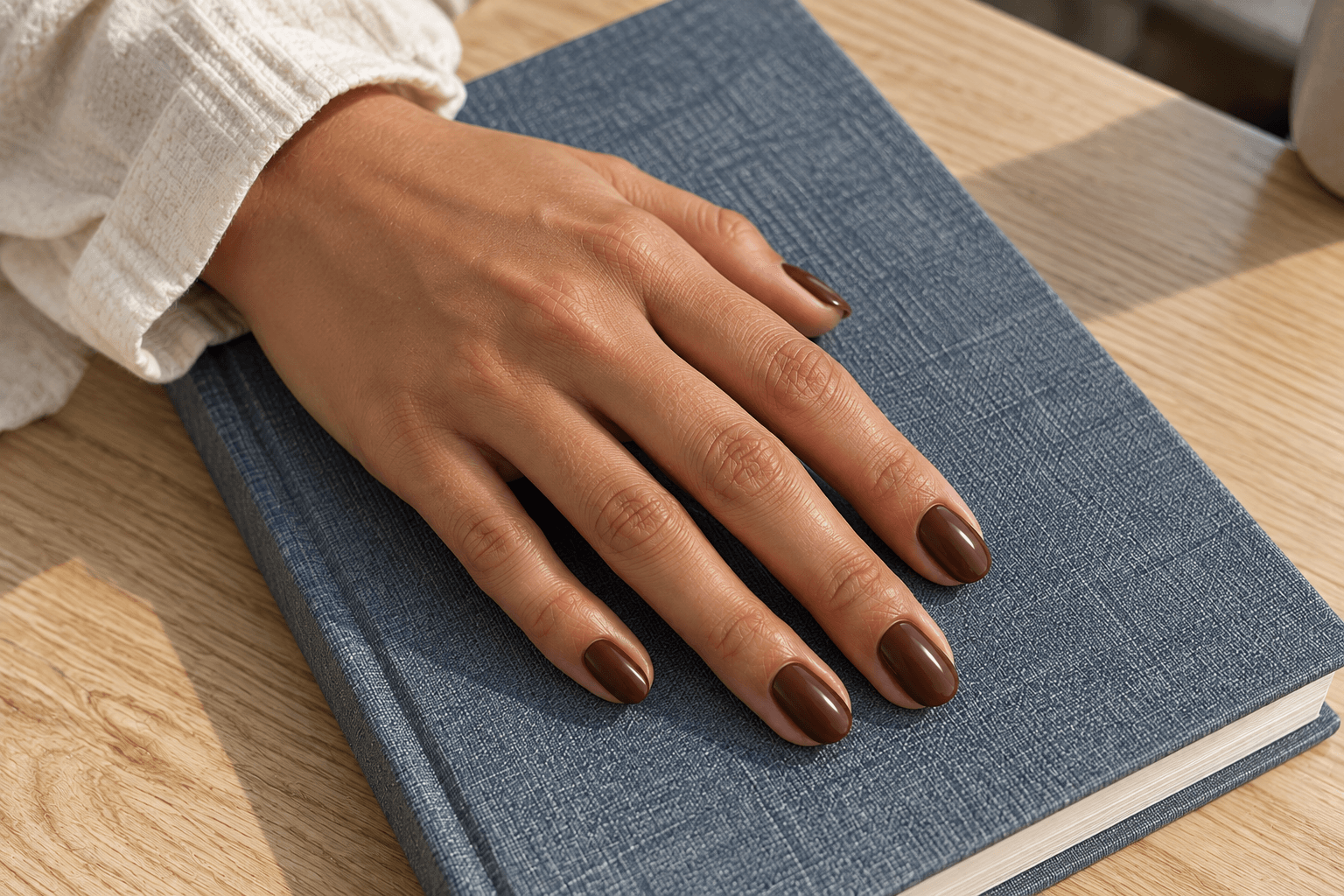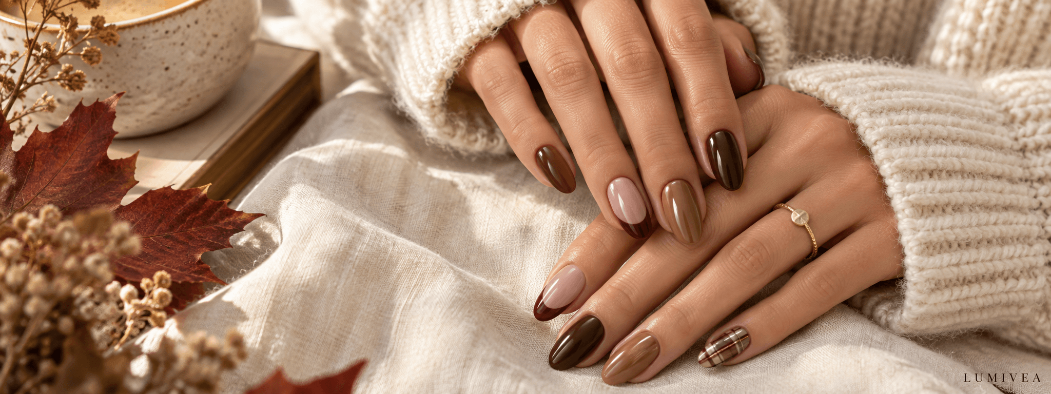
A plaid reference can go from “a little autumn detail” to “my entire scarf collection” surprisingly quickly. The difference is not just the colors. It is how many nails carry the pattern, how much of each nail it covers, and how tightly the lines sit together.
If you are deciding between one accent and a full plaid set, start with the amount of pattern you want to notice when your hand is at an ordinary distance. A single light accent gives your eye somewhere specific to land. A repeated grid makes the whole manicure the pattern. Between those two are tips, corners, side panels, and mixed layouts that leave room for both.
These 15 fall plaid nail ideas move from small accents to more complete patterns. Each includes a clear design brief you can save alongside the image, so you can describe the detail you like rather than handing over a screenshot and hoping “something like this” means the same thing to everyone.
Images are AI-generated design concepts illustrating color and placement choices, not photographs of completed client manicures or tested product results.
Choose your plaid coverage first
“Full plaid” can mean a fully patterned accent nail or a pattern repeated across every nail. Those are different decisions. This table separates the amount of pattern on one nail from its distribution across the set.
| Layout | Where the pattern goes | What remains plain | Choose it when… |
|---|---|---|---|
| One accent per hand | One whole nail on each hand | The other four nails | You want a clear focal point |
| Two related accents | Two nails, with full or partial detail | Three nails, plus any open accent areas | You want the pattern to connect across the hand |
| Tips, corners, or panels | A defined part of selected nails | The rest of each nail surface | You like repetition with visible breathing room |
| Full patterned set | Every nail | Only the spaces within the plaid | You want the pattern itself to lead |
Then consider contrast. Fine taupe lines on a beige base can feel quieter across a full set than one black-and-white accent. Coverage tells you how much pattern there is; contrast tells you how strongly it announces itself.
Browse small accents, partial patterns, or full-set arrangements.
What makes a plaid reference useful?
For this guide, plaid means crossing bands or lines forming a repeated grid. Some ideas lean toward a simple windowpane, while others use broader bands with finer companion lines. These labels describe the visible layout; they do not identify a named tartan, a brand pattern, or an exact polish shade.
Look at a reference twice: enlarged for the linework, then reduced to the size it occupies in a normal phone photo. A design can be beautifully intricate up close yet lose its separate lines when small. Neither view is wrong, but they answer different questions.
Also notice where the pattern ends. A grid cropped naturally by the nail edge feels different from a small patch framed by plain color. You can keep the same cream-and-brown palette and get quite different results just by changing that boundary.
Small accents: let one detail lead
1. Oatmeal plaid on one nail, chocolate on the rest
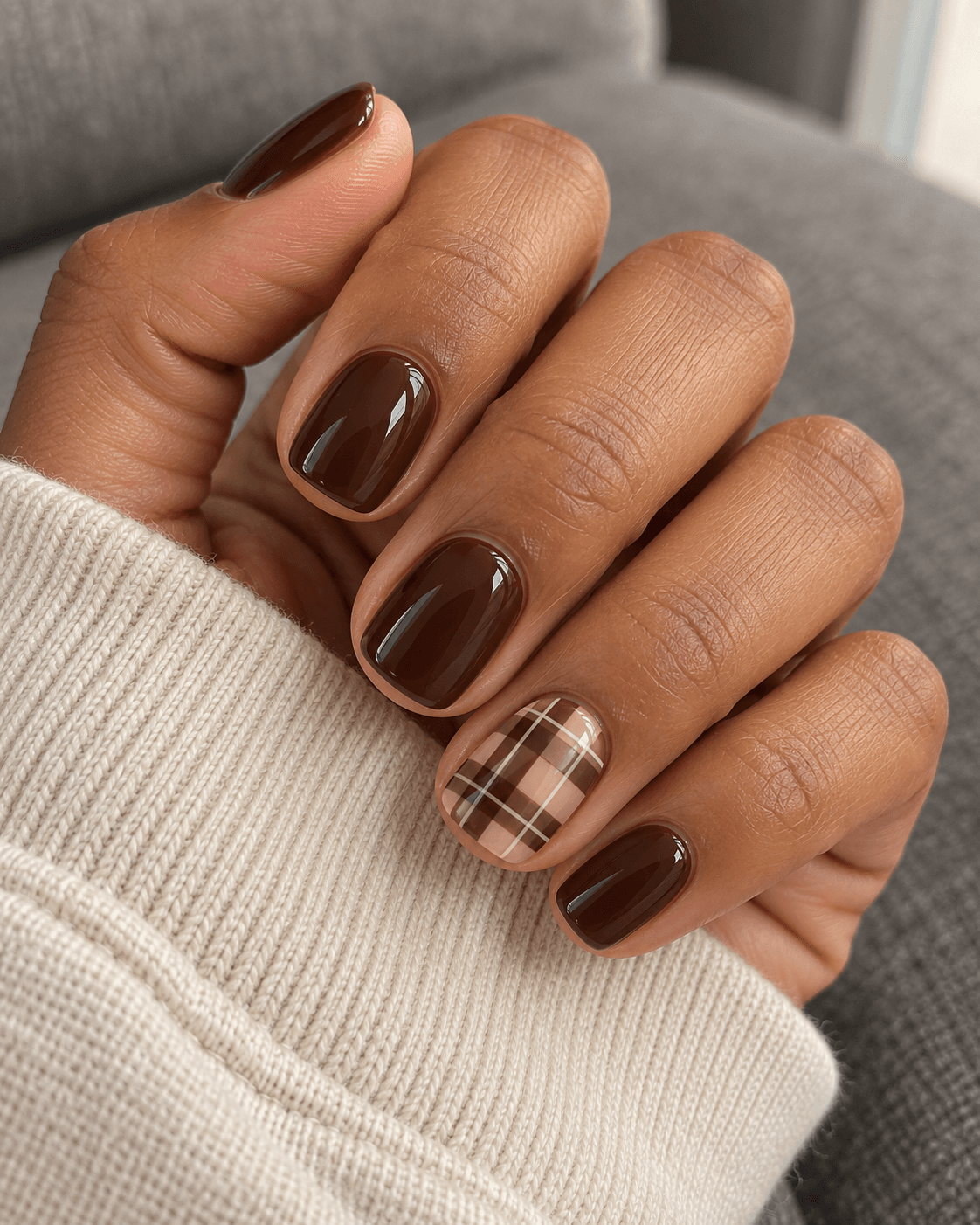
A pale accent gives the pattern its own little window. Imagine four chocolate nails and one oatmeal nail crossed by cocoa bands and a finer cream line. The colors belong together, but the pale background makes it immediately clear where to look. It is the manicure equivalent of a patterned scarf with a plain coat: enough character without coordinating an entire outfit around it.
Keep the chocolate on the plain nails close to the darkest stripe. If the two browns are very different, the accent can feel borrowed from another set. The oatmeal should still occupy generous areas between the bands; filling every gap with another stripe defeats the point of choosing a pale base.
Ask for one patterned nail per hand if you want a matched layout. “One accent” can otherwise mean one across the entire manicure, and those are noticeably different choices.
Reference brief: One oatmeal plaid ring nail per hand; chocolate solids elsewhere; broad open squares and one fine cream detail.
2. An off-center windowpane accent

A windowpane-style grid has room to breathe. Rather than packing several colors into each crossing, this version uses thin espresso lines on a milky beige base. Moving the grid slightly off center changes the composition: one larger pale rectangle becomes the resting point, while smaller sections disappear naturally at the nail edges.
This is a useful choice when the densely striped reference you saved looks beautiful enlarged but turns into a dark patch when you view it small. Fewer intersections remain easier to distinguish in that smaller view. On a short nail, one or two vertical lines and a couple of horizontal ones can establish the idea without squeezing in a whole repeat.
The other nails can stay milky beige. That makes the change about linework rather than a sudden change of background color. Choose this over the first idea when you want the whole set to look light.
Reference brief: Milky beige throughout; a thin, offset espresso grid on one ring nail, with a large open rectangle.
3. A rust plaid thumbnail that reveals itself when you move
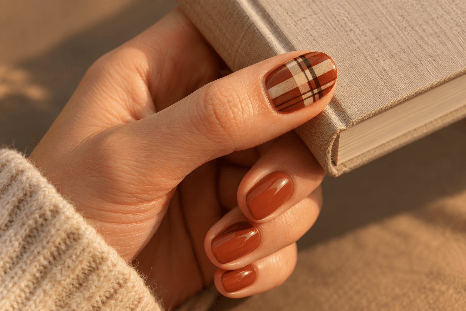
The ring finger is not the only place an accent can live. A patterned thumbnail gives a different rhythm: it becomes prominent when you hold a book or wrap your hand around a glass, then less obvious when your fingers rest flat. It is a good reference choice if you like a little reveal rather than having the pattern face forward all the time.
Try a muted rust background with cream bands and a thin dark-brown crossing line. Pair it with plain rust nails so the thumbnail feels connected to the rest of the hand. The thumb often gives a pattern a differently proportioned space, so the reference should show the actual thumbnail rather than transplanting a narrow ring-nail pattern unchanged.
Photograph or save a view where the thumb is visible. Otherwise the very detail you chose may be missing from the image you bring along.
Reference brief: Rust solids with a rust, cream, and dark-brown plaid thumbnail; show the thumb clearly in the reference.
4. Burgundy solids with a dusty-rose plaid accent
Here the contrast comes from depth. Deep burgundy surrounds a dusty-rose accent, with burgundy crossing bands tying the two together. A fine muted rose-beige line can add separation inside the dark pattern without the sharp flash of bright white.
This version works especially well as a reference for someone who wants the dark red to remain the main event. The accent is lighter, but it does not introduce a completely different seasonal palette. Keep the rose muted if you want that connection; a vivid candy pink creates a more playful contrast, which is a different brief rather than a mistake.
Choose the base and the plaid colors in the same reference image where possible. A near-black burgundy photographed in shadow can be difficult to distinguish from brown, so write “red-leaning burgundy” if that is the direction you mean.
Reference brief: Red-leaning burgundy solids; one dusty-rose accent with burgundy bands and a fine rose-beige line.
5. Two accents with different jobs: plaid and one borrowed stripe
If one accent feels a little isolated but two full plaid nails seem busy, give the second accent a smaller job. Keep a full oatmeal-and-brown plaid on the ring finger, then repeat only one brown stripe on the index finger. The remaining nails stay plain oatmeal. You get a connection across the hand without copying the complete grid twice.
The stripe should borrow its width and direction from the plaid. A random wavy line would create a second visual language; a straight band from the same pattern feels intentional. This is also a useful way to use a strong color sparingly: a rust detail can appear at one crossing and once on the companion nail.
Make the distinction explicit in your brief. “Two accent nails” alone does not explain that one is detailed and the other is deliberately spare.
Reference brief: Ring nail full plaid; index nail one matching straight band; all other nails plain. Same base across the set.
Partial patterns: tips, corners, and open space
6. Plaid French tips with a generous pale base
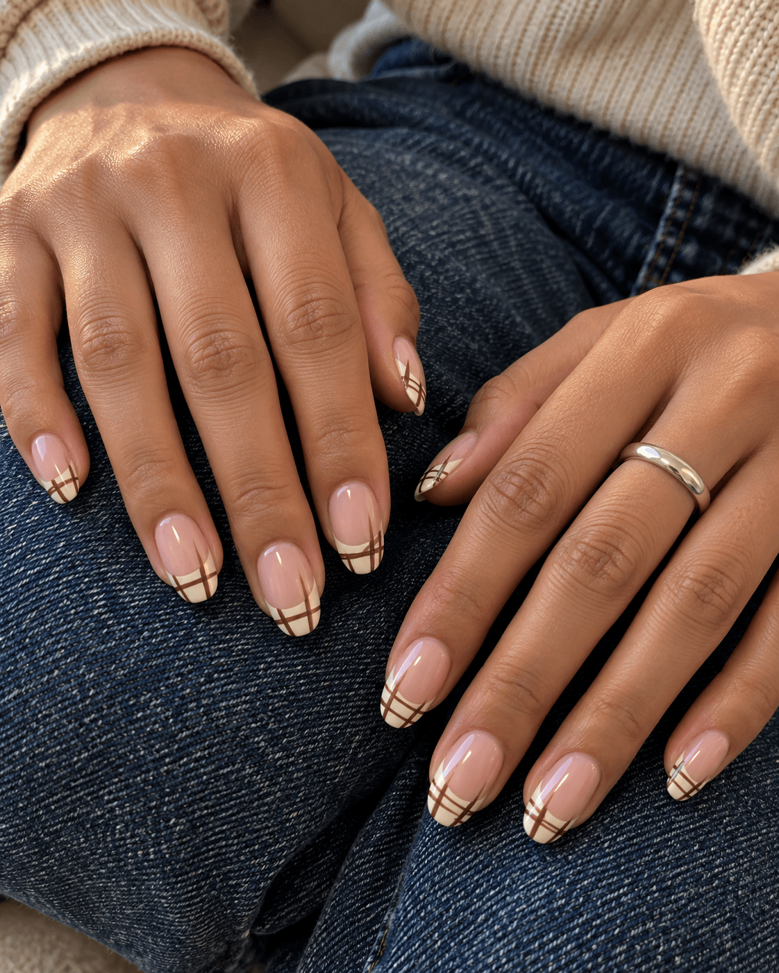
A plaid tip keeps the middle of the nail open while carrying the pattern at the edge. The catch is scale. A very thin tip cannot show the same broad pattern as a full nail. For this version, picture a moderate cream tip with a few brown crossing lines and a sheer-looking pink-beige base beneath it.
The pattern should stop at the curved boundary of the tip. If the lines continue down the nail, the look becomes a full grid with a pale background, which is another design entirely. A clean boundary is what makes the French version read clearly.
Use this reference when you like repeated detail across all fingers but still want plenty of plain base. If the tip area on your chosen length is very small, keep the crossing lines fewer and simpler rather than trying to shrink an elaborate plaid into it.
Reference brief: Pink-beige base; cream French tips containing a sparse brown plaid; no lines extending below the tip boundary.
7. A diagonal plaid corner with an open center
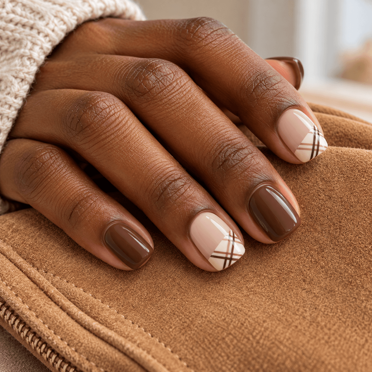
A corner of plaid can suggest a whole pattern without showing much of it. Place a cream-and-cocoa patch at one tip corner, with a diagonal inner boundary and the rest of the nail left pale. It looks like a small piece of checked fabric entering the frame.
Keep the grid upright within the patch. The diagonal belongs to the edge of the patch, not necessarily to the stripes themselves. That distinction makes the reference much easier to describe. Rotating the grid as well creates a different effect and can make a small patch harder to read.
Try it on two nails with the remaining nails plain cocoa. Use the same corner on those two nails for a tidy repeat, or opposite corners for a deliberate change. Either way, draw the boundary in your reference notes; “diagonal plaid” leaves a lot open to interpretation.
Reference brief: Two cream-and-cocoa plaid tip corners, straight grid inside each diagonal patch; remaining nails plain cocoa.
8. A narrow plaid panel down one side
Think of this as a strip of pattern rather than a tiny full plaid nail. A cream panel runs along one side of a taupe nail, taking up roughly a third of its visible width. A brown longitudinal band and several spaced crossbars give that strip a checked rhythm. The rest stays plain.
Because the panel is narrow, the repeated horizontal marks do much of the work. Adding many parallel vertical lines would eat up the pale background and turn it into a dense border. Leave a clear difference between the patterned strip and the unpatterned area.
This is a particularly useful idea to sketch before choosing a finished reference. Decide which side carries the panel and whether every nail repeats it. There is no need to frame it as changing the appearance of your fingers; its appeal is simply the off-center layout.
Reference brief: Taupe base with a cream plaid side panel about one third of the nail width; clear plain space beside it.
9. An open brown grid over a sheer-looking base
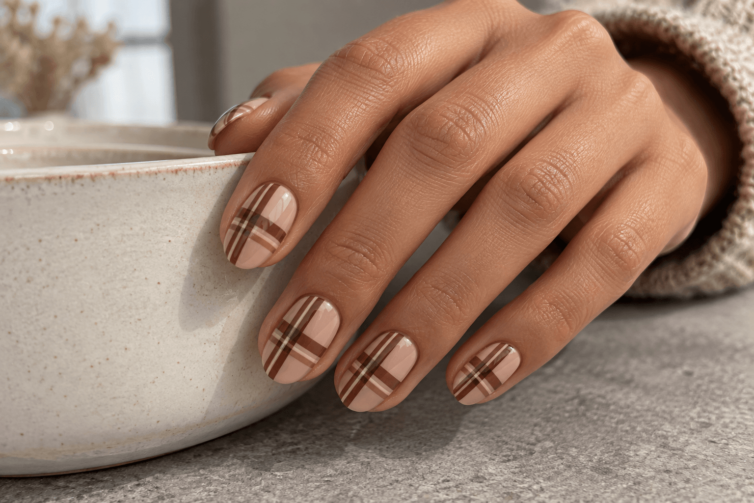
This version spreads the pattern across the nail but keeps the background visually light. A translucent-looking beige base sits under widely spaced brown bands, with a fine cream line beside one band. There are no little motifs tucked into every square. The empty-looking areas are part of the design.
Notice the difference between coverage and contrast here. The grid reaches the edges, so it is a full-surface pattern. Yet its broad spaces can make it feel quieter than a small, densely packed black-and-white accent. “Full pattern” does not automatically mean “maximum intensity.”
If you choose this for every nail, keep the line spacing consistent in spirit rather than demanding an identical number of squares on differently sized nail plates. Let the repeat crop at the sides. Plaid does not need a complete square at every boundary to make sense.
Reference brief: Sheer-looking beige base, widely spaced cocoa bands and one fine cream companion line; open spaces remain visible.
10. A small framed plaid patch
A centered patch gives plaid a clear beginning and end. Picture one small oatmeal rectangle on a chocolate ring nail, containing a simple brown grid. A slim chocolate margin stays visible all around it. Unlike the side panel or French tip, this pattern touches none of the outer edges.
The framing is what makes the idea distinct, so resist filling the rectangle with a miniature version of an intricate five-color plaid. Two directions of linework are enough. The patch can have softly rounded corners if you prefer, but keep its boundary separate from the nail outline.
This is a more graphic option than a conventional accent. It resembles a little label or swatch, especially against a solid background. Pair it with plain chocolate nails if you want the patch to be the only interruption in an otherwise simple set.
Reference brief: One small oatmeal plaid rectangle centered on a chocolate ring nail, with chocolate visible around all four sides.
Full patterns: make the repeat the main idea
11. A full set of tonal taupe plaid
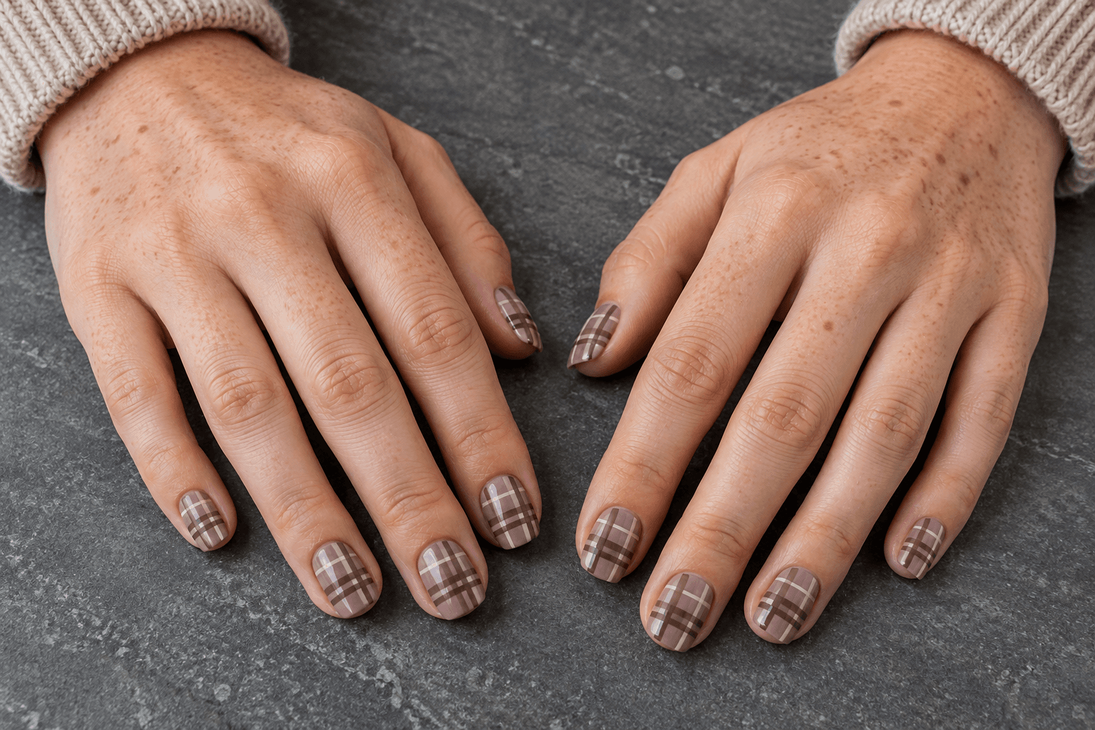
This is the quiet full-pattern option. Use a mushroom-taupe base with slightly darker taupe bands, then a very fine pale-beige line. The pattern covers every nail, but the colors sit close together, so it reveals itself more at close range than from across a table.
The design still needs enough separation to remain visible. If every color is nearly identical, the pattern can disappear in a small photo; if the pale line becomes bright white and thick, it takes over. The useful middle ground is a visible grid with one restrained highlight.
Keep the finish and palette consistent across the set. Varying both the stripe spacing and the shine from nail to nail would make this less about calm repetition. Choose this when you want plenty of plaid, but your reference board is mostly soft neutrals rather than bold graphic contrasts.
Reference brief: Full set: mushroom taupe, slightly darker crossing bands, fine pale-beige detail, consistent gloss and roomy repeats.
12. Large cream-and-cocoa checks on short nails
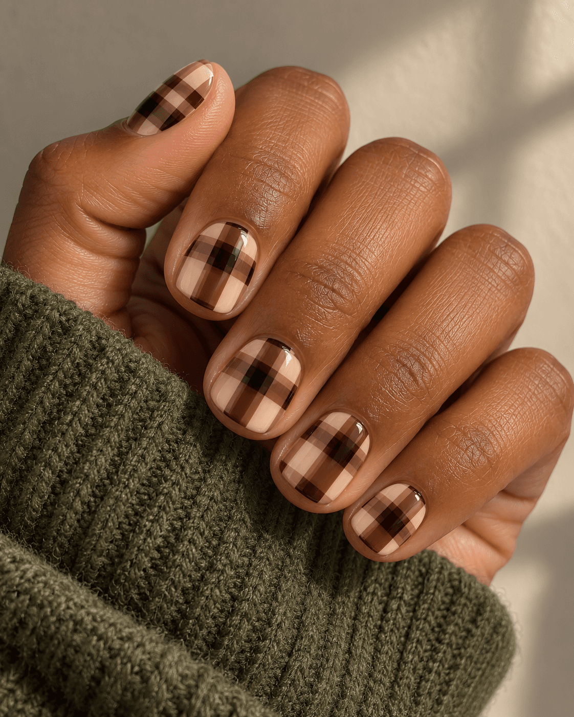
A small canvas does not require a tiny print. Broad intersecting cocoa bands over cream can create just a few large sections on each short nail. The repeat continues beyond the visible edges, as though the nail were a crop from a much larger piece of patterned paper.
For this idea, look for crossing bands rather than alternating filled checkerboard squares. Where the bands intersect, a darker block helps explain the layered pattern. The spaces between them stay cream. It is bolder than tonal taupe because the light and dark areas separate strongly, even though there are fewer lines.
Let the pattern crop differently on each nail while keeping its scale similar. Trying to fit the same complete grid onto every nail may force the smaller ones into a tighter pattern. The more useful instruction is “same broad stripe scale, natural crops,” not “exactly six squares everywhere.”
Reference brief: Short nails; broad cocoa crossing bands over cream, darker intersections, only a few large visible sections per nail.
13. Navy plaid with one fine rust line
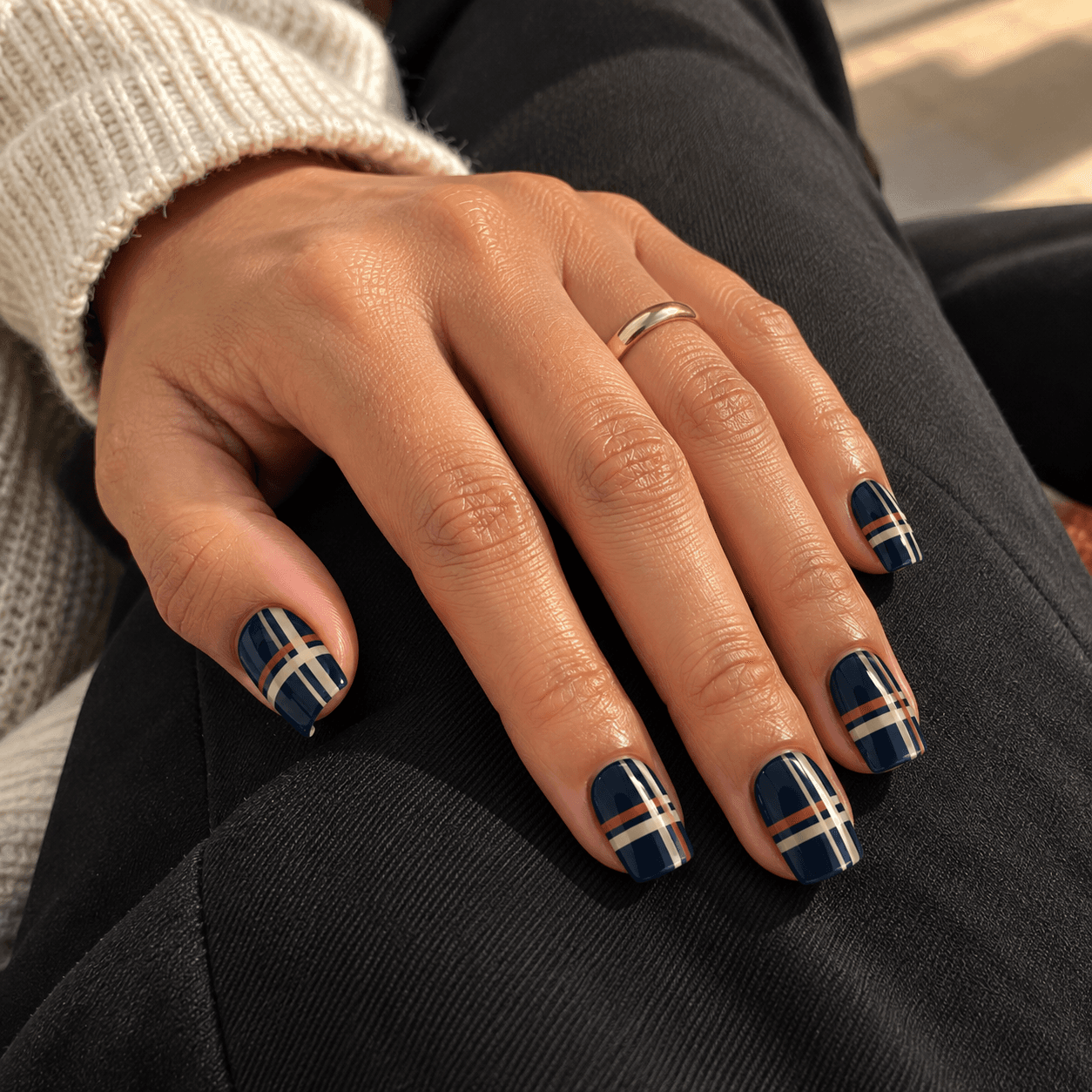
A dark blue base gives autumn plaid a different starting point from brown. Cream crossing bands make the pattern readable, while a narrow rust line adds warmth. The rust should behave like punctuation: a small mark with a clear job, rather than another equally broad band competing for space.
This is one of the stronger full-set ideas here. If you want to try the palette at lower intensity, move the same pattern to the ring and thumb nails and leave the others navy. That changes the amount of pattern while keeping the design itself intact, which makes it easier to compare the two options.
Avoid relying on the word “classic” to describe the grid. Specify which band is broadest and which is the small detail. These are generic plaid-inspired concepts, not identified traditional tartans or reproductions of a particular textile design.
Reference brief: Navy base, cream crossing bands, one fine rust companion stripe; full set or ring-and-thumb accents.
14. The same palette with two deliberate pattern scales
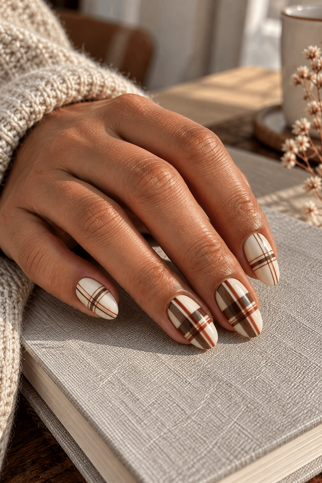
A coordinated set can vary its pattern without becoming a collection of unrelated ideas. Use cream, cocoa, and muted rust throughout. Let the middle and ring nails carry broad, open plaid, while the index and little nails use a finer repeat. Keep the background color and finish consistent so the scale change is easy to see.
This is busier than repeating one grid, even though the palette stays small. Choose it if you enjoy looking from nail to nail and noticing differences. If you prefer a single focal point, the one-accent arrangements near the start are a better match for that preference.
Keep the fine version genuinely related to the broad one: the same dominant cocoa band, the same small rust line, the same cream spaces. Shrinking everything until it becomes indistinct does not add useful detail. The small pattern still needs readable gaps.
Reference brief: Cream, cocoa, and rust throughout; broad repeats on middle and ring, finer related repeats on index and little.
15. A plaid-heavy hand paired with a mostly plain hand
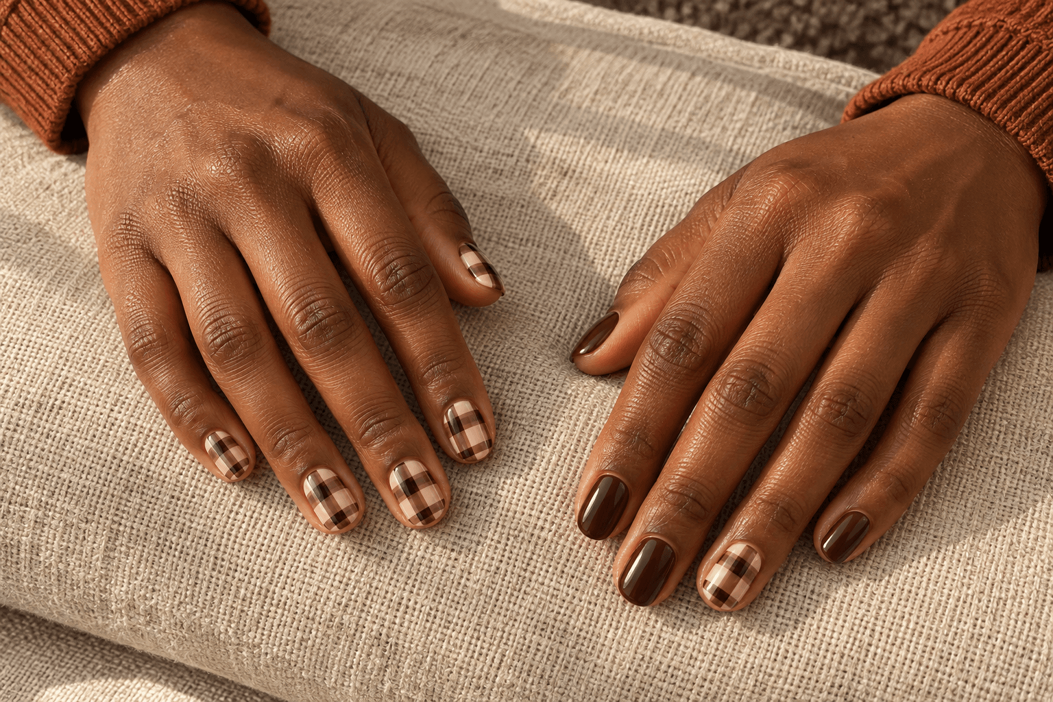
For a more unexpected layout, let one hand carry the pattern and the other carry its color. One hand can wear cream-and-cocoa plaid throughout; the other stays chocolate except for a single cream-and-cocoa plaid ring nail. The colors connect them, but the amount of detail is deliberately uneven.
This is not the choice for someone who wants a matched manicure. Its appeal is the difference between the two hands, especially when they appear together. A reference showing only the patterned hand cannot communicate that plan, so save a two-hand image or write out the distribution.
The shared accent on the mostly plain hand acts as a bridge. Without it, the two halves may look like separate concepts placed next to each other. If that stronger split appeals to you, it can be intentional too; just decide before the reference leaves your camera roll.
Reference brief: One hand full cream-and-cocoa plaid; the other chocolate solids with one matching plaid ring nail.
The same pattern, three different layouts
Here is a useful comparison to make before adding another saved image to the pile. Keep the palette fixed: oatmeal base, cocoa crossing bands, one fine cream line. Keep the nail length and finish fixed too. Change only the distribution.
| Version | Thumb | Index | Middle | Ring | Little | Effect of the change |
|---|---|---|---|---|---|---|
| A: one accent | Chocolate | Chocolate | Chocolate | Plaid | Chocolate | The ring nail becomes the focal point |
| B: two accents | Plaid | Chocolate | Chocolate | Plaid | Chocolate | The pattern appears in more than one hand position |
| C: full set | Plaid | Plaid | Plaid | Plaid | Plaid | The repeated pattern becomes the main feature |
Version B is a useful middle option if you like the accent idea but wish it appeared more often in photos. Version C makes sense if it is specifically the plaid you love. There is little reason to choose five patterned nails just because a reference happens to show five.
To compare them without changing a manicure, draw three rows of five simple nail outlines on paper. Fill them according to the table. This rough map is enough to see the distribution; it does not need convincing nail art or perfect stripes.
Three details to settle before saving your final reference
How wide are the bands?
Broad bands create larger blocks where they cross. Fine lines leave more of the base visible. Mixing the two can give the pattern structure, but the broad band should still be identifiable. If all the lines compete at once, simplify the repeat before adding another color.
For shorter lengths, consider fewer crossings rather than automatically making every detail tiny. Our short nail design ideas explore the same question across other motifs: which parts deserve the available space?
Which color has which job?
Describe colors by role: the background, the main crossing bands, and the small detail. “Brown and cream plaid” could mean a pale nail with brown stripes or a dark nail with cream stripes. Both fit the words, but the results look quite different.
If your browns keep drifting between coffee, red-brown, and gray-brown in saved photos, the mocha, chocolate, and espresso comparison can help you name the direction. Treat those names as visual descriptions, not promises of an exact bottle color.
What do you want to stay plain?
This question is often more useful than “What else could we add?” You might want four solid nails, the lower half of every nail, or simply large gaps between the lines. Name that space explicitly. A clear reference brief protects the quiet parts as well as the decorative ones.
If you are deciding between plaid and a different seasonal detail, return to the fall nail ideas guide. Choose the main idea first. A plaid grid, leaf, metallic tip, and tiny pumpkin can all be appealing individually without needing to attend the same manicure.
A plaid reference brief you can actually use
Pair one whole-hand image with a closer view of the pattern you mean. The whole-hand view explains distribution; the close view explains band widths, crossings, and color roles. An extreme close-up alone can hide the fact that the original set had just one accent.
“I like the oatmeal background and cocoa bands in this reference. I want one full plaid ring nail on each hand, with chocolate on the other nails. Please keep the gaps broad and the cream detail thin. The placement matters more to me than copying the exact number of squares. I would like to discuss how that pattern could fit my chosen short, softly squared shape.”
If you prefer another layout, change the distribution sentence first. For French tips, specify that the lines stay inside the tip. For a side panel, specify the side and approximate width. For a full set, say whether the repeats should feel uniform or intentionally varied.
A generated image can communicate those choices, but it cannot prove a finished result or identify the products behind it. Keep that distinction when you save the reference. A nail professional can discuss which elements to adapt; the useful part you bring is knowing which details matter to you.
Questions that come up when choosing plaid nails
Can plaid look clear on short nails?
As a design concept, yes: a few broad crossings, an open windowpane grid, or one accent can remain legible without a long surface. The relevant question is how much of the repeat you need to see. A short nail can show a cropped section rather than an entire textile pattern.
Should the plaid match my clothes?
It can borrow one color without copying the whole print. A brown band might echo a coat, or a muted rust detail might sit alongside a scarf. If the clothes already have a strong pattern, a single nail accent gives a different balance from another dense print across every nail. Choose the combination you enjoy looking at; there is no matching rule to pass.
Is plaid the same as checkerboard?
In these examples, plaid is built from crossing lines or bands. A checkerboard is read as alternating filled squares. They can resemble each other from a distance, so point to the actual structure you want: crossing stripes with visible background, or alternating blocks.
Does a full plaid set have to be bold?
No. Low-contrast taupe-on-taupe plaid can be more understated than one strongly contrasting accent. To quiet a full set, reduce the contrast or open the spacing. To make a small accent more prominent, increase the difference between its light and dark areas.
Should every plaid nail have identical squares?
Not necessarily. The nail outlines differ, and the pattern can crop at their boundaries. A consistent band width and related spacing usually communicates a coordinated repeat more clearly than squeezing an identical count into every surface.
Choose the detail you want to notice
If you want a reliable starting point, compare the oatmeal accent in idea 1 with the tonal full set in idea 11. They answer the title question from opposite directions: a single distinct focal point or a pattern repeated softly across the hand.
Save the one that matches how much detail you want to see, then write down the background, band color, and placement. That turns a nice picture into a reference with a purpose.
For the next design decision, explore pattern scale and placement across nail lengths or one accent nail versus a coordinated full set.