Find the brown you mean, then describe the details that make it yours.
By Lumivea Editorial
“Brown nails” sounds like a decision. Then you open your saved pictures and find a beige-brown manicure, a rich chocolate set, and something so dark it could almost be black. All three have been called mocha somewhere. The coffee menu has entered the chat, and it is not helping.
What you need is a way to describe the brown you actually like. In this guide, mocha means the softer beige-brown direction, chocolate means a richer middle-to-deep brown, and espresso means a very dark brown approaching black. Those are our working descriptions for the comparisons below, not fixed specifications for products with those names.
We will separate four things that often get bundled together: depth, undertone, finish, and how much of the nail the color covers. You can then save a reference with enough detail to explain why you chose it.
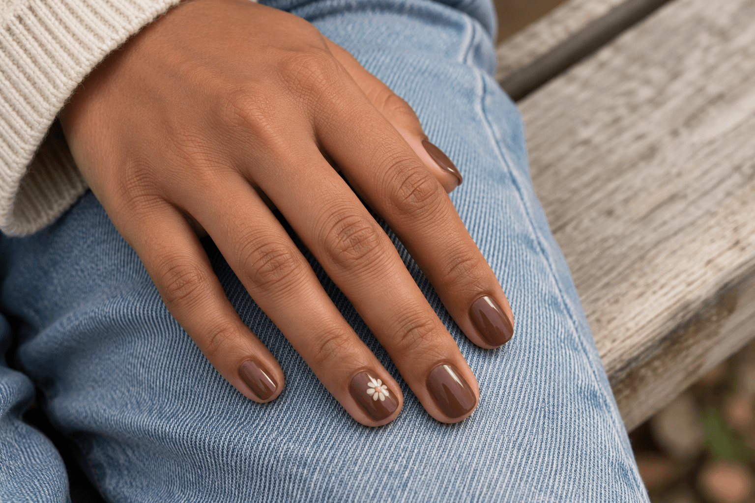
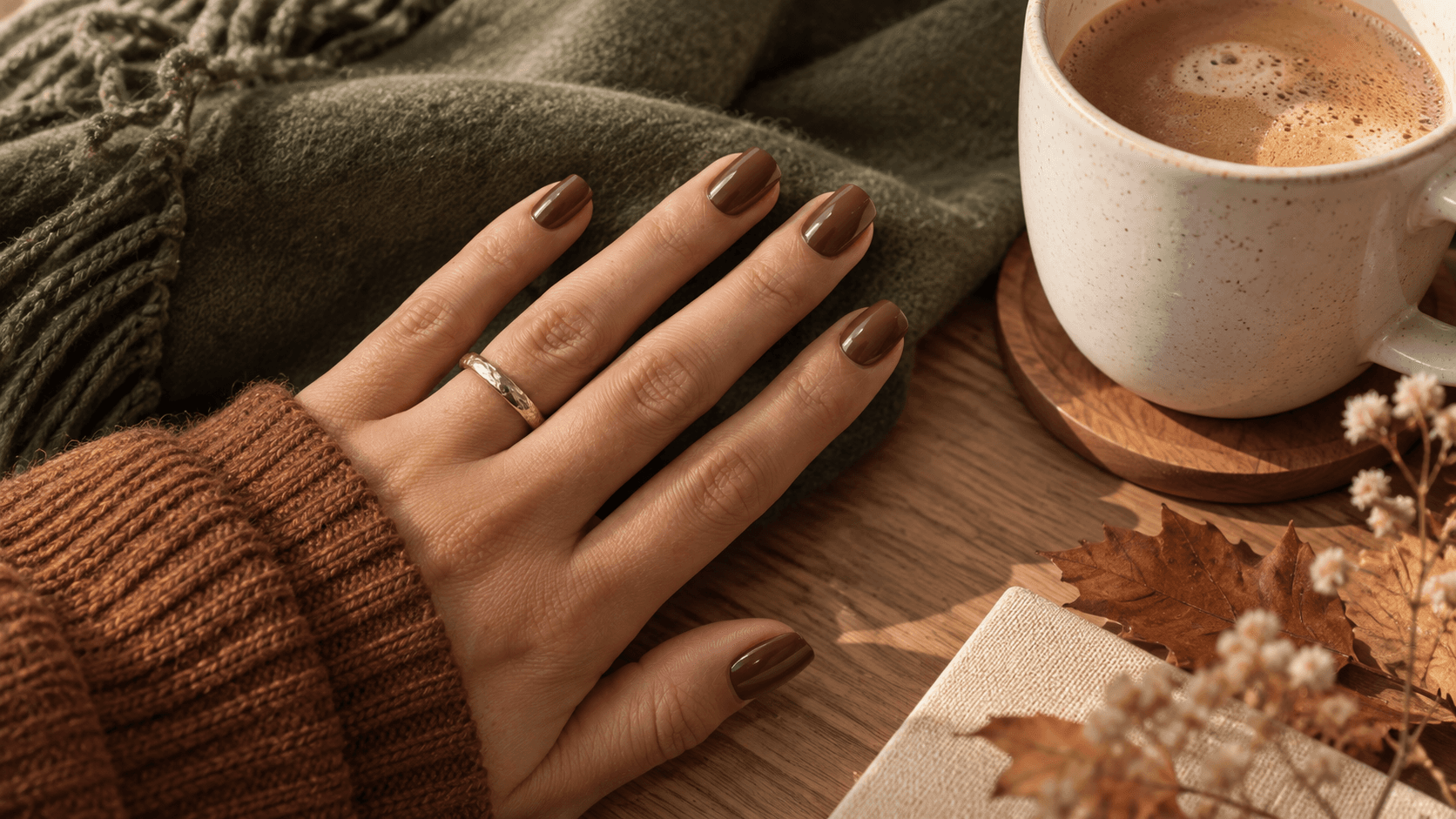
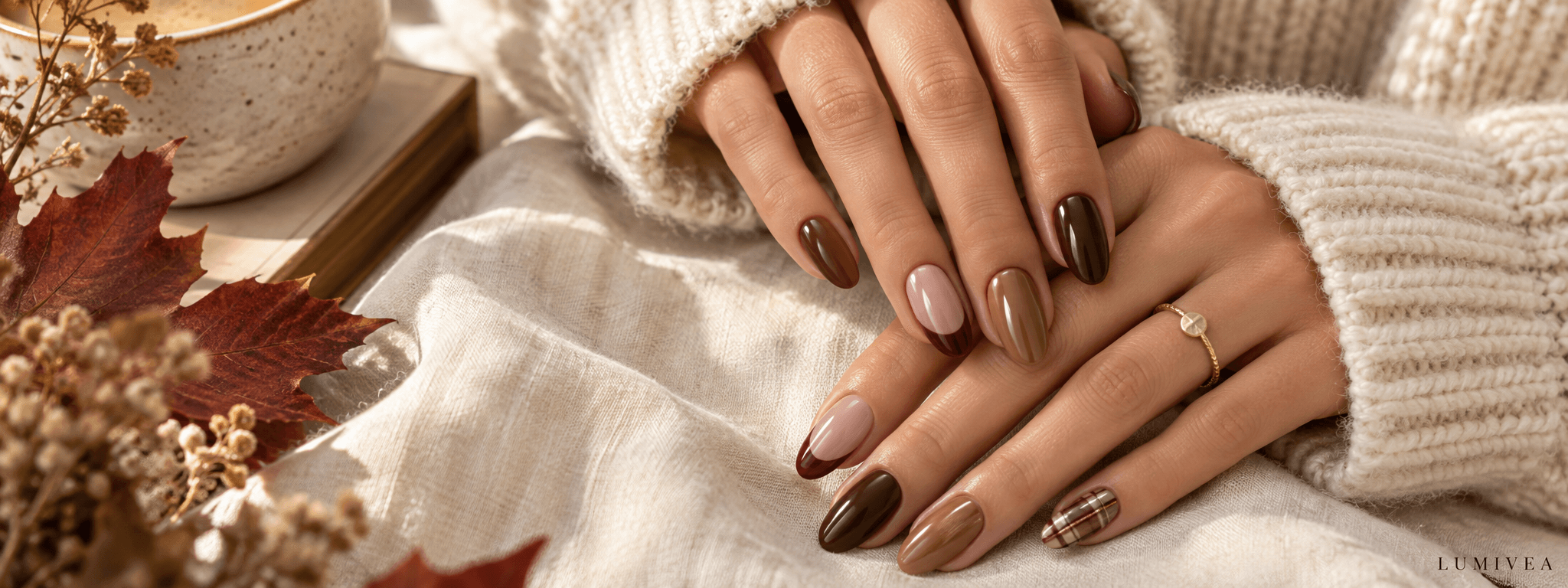
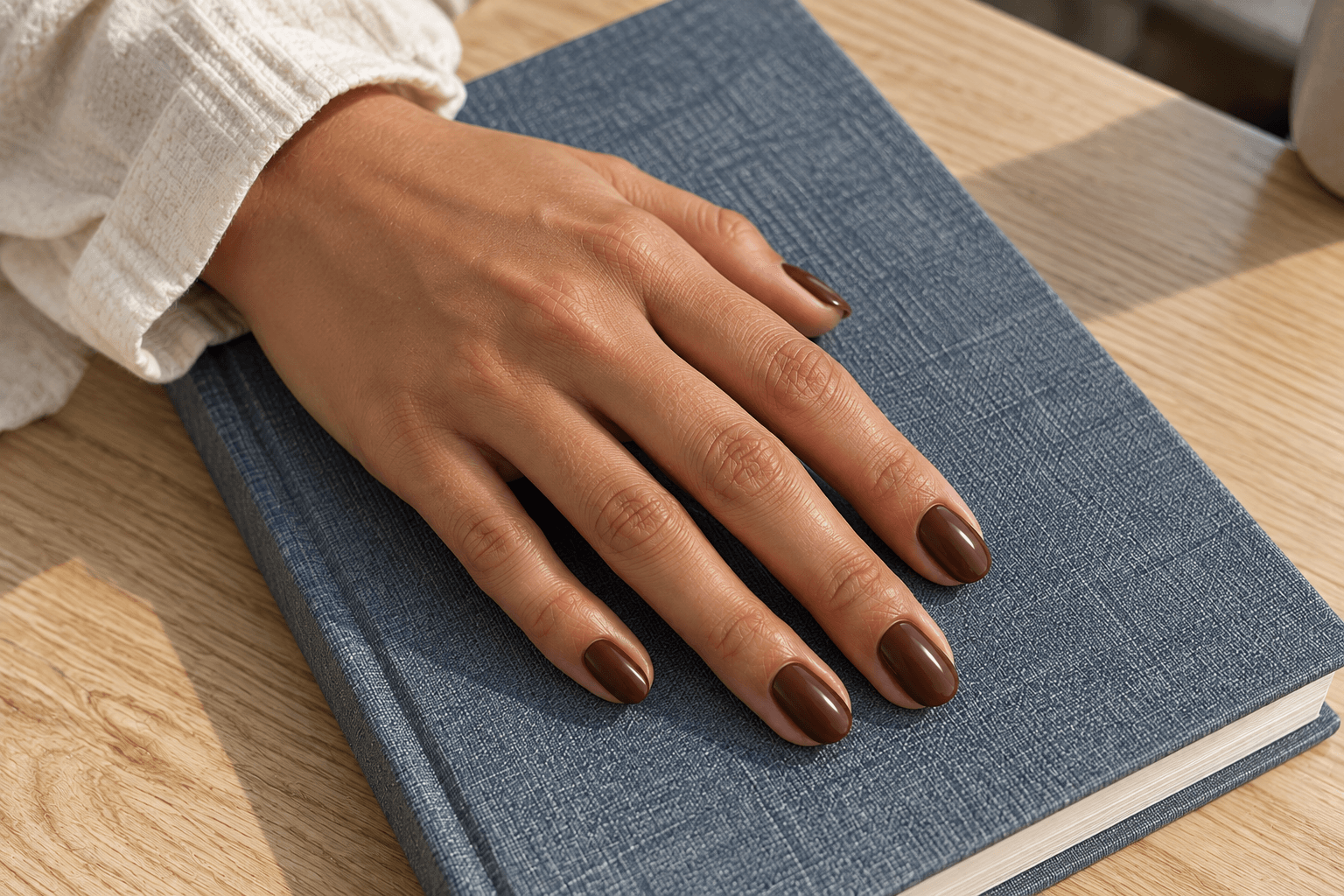
The nail images are AI-generated design illustrations. The digital palettes are editorial color examples, not tested polish swatches or promises of an exact real-world match.
Find your brown
- Compare mocha, chocolate, and espresso
- Separate depth from undertone
- Choose full color or a smaller detail
- Build a clear reference brief
- Quick answers
Mocha, chocolate, and espresso: start with depth
Before comparing warmth or shine, ask one question: how light or dark do you want the overall manicure to look? A useful shortcut is to imagine the reference as a small thumbnail. Does the color read as a soft beige-brown, a definite block of brown, or an almost-black shape?
The palette below makes that first choice deliberately simple. Its colors are selected illustrations of three directions. They are not codes to hand over as a guaranteed polish match.
| Direction | What to look for | Useful reference wording |
|---|---|---|
Mocha | A medium-light beige-brown that is still clearly brown | “A soft brown with a beige note; not pale cream.” |
Chocolate | A richer medium-deep brown with visible color | “A full, warm brown that does not look nearly black.” |
Espresso | A very deep brown, with brown most noticeable in the light | “Almost black, but with a brown undertone rather than wine-red.” |
Mocha: when you want a softer brown
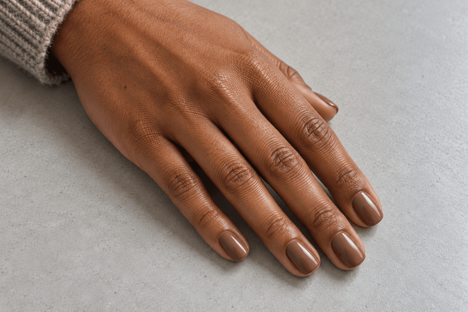
Our mocha direction sits between a light beige and the deeper chocolate example. The beige note matters: it gives the color a softer, less dense appearance while leaving enough brown to be the main idea.
If a reference appeals to you because it feels quiet, check whether that comes from the shade being lighter or from the base being translucent. A light opaque brown and a sheer brown can both look soft in a picture, but they are different requests. Here, the concept is an even, full-coverage beige-brown.
Think of choosing fabric for a chair. A pale linen color and a thin, see-through fabric are not interchangeable, even if both look airy in a photograph. For your reference, name the color depth and the amount of coverage separately.
Keep in your brief: soft beige-brown, an even color, and the finish you prefer. If the screenshot looks too pink, gray, or pale for what you have in mind, say so rather than relying on “mocha” to carry the entire description.
Chocolate: when you want the brown to be unmistakable
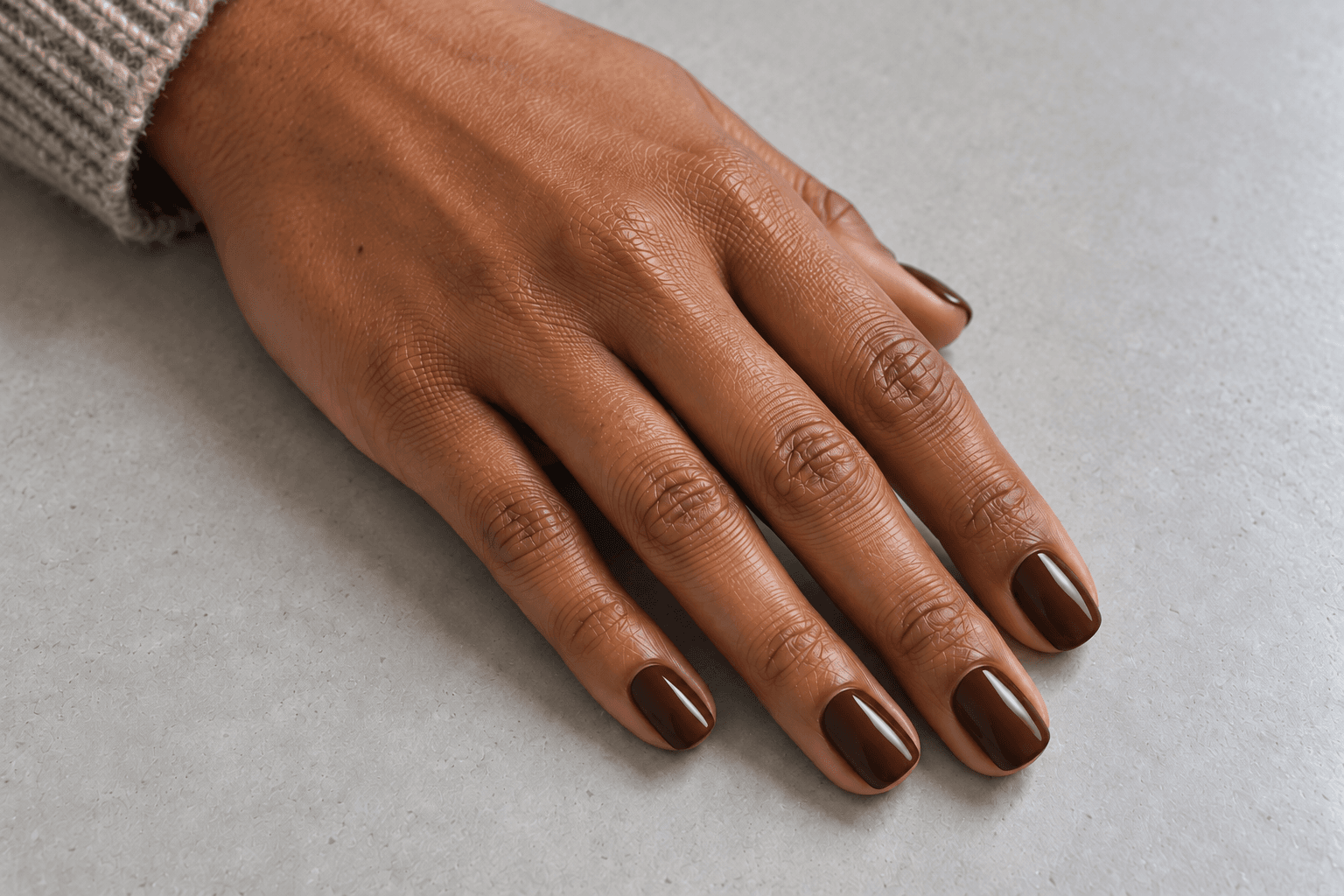
This is the middle ground for someone who wants richness but still wants to see brown at a glance. Compared with our mocha example, chocolate has more depth. Compared with espresso, it leaves more room for the brown itself to show.
A glossy finish adds a bright reflection across that solid color, giving the surface some contrast without introducing nail art. If you enjoy a plain set, this can be the whole design. There is no unfinished corner waiting for a gold star.
Be especially specific if you save a chocolate reference with a reddish cast. You might love that warmth, or you might want something more neutral. The useful phrase is “this depth, but less red” rather than “the exact same brown,” especially when two screens are showing the picture differently.
For a mixed-color concept, chocolate can act as the darker partner beside a pale beige. Keep the roles simple: one main brown, one lighter accent. You can explore that further through two- and three-color nail palettes.
Espresso: when you want a brown close to black
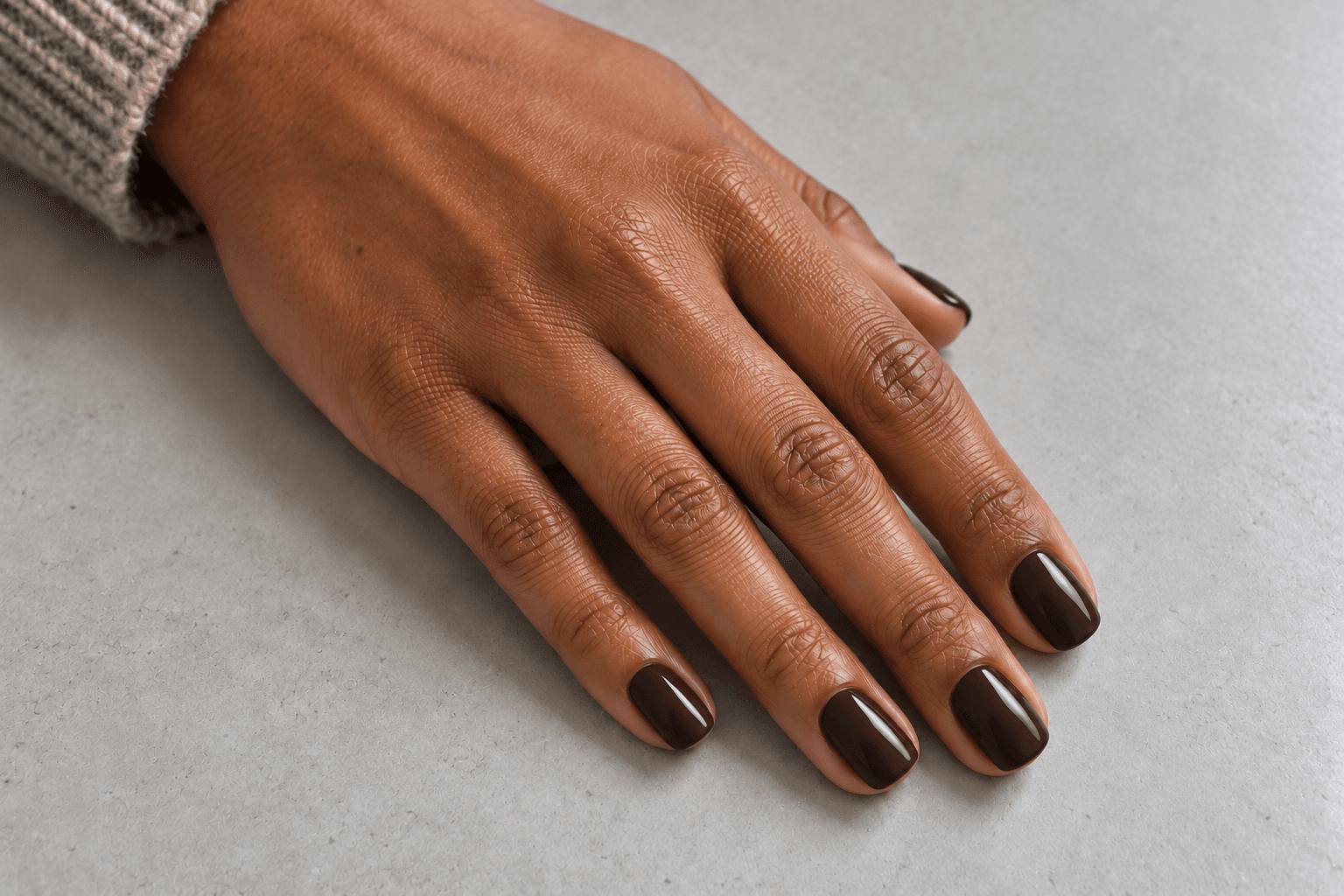
The espresso direction is about depth first. In a small picture, the manicure may read almost as black; the brown becomes easier to notice in the brighter areas. If you want that dark outline but prefer a brown cast, this is the direction to compare.
It also helps explain a common reference mix-up. A near-black brown and a near-black red can look similar in a dim image. Before saving either as “espresso,” look for the color that appears near the highlights: brown, cherry-red, or purple?
If what you actually like is the wine-colored edge, follow that clue. Our burgundy, black cherry, and plum comparison is the neighboring color family to keep in mind. You do not have to force a favorite dark red into the brown folder because the caption said coffee.
Depth and undertone answer different questions
Depth asks how light or dark. Undertone asks what kind of brown. Once you separate those questions, “I like it, but something is off” becomes much easier to explain.
For example, you might want a medium-deep chocolate color but prefer a quieter, less red version. Going lighter would change the wrong thing. You are asking to move sideways in color character, not upward toward beige.
| If the reference seems… | What you may be noticing | A clearer request |
|---|---|---|
| Too orange or coppery | A warmer orange-brown direction | “Keep this depth, with less orange.” |
| Too red or wine-colored | A red cast pulling it toward another color family | “A brown this dark, but without the burgundy note.” |
| Too gray or mushroom-like | A more muted gray-brown direction | “Similar depth, with more warmth.” |
| Too pale | A depth issue rather than necessarily an undertone issue | “A deeper version of this brown.” |
There is no need to turn this into a rule about who is allowed to wear which brown. Start with the color relationship you enjoy. If you regularly wear blue denim and cream, put a reference beside those colors and see whether you like the combination. If you prefer gray and black, compare it there. This is a way to choose a palette, not a test you can fail.
Keep the finish in the conversation
Imagine a brown ceramic mug beside a brown piece of suede. Even if the colors were close, their surfaces would give you different impressions. Nail references work similarly: shine, fine shimmer, and a more matte-looking surface can change what catches your eye.
For the three main illustrations here, the intended finish stays glossy so the color directions are easier to compare. If you use a different finish as your final reference, name it explicitly. “Chocolate brown with a matte finish” is more useful than a chocolate image in one message and “maybe less shiny?” three messages later.
Also separate a bright reflection from a painted detail. A pale strip across a glossy nail may be light rather than a white line in the design. Look for whether the same bright shape appears across several nails before adding it to your list of requested decorations.
Want less brown? Change its coverage before changing its shade
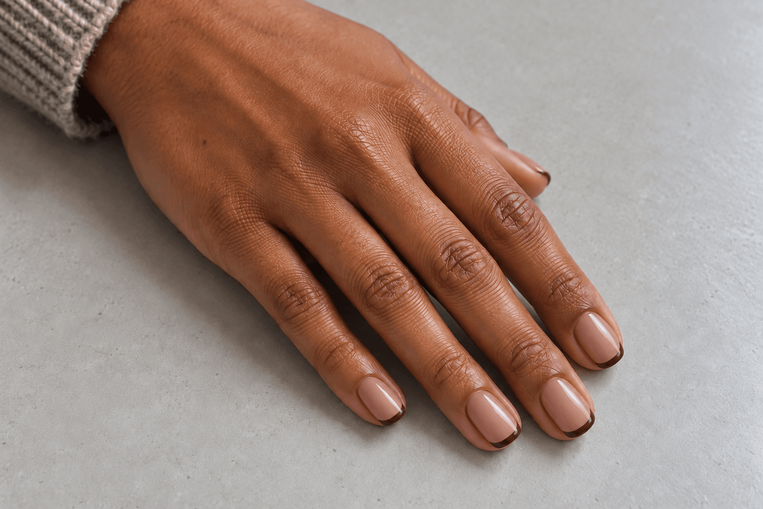
A full espresso nail is a large dark shape. A narrow espresso French tip is a small dark border. The brown direction can stay very deep while the overall manicure becomes much lighter because most of the base remains visible.
It is the difference between a room with brown walls and a room with a brown picture frame. The color matters in both, but the amount of it changes the effect.
If you love a dark reference but want a smaller dose of it, compare three placements: full color across the set, a narrow tip on a pale base, or one brown accent among lighter nails. You are changing the composition, not asking the color to become something else.
For the French-tip direction shown here, preserve the narrowness of the band. A thick tip would occupy more of the nail and shift the balance again. “Espresso at the very edge, with plenty of the pale base showing” communicates the idea clearly.
Use a photo for direction, then check a real sample
A reference is useful, but it cannot guarantee a color match. Lighting, the camera’s color balance, image editing, and your display can all affect what reaches your eye. An AI-generated illustration adds another limitation: there may be no real polish behind that exact pictured shade.
Take the useful information from the image—soft or deep, reddish or more neutral, glossy or muted—and compare an actual sample if you need to choose a product or discuss a result. If possible, view the sample in ordinary daylight as well as the lighting where you first saw it. You are checking whether you still like it when the setting changes.
When two saved pictures seem to disagree, avoid averaging them into an imaginary perfect shade. Label the part you want from each: “the depth of this one, the less-red tone of that one.” The question of why nail colors look different in different photos is worth keeping separate from the question of which design you prefer.
Three brown nail briefs you can borrow
Choose the closest starting point, then change the shape, length, and coverage to match your preference. These are descriptions of a visual direction, not instructions for performing a manicure.
Soft mocha: “A medium-light beige-brown, with even opaque color and a glossy finish. Short, softly squared nails with rounded corners. I want it clearly brown, but lighter than the chocolate example.”
Rich chocolate: “A medium-deep brown that stays visibly brown, with a warm tone but not a strong burgundy cast. Glossy, full color on every nail, with no added pattern.”
Espresso French: “A very dark brown in a narrow French tip, over a pale pink-beige base. Keep most of the base visible. I want the contrast of espresso without full dark coverage.”
Notice that each brief gives the image a job. It explains which details matter and leaves room to discuss what the real materials can do. You can use the same approach when putting together a nail appointment reference brief.
A few questions that come up when choosing brown
Is mocha always lighter than chocolate?
That is how we organize the examples in this guide. Treat the name on a saved image as a clue rather than a specification. Compare the visible depth and color cast; those tell you more about the look you want than the food or coffee name alone.
Can short nails carry a deep espresso color?
Yes, it is a design option. A short nail gives the dark color a smaller area than a longer reference. You can keep it plain to emphasize the outline, or use a thin tip if you want less dark coverage. There is no required length for liking a color.
Do brown nails have to feel autumnal?
No. A brown-and-cream French design can be an everyday palette. Plaid, rust accents, and seasonal styling are choices you can add when you want that association. Brown itself does not need an October booking confirmation.
Save the description along with the picture
Before adding another image to your board, finish this sentence: “I want a brown that is ___, with a ___ finish, covering ___.” That gives you depth or undertone, surface, and placement in one short note.
If you have found your brown and want to see how it fits into a wider seasonal look, return to the fall nail guide to color, finish, and detail. You can compare your chosen shade with olive, a plaid accent, or a small gold detail without starting the decision from scratch.
And when the color names get confusing, use your own words. “Brown, but softer; glossy; no red; just a narrow tip” is a perfectly useful brief. The manicure does not need to pass a coffee vocabulary exam.
Lumivea · Nail inspiration, explained.