Eight looks, the details that make them work, and a simple way to choose your own.
By Lumivea Editorial
You save a glossy brown manicure. Then an olive one. Then a tiny plaid accent that looks exactly like your favorite scarf. A few minutes later, your fall nail board has twelve different moods and no obvious next appointment.
The useful question is: what, exactly, do you like in each picture? It might be the warmth of the brown, the narrowness of a French tip, or the way one patterned nail sits beside four plain ones. Once you separate those details, choosing gets much easier.
This guide brings together eight fall nail directions and explains what gives each its character. You can borrow a whole look or just one part. By the end, you will have a small, clear nail brief instead of a camera roll that requires a committee meeting.
The images in this guide are AI-generated nail-design illustrations. They show color and placement concepts, not our own manicures, tested products, or exact polish shades.
Find your starting point
- Choose color, finish, and detail
- Compare the eight looks
- Look closely at each design
- Adapt an idea to short nails
- Write your own nail brief
Start with three choices: color, finish, and detail
Think of a manicure the way you might put together an outfit. The base color is the main piece, the finish is its texture, and the detail is the accessory. A brown coat, a satin skirt, and a patterned scarf each bring something different. On nails, those same jobs might be done by mocha polish, a glossy surface, and one plaid accent.
Color sets the mood. Warm browns and rust sit in one corner of this guide; olive offers a greener alternative; black cherry brings more depth. If you prefer a pale manicure, a milky base can still carry a small autumn-colored detail. There is no requirement to go dark just because the calendar has changed.
Finish changes how that color meets the light. A glossy brown shows a clean reflected highlight. Fine shimmer scatters little points of brightness. A metallic accent catches the eye even when it occupies very little space. When you save an image, name the finish as well as the shade.
Detail decides where you look first. A thin tip draws your eye to the edge; a plaid accent creates one focal point; a plain full-color set lets the outline and shade do the work. If you are torn between several ideas, choose the part you would miss most if it disappeared. That is the detail worth keeping.
A quick comparison of the eight looks
Use this table to narrow your saved images to two or three possibilities. The descriptions are visual shorthand, so feel free to choose the opposite mood if that is what you enjoy.
| Look | Its main appeal | Detail to preserve |
|---|---|---|
| Glossy mocha | A warm, even block of color | A brown that remains visibly brown |
| Brown French tips | A small outline of autumn color | A narrow tip with plenty of base showing |
| Muted olive | An earthy change from brown | A softened green rather than a bright one |
| Black cherry | A dark look with a red undertone | Visible wine-red color in the light |
| One plaid accent | A pattern with a clear focal point | Space between lines and matching plain nails |
| Taupe shimmer | Quiet color with a soft glow | Fine shimmer rather than large sparkles |
| Milky nails with gold | A pale look with one bright detail | A small gold mark and an uncluttered base |
| Terracotta | A warmer, brighter solid color | A muted brick-orange tone |
Eight fall nail ideas, with the details explained
1. Glossy mocha when you want color to carry the look
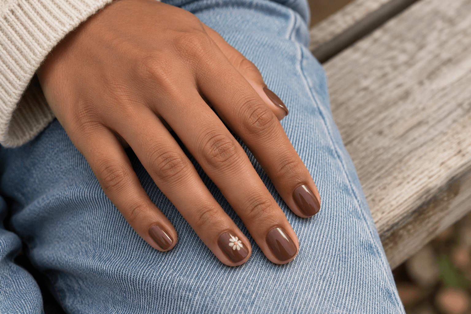
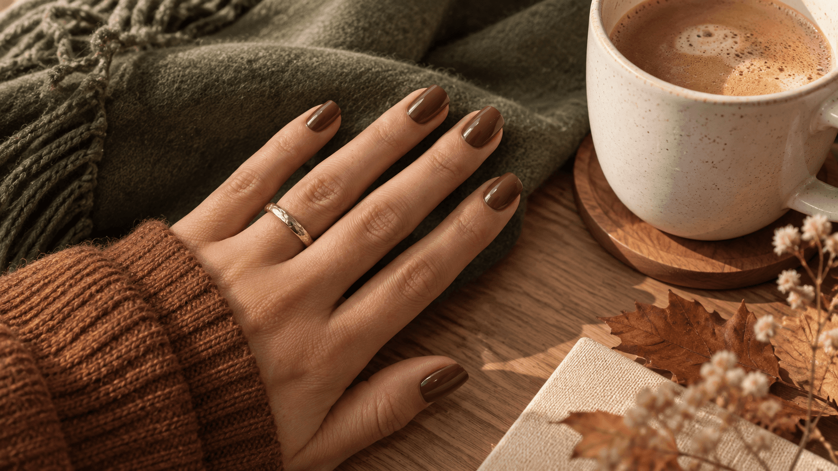
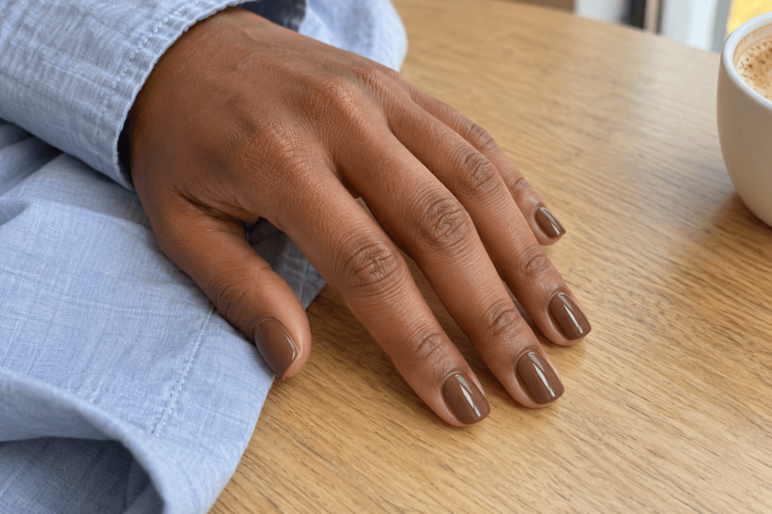
The opening image is a useful example of how much a plain manicure can say. The short, softly squared nails have rounded corners, and the same warm brown runs across the whole set. Without a pattern competing for attention, you notice the color and the small highlight on each nail.
When you use a photo like this as a reference, be specific about depth. A medium mocha and an almost-black espresso may both be called “brown nails,” but they create quite different impressions. If the warmth is what you love, ask to see a brown that stays visibly brown away from a bright lamp.
Imagine it with blue denim, a gray sweatshirt, or a cream shirt. You are choosing a color that can sit alongside those everyday textures. It does not need a gold line to qualify as a finished idea.
The distinction between mocha, chocolate, and espresso is a helpful one to keep in your notes.
2. Thin brown French tips when you want just a little contrast

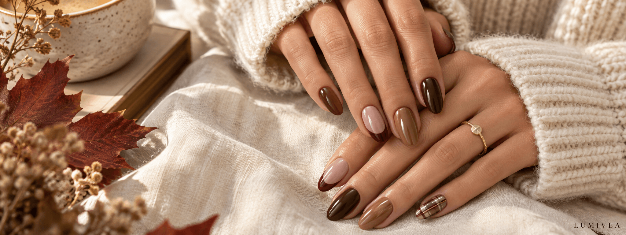
Here, the brown acts like a fine border around a picture. Most of the nail remains a pale, translucent-looking pink-beige, so the dark edge reads clearly without covering the whole surface.
The important word in the reference is thin. A wide brown tip would be a different design, even with exactly the same colors. On a shorter nail, compare how much visible base remains beneath the tip. If that open area is what makes the image appealing, keep it in the brief rather than simply asking for “brown French.”
A useful description is: “A sheer-looking pink-beige base, a narrow curved brown tip, and no extra decoration.” That gives someone much more to work with than a tiny screenshot alone. You can also compare thin, curved, and angled French-tip designs when you want to change the outline.
3. Muted olive when you want autumn color beyond brown
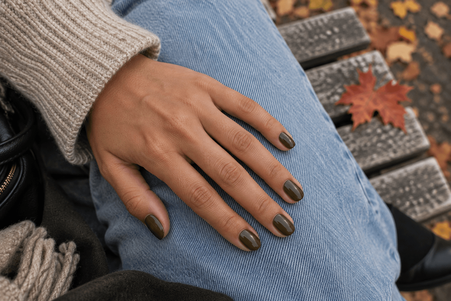
Olive brings a different kind of warmth. In this illustration, the green has a yellow-brown cast, which makes it feel earthier than emerald and deeper than a pale sage. The faded blue denim gives you a clear contrast to look at.
Notice that every nail is plain. That repetition lets the green become the main idea. If you add tortoiseshell, leaves, and gold to the same reference, it becomes harder to tell whether you wanted olive nails or a collection of autumn motifs.
Try a small thought experiment: cover everything around the hand with your fingers. Do you still like the nail color? If yes, save the image for the shade. If the setting was doing most of the persuading, keep looking. A lovely sleeve can be a very convincing salesperson.
4. Black cherry when you like depth with a hint of red
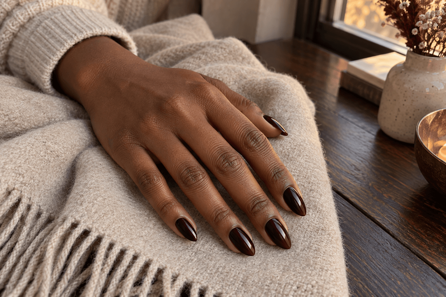
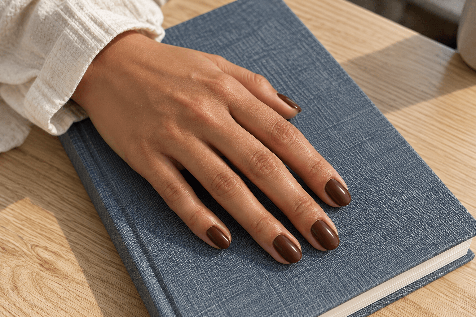
Black cherry sits close to black in the shaded parts of this image, with a wine-red tone showing nearer the light. That contrast is the point: it has the depth of a very dark manicure without losing all its color.
The almond shape here adds a tapered outline, but you do not have to copy the length to borrow the shade. On short rounded nails, the same color direction becomes a smaller, more compact shape. Save a second reference for length if the picture you love shows something you would not choose for yourself.
Before settling on a real polish, look at its actual sample in more than one lighting condition. A generated picture cannot tell you how a named product will appear. In your notes, “very dark red with visible cherry undertones” is a better starting point than treating a screen color as an exact match.
5. One plaid accent when you want a pattern to stand out
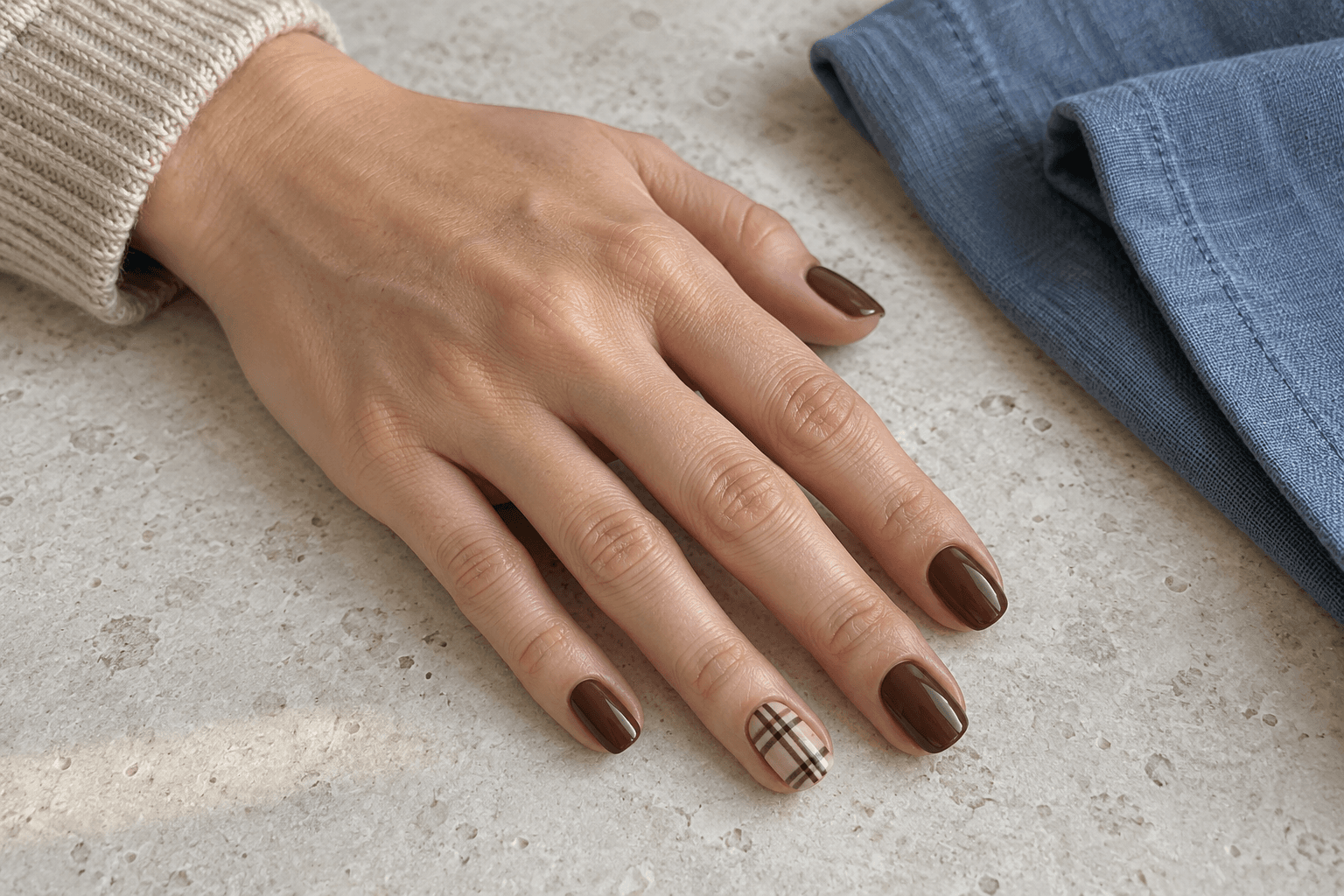
The plaid nail works with the rest of the set because its darker lines repeat the brown on the plain nails. The pale base gives those lines enough separation to remain visible. There is a relationship between the accent and its neighbors, so it feels like one idea.
This is a good place to borrow the scarf rule: one patterned scarf can change a simple outfit. You do not also need a patterned coat, bag, and shoes unless that busier mix is the goal. One accent nail offers the same kind of focus.
On a small nail, choose which parts of the grid matter most. A few separated lines can describe plaid without reproducing every stripe in a fabric swatch. If you prefer pattern across the whole set, consider reducing the contrast or number of colors so the result keeps the mood you liked. The next decision is one plaid accent or a full patterned set.
6. Taupe shimmer when the finish is the interesting part
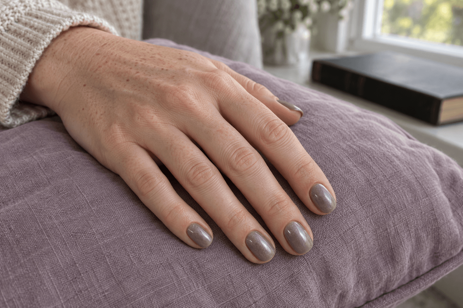
This look starts with a quiet mushroom-taupe color, then adds fine points of reflected light. The shimmer is small enough that you still read the base shade. It has a softer visual texture than a bold metallic surface.
If you saved a picture described as “velvet nails,” pause before relying on the name alone. What are you responding to: a narrow band of light, a soft all-over glow, or obvious sparkle? Those are different visual requests, and a still image does not show how a finish behaves as the hand moves.
For the concept shown here, the brief is “muted taupe with fine shimmer; keep the decoration minimal.” This is a case where adding a pattern might hide the very thing you chose. When comparing glossy, matte, shimmer, and metallic nail finishes, pay attention to the size and character of the reflections, not just the base color.
7. Milky nails with a small gold accent when you prefer a pale base
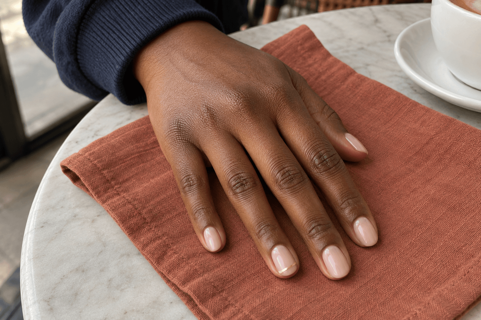
Autumn does not have to mean a dark manicure. A pale pink-beige base and a fine gold detail can give you a quieter version of the season, especially when you like the look of mostly plain nails.
In this image, the little metallic line is confined to one nail. There is plenty of base around it, so your eye can find it quickly. Make the line much thicker, repeat it everywhere, or add several shapes, and the balance changes.
If “milky” is the part you like, explain how much coverage you mean. A translucent-looking base and an opaque pale pink can be described with the same loose word, but they look different. Save a close view of the base along with the accent, and treat the gold as a placement idea rather than a reason to buy a specific product.
8. Terracotta when you want a warmer, brighter solid color
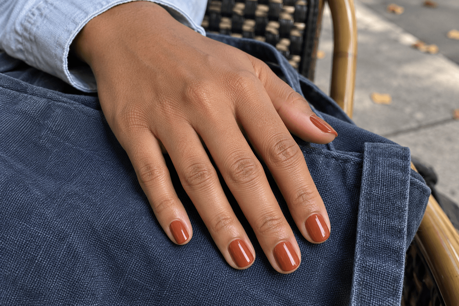
Terracotta gives you the warmth of orange with a little brick-brown softness. Against indigo fabric, the color in this illustration feels distinct without becoming fluorescent. The rounded nail outline keeps the focus on that single, even shade.
Words matter here too. “Pumpkin,” “rust,” “burnt orange,” and “terracotta” can point people toward different colors. If you prefer this muted direction, say what you want to avoid: a very bright orange, a pink coral, or a red that overwhelms the brown note.
You can carry this color into an occasion-specific design later. For a first reference, though, the plain version helps you decide whether you enjoy the shade itself. Seasonal nail art is optional; your hands do not need to audition for the harvest festival.
How to borrow an idea for short nails
A reference with long nails can still be useful. Separate the parts that depend on space from the parts that do not. A solid olive color transfers as a color idea. A detailed plaid grid may need fewer lines. A wide French tip may need a narrower band to leave the amount of base you liked in the original.
Think of moving a poster onto a postcard. You would keep the main message and reconsider the small lettering. For nail designs, that might mean preserving the brown-and-cream palette while simplifying the grid, or keeping the gold detail on just one nail.
Look at the reference at roughly the size you will see your own hand, not only zoomed in on a screen. If the detail disappears at that scale, decide whether that tiny, private detail is part of its appeal. It does not have to be visible across the room to be worth choosing.
Turn your favorite image into a clear nail brief
Instead of collecting five more pictures, write a few lines about the one you keep returning to. This example matches the plaid look above:
Color: Chocolate brown with a cream-beige accent base.
Finish: Glossy.
Shape and length: Short, softly squared nails with rounded corners.
Detail: One plaid accent nail; the others plain.
Keep: Clear space between the plaid lines.
Skip: Extra glitter or additional patterns.
You can do the same with a much simpler look: “Short rounded nails, muted olive, glossy, no nail art.” A clear brief does not need to sound technical. Its job is to separate what matters to you from the sleeve, coffee cup, and lighting in the picture.
If you bring several references to an appointment, label their jobs: this one for color, this one for length, this one for the accent. That is easier to discuss than asking for three complete manicures at once. Ask the person doing your nails what can be adapted to your nails and the products they use. A picture is a starting point for that conversation, not a promise of an identical result.
Keep this format for your next nail appointment reference brief, too. It works just as well when your board moves on to winter.
One last check before you save the look
Ask yourself: would I still want these nails without the beautiful background? Then note the color depth, the amount of shine, and the exact location of the detail. Those three observations are the useful part of the reference.
For more seasonal combinations, continue with our 25 classy October nail ideas, from mocha gloss to soft plaid details. Use this guide to choose your direction, then use the October collection to compare variations within it.
And if you come back to plain mocha after all that browsing? Save the plain mocha. Finding your favorite is the point; adding more detail is not an entrance requirement.
Lumivea · Nail inspiration, explained.