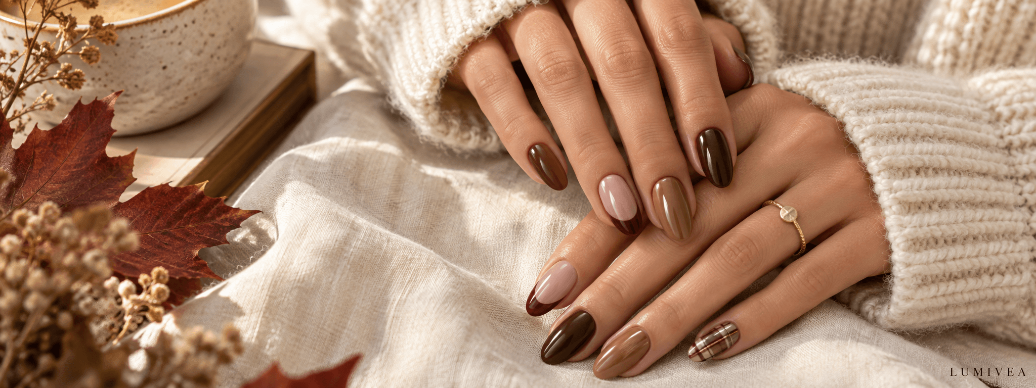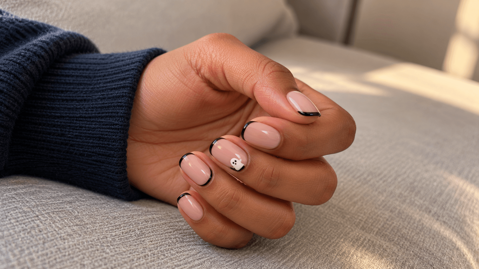
You want a little Halloween on your nails, but perhaps not an entire haunted attraction. One ghost? Lovely. A bat you notice when you reach for your mug? Also lovely. Every creature in the cemetery competing across ten nails? That is a different brief.
The useful thing about a subtle design is that you can choose where the seasonal detail lives. It might be one accent nail, a narrow tip, a low-contrast line, or a dark color that only suggests the mood. You do not have to make every motif microscopic; often, one clear little shape surrounded by plain color is the quieter choice.
These 20 subtle Halloween nail ideas move from recognizable tiny motifs to designs that simply feel dark and atmospheric. Some say Halloween immediately. Others are everyday looks with a seasonal interpretation. Each idea explains what to preserve in a reference so the result does not drift into something much busier.
The images are AI-generated design illustrations, not photographs of work performed by Lumivea or tested product shades. Use them to compare color, motif, and placement; a real result may differ.
Choose how clearly you want the Halloween detail to read
“Subtle” can mean several things. A small white ghost is physically tiny but still very recognizable. A full plum manicure covers every nail, yet may not read as Halloween at all without the surrounding context. Start with that distinction instead of assuming that the palest design is automatically the quietest.
| Direction | What makes it work | Start with |
|---|---|---|
| A tiny literal motif | One clear character or symbol, with plain space around it | 1. Tiny ghost, 6. Little bat, 14. Small spider |
| A nighttime suggestion | A moon, constellation, or restrained fine-line pattern | 7. Silver crescent, 8. Constellation, 11. Corner web |
| A dark color mood | Color and finish carry the seasonal association | 16. Black cherry, 17. Smoky tips, 19. Plum shimmer |
Browse by motif
- 1–5: Little ghosts and pumpkins
- 6–10: Bats, moons, and cats
- 11–15: Fine webs and one small spider
- 16–20: Dark colors and quiet graphic details
Little ghosts and pumpkins
These are the most literal seasonal motifs in the guide. Limiting the number of motifs and leaving the neighboring nails plain keeps the reference focused.
1. One tiny ghost on a milky base
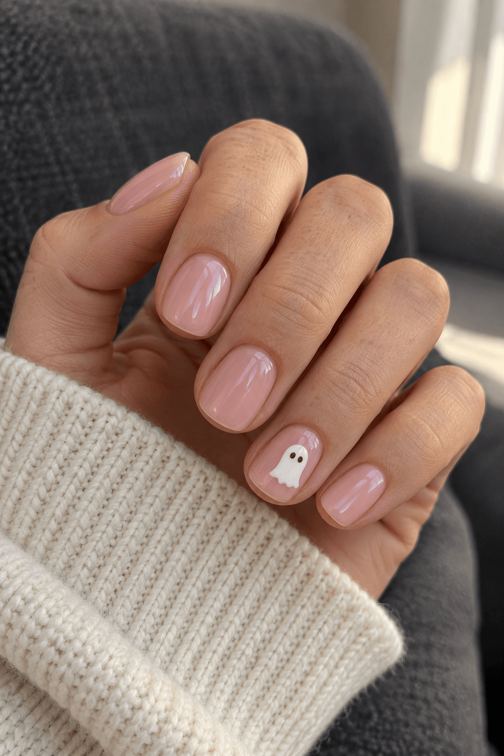
A single ghost is a good starting point if you want the Halloween reference to be unmistakable up close but easy to miss from across a table. Keep the body small, give it a simple rounded top and wavy lower edge, and let the pale base surround it. Two little eyes do most of the storytelling; the ghost does not need accessories or a facial-expression department.
The important relationship is white against milky pink. If the base becomes equally opaque white, the outline may stop reading clearly. A slightly pinker or more translucent-looking base gives the little shape somewhere to sit. Keep the other nails plain so this feels like a small discovery rather than a repeated print.
Save this detail: One small white ghost on a milky pink ring nail; plain matching nails elsewhere.
2. A ghost tucked into a white French edge
This idea uses the shape of a French tip as part of the motif. On one nail, a small rounded white ghost rises just above the tip’s usual boundary, with its eyes placed inside the raised white area. The remaining nails keep a plain white French edge. From a little distance, the set still reads mostly as a French manicure.
The distinction from a floating ghost is placement: the character belongs to the edge instead of sitting in the middle of the base. Save a reference where that connection is clear. If the figure stretches too far down the nail, it can overwhelm the narrow-tip effect you liked. Leave enough pale base for the ordinary French layout to remain visible.
Save this detail: A white French set with one small ghost shape emerging from the tip.
3. A ghost peeking in from a side edge
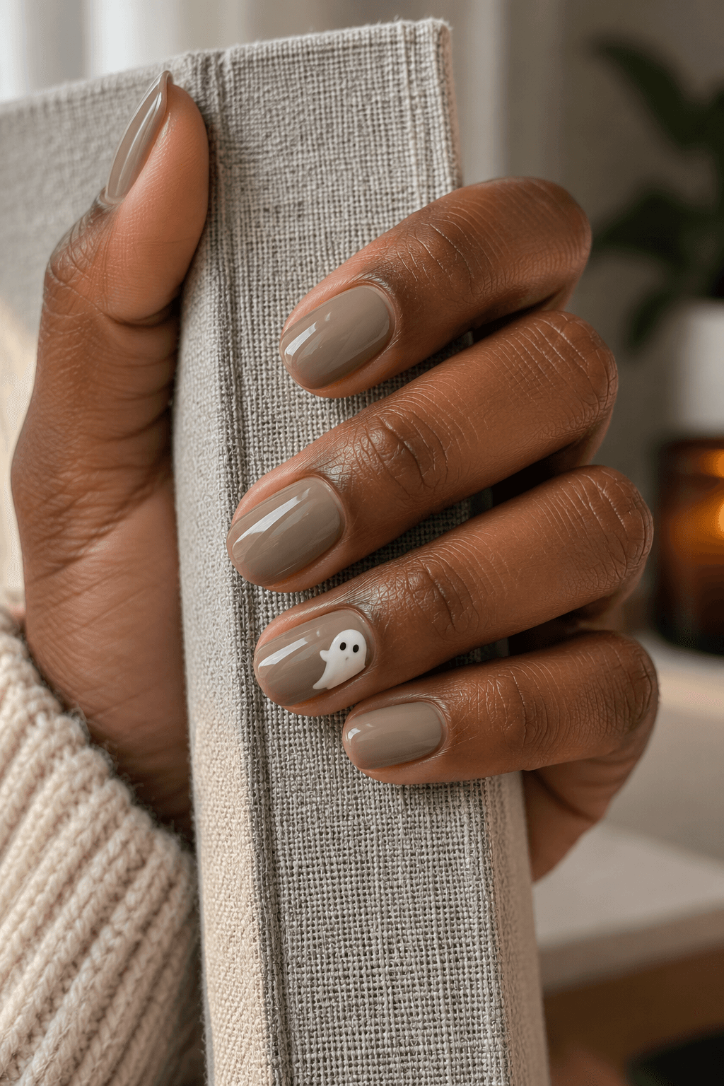
A partial motif can be more playful than a complete one. Here, a little cream ghost appears to peek in from the side of a taupe accent nail. Only part of its rounded body is visible, while the two eyes make the idea legible. The plain center of the nail becomes part of the composition rather than unused space.
Taupe gives this version a softer contrast than white on black. The detail to preserve is the crop: you want a deliberately interrupted shape, not a complete ghost squeezed against the sidewall. This is also a useful option if your favorite reference contains several ghosts but you only want one small hint of the pattern.
Save this detail: A cream ghost partly cropped by one side edge, with the center of the taupe nail left plain.
4. A muted pumpkin half-moon
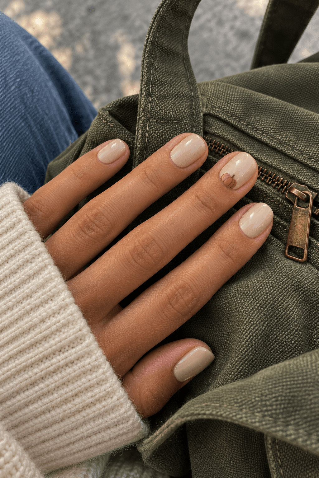
A pumpkin does not have to arrive in bright orange with an elaborate face. A small terracotta half-circle near the base of one beige nail can suggest the whole shape. A few darker curved marks describe the segments, and a tiny stem supplies the final clue. The rest of the nail stays plain.
Keep a visible margin between the painted motif and the cuticle in your reference. The pumpkin should sit on the nail plate, not appear to grow out of the skin. This version feels seasonal through its shape and muted color; adding eyes, lettering, and extra leaves would turn it into a more literal illustration. Choose those additions only if that is the direction you want.
Save this detail: One small terracotta pumpkin half-moon on beige; no face or surrounding pattern.
5. A fine pumpkin outline on a clear-looking base
If the solid orange area is the part you want to reduce, keep the pumpkin’s outline instead. Picture a fine rust-colored contour with a short stem on one glossy, clear-looking pink nail. A couple of separated internal curves can suggest the segments while leaving the base visible through the shape.
This is a different kind of restraint from simply making the filled pumpkin smaller: the motif can remain readable while using less solid color. Make sure the saved outline is clear enough to recognize at a normal view of the hand. If every line is extremely faint, you may enjoy the delicacy but lose the pumpkin. That is a preference to decide, not a reason to add a dozen more lines.
Save this detail: A single rust pumpkin outline with the pale base visible inside it.
Bats, moons, and cats
This group runs from clearly recognizable creatures to celestial details that can work beyond October. Choose according to the symbol you actually enjoy, not just the seasonal caption.
6. One little bat against a nude-pink sky
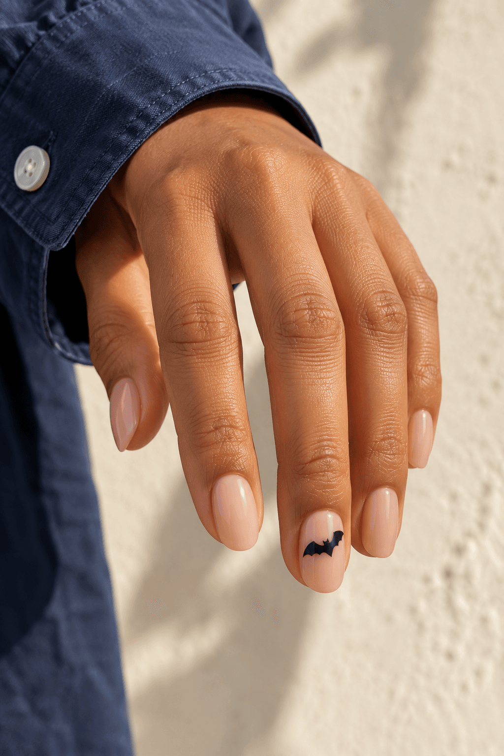
A bat silhouette provides a clear Halloween cue with very little color. Put one near the upper third of an accent nail and leave space around its wings. A soft nude-pink base keeps the contrast simple. The silhouette is the whole idea, so the background does not need stars, mist, and a full moon to explain the season.
Look closely at the outline in your reference. A small bat needs a recognizable center and two distinct wings; a shapeless black mark will not become clearer just because the caption calls it a bat. If you prefer a scattered flight of several bats, that is a more patterned direction. For this version, the single silhouette should remain the first and only motif you notice.
Save this detail: One small black bat, with generous pale space around the wings.
7. A silver crescent on midnight blue
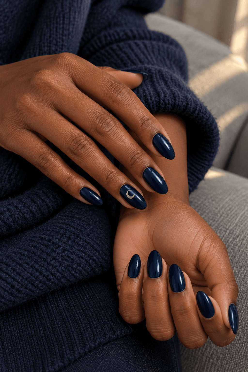
Midnight blue offers the atmosphere of a dark manicure without using black. Add one small silver crescent to an accent nail and the reference becomes celestial. This is one of the less literal ideas in the list: it can sit comfortably beside Halloween imagery, then keep making sense after the decorations come down.
The crescent needs a visible dark center and a clear curve so it reads as a moon rather than a metallic comma. Keep its size modest in relation to the nail. If the silver covers much of the surface, you move toward a statement celestial design. A narrow crescent and plain neighboring nails keep the effect focused.
Save this detail: Glossy midnight blue with one small silver crescent and no star field.
8. A tiny three-point constellation
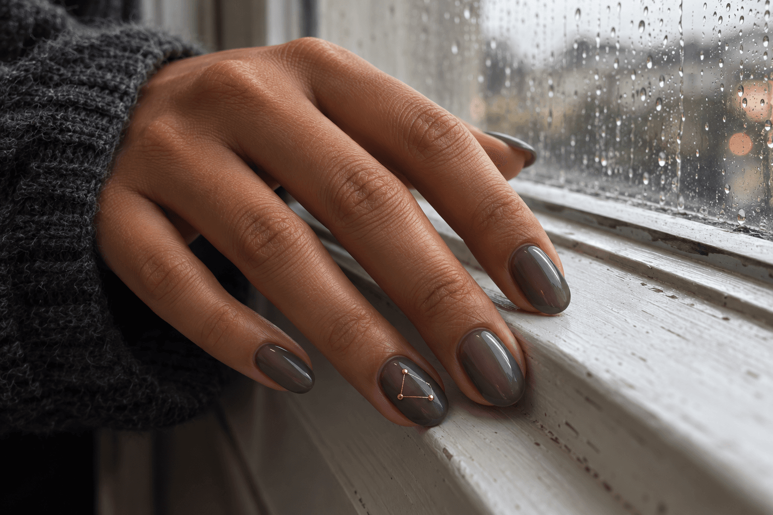
A constellation gives you a witchy, nighttime suggestion through a little diagram rather than a character. Use three small gold points linked by fine lines on one smoky-gray nail. Keeping the group together makes it a single accent. Scattering separate stars across every nail would create a different rhythm.
The jewelry-heavy references are useful for the way a tiny highlight catches attention, but this version uses flat-looking painted marks instead of a collection of raised pieces. That keeps the concept visually lighter. In your reference, make sure the lines are distinguishable from the shine on the nail; a bright reflection is not necessarily part of the artwork.
Save this detail: One small three-point gold constellation on smoky gray; no surrounding glitter.
9. Two tiny cat eyes on a black accent
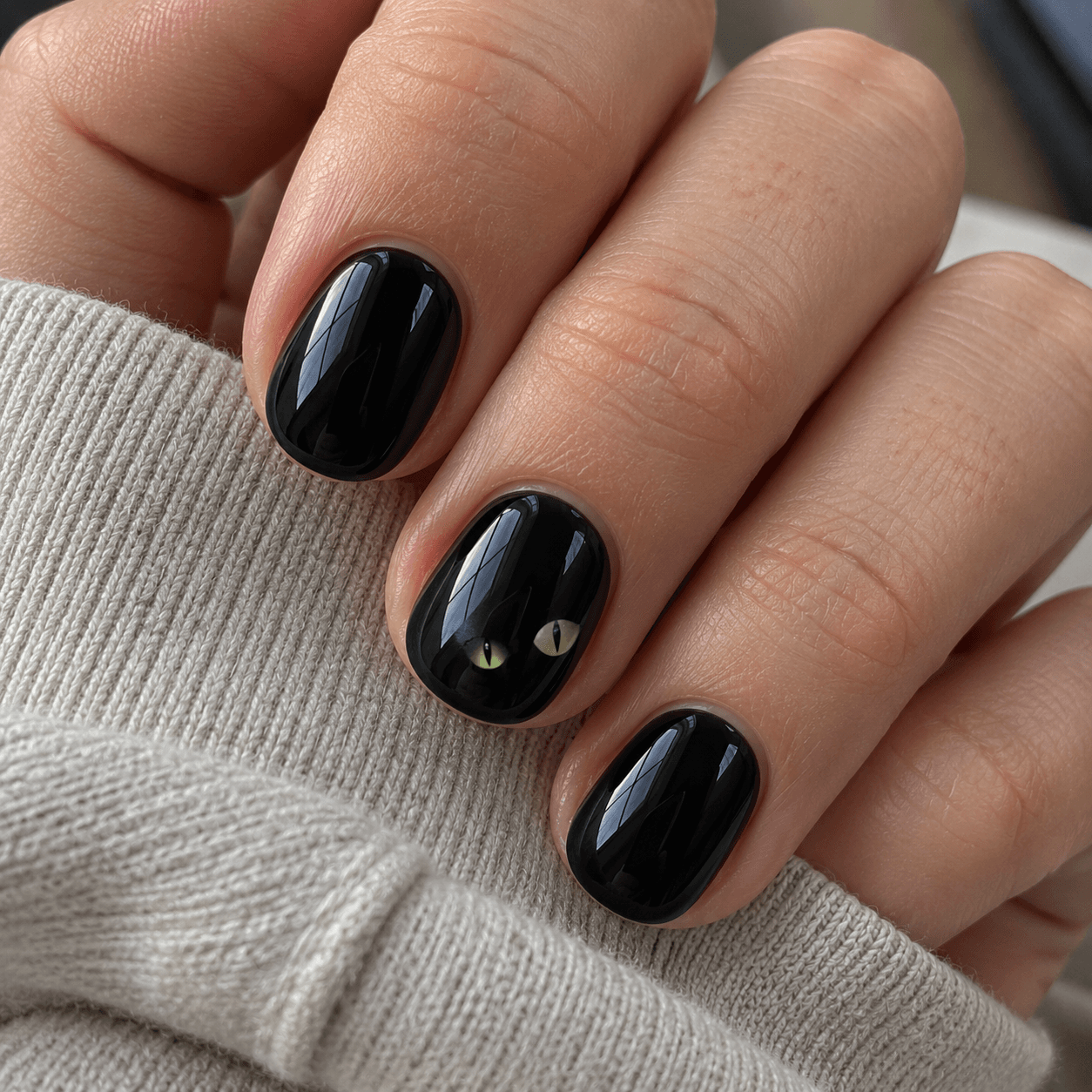
Two little eyes can suggest a cat without drawing the whole animal. Against a plain black accent nail, muted green eye shapes with dark centers give you a small, readable point of contrast. Keep the other nails plain black so the eyes feel like one mischievous detail tucked into a dark set.
This is an illustrated motif, not the reflective finish also called cat-eye. Including that distinction in your notes prevents a surprisingly different interpretation. You are asking for two visible eye shapes, not a band of reflected light. Choose a reference where the eyes stay small and separated; if they expand across the full nail, the result becomes much more graphic.
Save this detail: A plain black set with two tiny painted cat eyes on one nail; no reflective cat-eye effect.
10. A seated cat silhouette at one corner
A small seated cat gives a different result from the eyes-only idea: the recognizable outline comes from the ears, body, and curved tail. Place it at the lower corner of a pale beige accent nail, with a plain margin around it. The off-center position leaves the rest of the surface quiet.
Avoid choosing a reference that relies on minute fur details. At this size, a clean silhouette communicates more than a miniature portrait. A brown-black outline can feel a little softer than a very stark black one, but keep enough contrast for the ears and tail to remain distinct. The animal is the motif; an extra moon behind it would add another focal point.
Save this detail: One small seated cat silhouette in a corner of a pale nail; no background scene.
Fine webs and one small spider
Here, the gaps between lines matter as much as the lines themselves. A little open space can keep a web airy instead of turning it into a dark patch.
11. A fine web in one corner
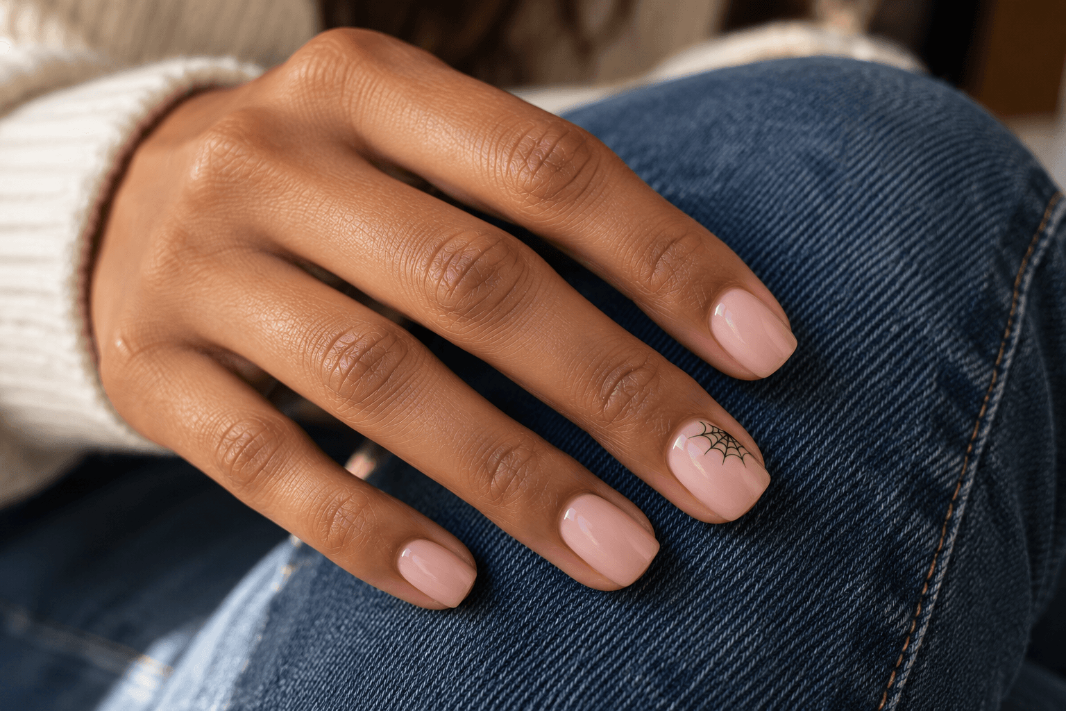
A corner web is a particularly useful reference when you like Halloween linework but do not want an all-over pattern. A few fine spokes radiate from one corner, joined by curved threads. The pale base remains the main visible area, so the web reads like a small annotation rather than a net over the whole manicure.
Look for visible spaces between the threads. A tightly packed dark patch loses the airy quality that makes this version subtle. The corner matters too: shifting the same web into the center can make it the dominant shape. If you save a full-web image for inspiration, write down that you only want one corner of it.
Save this detail: Fine black web lines in one tip corner, with most of the pale nail left plain.
12. A silver web over smoky taupe
Change the contrast rather than the motif: a thin silver web over a smoky taupe base gives a softer, more light-dependent version of the corner-web idea. Keep it to one accent nail, with the rest of the set in the same taupe. Here, finish and contrast are the reason to choose the variation.
A photograph can make metallic lines look bright in one spot and almost disappear in another. Treat the image as a direction for the design, not a promise that the web will be equally visible under every light. If you want to recognize it immediately, choose a clearer light-dark separation instead. If you like the detail appearing more quietly, that lower contrast may be exactly the appeal.
Save this detail: One fine silver corner web on smoky taupe, with matching plain nails.
13. A French tip edged with a little web
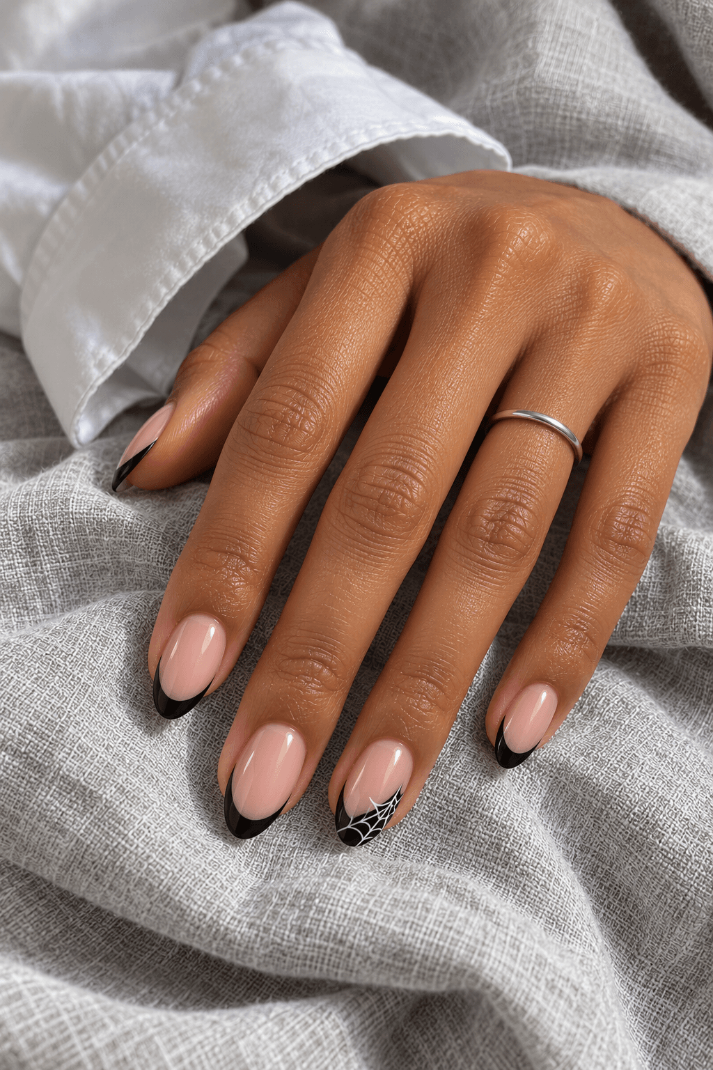
A slim black French set already has a clear dark-light relationship. Put a small white web inside the dark tip of one accent nail and you keep the familiar layout while adding a seasonal detail. The pale base should stay clean so the motif belongs to the tip rather than spreading across the whole nail.
This version depends on having enough visible tip area for the threads to remain separate. A microscopic tip and a complicated web are competing requests. Choose a simplified web in the reference, and discuss the balance between band width and detail if you take it to a nail professional. The goal is a small readable pattern, not every thread from a large illustration.
Save this detail: Slim black French tips with a simplified white web on one tip only.
14. One tiny spider on an otherwise plain nail
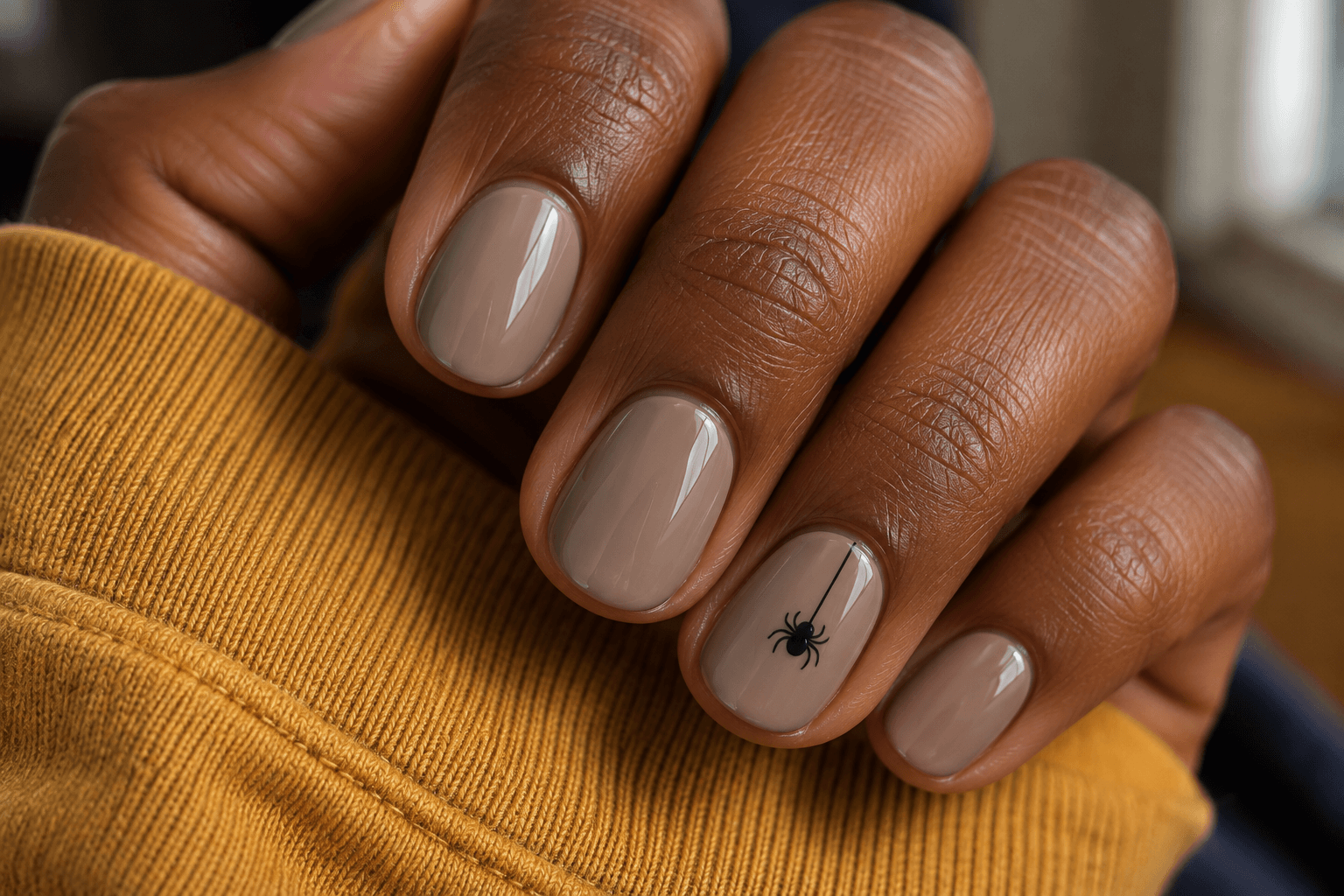
For a slightly more recognizable Halloween detail, a tiny spider can hang from one fine line on a mushroom-taupe accent nail. Keep the body and legs compact, with enough base around them to read the whole motif. A full web is optional; the short thread already gives the spider somewhere to belong.
The scale matters because a large black spider is a much bolder choice, even on a neutral base. If you want the quieter version, save a picture that shows the motif in relation to the full nail, not only a tightly enlarged crop. You should be able to describe it as a small accent without relying on the word subtle to do all the work.
Save this detail: One tiny black spider and a short fine thread on taupe; no full web.
15. A lace-like web crescent near the base
Instead of radiating from a tip corner, this web forms a narrow lace-like crescent near the base of one pale nail. The curved placement changes how you read the same family of fine lines: it feels like a small border, leaving the center and tip open.
Keep a visible strip of base between the pattern and the skin in your reference. The effect should come from the painted crescent, not from a heavy dark outline around the entire nail. A few separated arches can carry the idea; a dense black band will look more solid. This is worth choosing when you like the delicacy of lace but want the seasonal reference to stay small.
Save this detail: A narrow, airy black web crescent near the base of one nail, with the center left clear.
Dark colors and quiet graphic details
These final five ideas suggest a Halloween mood through color, finish, or a small abstract mark. They are not all literal Halloween designs, which is exactly why you might prefer them.
16. Black cherry with a fine black outline
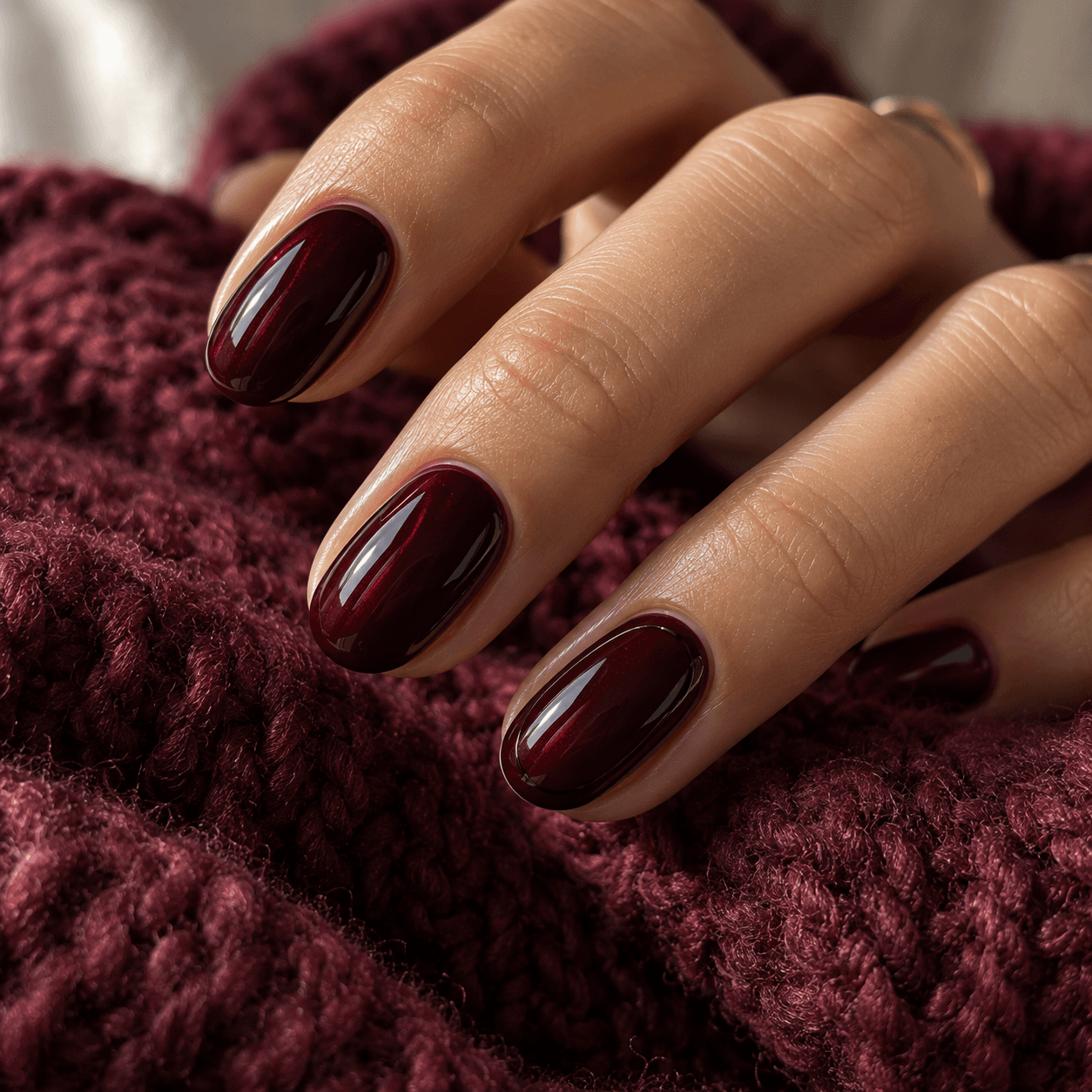
Not every Halloween-leaning set needs a creature. A deep black-cherry base with a fine black outline on one nail gives a darker, slightly gothic direction through color and framing. The contrast is quiet because the two colors sit close together in depth.
This belongs in the mood-only end of the list. Without a seasonal caption, someone may simply see a dark red manicure, and that can be the advantage. Preserve the border’s fineness so it does not become a thick black frame. If you are unsure whether you mean a brown-red, a wine red, or a purple-red, the dark-red color family is worth comparing before adding the line.
Save this detail: Glossy black cherry with one very fine black perimeter accent; no themed character.
17. Smoky charcoal French tips
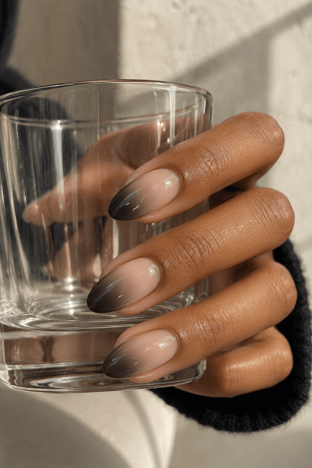
A smoky tip trades a sharply drawn French boundary for a softer transition into charcoal. The design can suggest a moody October palette without announcing a particular holiday. Keep the darkest area near the edge, with the pale base still visible toward the center.
The curve of the tip and the visible pale base are the details to compare. A soft charcoal transition and a solid black edge can share the same palette while looking quite different. Avoid describing this simply as black French if the blurred boundary is what you love; a crisp black band would be a different look.
Save this detail: Charcoal concentrated at the tips, with a soft transition and a pale visible base.
18. A copper tip with one black punctuation mark
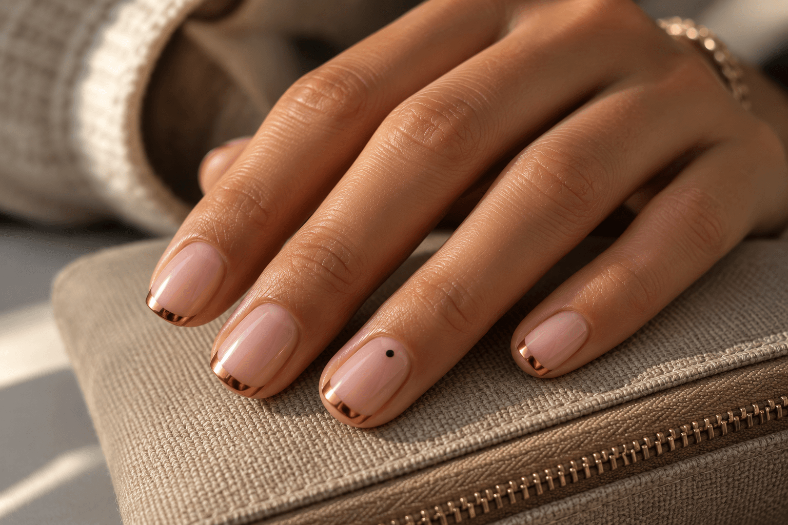
A narrow copper-colored tip and one small black dot use an autumn palette in a graphic way. This is a color cue rather than a literal Halloween drawing. The little dot can sit just below the tip on one accent nail, while the other nails keep the copper edge alone.
Think of the dot as punctuation: one mark changes the emphasis; a trail of them becomes another sentence. The copper does not need to cover the whole nail to be noticeable, especially in a reference with a clear reflected highlight. Keep the pale base dominant if you want the metallic detail to feel light rather than like a full chrome set.
Save this detail: Fine copper tips, one small black dot on an accent, and plenty of pale base.
19. Quiet plum shimmer for a witchy color mood
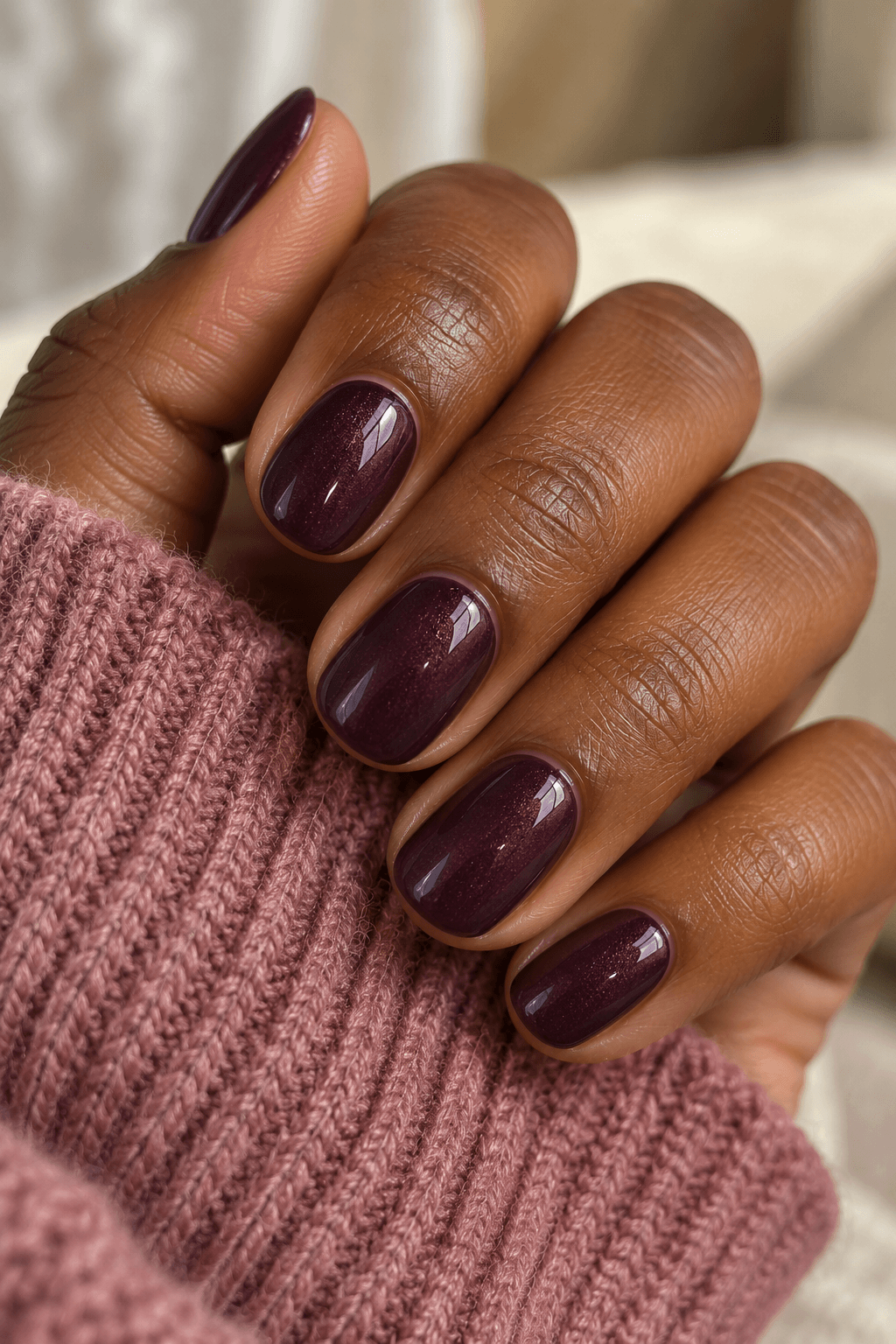
A deep plum with fine shimmer gives you a color-first option when tiny characters are not your thing. The purple direction suggests a different mood from black cherry, while a restrained shimmer adds little points of light without needing a star or crystal on top.
Choose the character of the shimmer carefully in the reference. Fine scattered brightness and large obvious glitter pieces do not create the same impression. This concept keeps the surface relatively quiet and the shade recognizable. It is also one of the easiest ideas to detach from Halloween visually: the seasonal association comes from the palette and context, not a motif you need to keep explaining afterward.
Save this detail: A visible deep plum with fine shimmer; no large glitter, stars, or extra decoration.
20. One inky ribbon on a clear-looking base
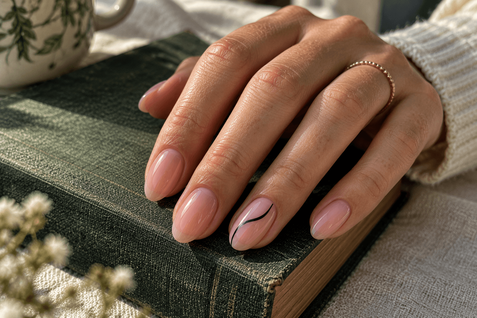
A narrow black ribbon curving across one clear-looking pink nail is the most abstract option here. It can suggest movement, a little gothic linework, or simply a graphic black-and-pale design. That ambiguity is useful if you want something that sits beside Halloween content without being tied to it.
Curved metallic lines and sculptural accents can direct the eye too, but this version keeps the mark flat-looking and narrow. Give it one clean path, with open base on both sides. Several thick loops would create a busier design. Save the reference for the curve and placement, and leave elaborate charms or raised details out of the brief.
Save this detail: One narrow black curved ribbon on a single pale nail; the rest of the set stays plain.
Four ways to keep the reference as quiet as you intended
Choose the motif before collecting the extras
If the ghost is what made you save the picture, keep the ghost at the center of the brief. A moon, glitter, web, and pumpkin may each be appealing on their own, but adding them all changes the idea. It is a little like choosing one charm for a bracelet and accidentally leaving with the whole display stand.
Write down one essential feature and one optional feature. “Essential: a small ghost. Optional: a fine black tip.” That makes it easier to simplify without losing the reason you liked the reference.
Separate motif size from motif count
A single readable bat may feel quieter than six almost-invisible bats. If the small shapes become hard to identify, making every shape tinier does not necessarily help. Consider reducing the number instead. The important choice is whether you want one recognizable detail or the texture of a repeated pattern.
Keep a shared color across the set
A plain base repeated on the accent and its neighboring nails can connect the design without more decoration. For dark red and purple directions, compare burgundy, black cherry, and plum before deciding on the small accent. Those shades can create quite different color moods even when the motif stays the same.
Look at the whole hand, then the close-up
A macro crop is useful for seeing the web lines or the shape of the ghost. A wider view tells you how much of the set that detail occupies. Save both kinds of information if you can. Otherwise, a tiny motif photographed very closely may seem larger in your brief than you intended.
If you are deciding between one detailed nail and a repeated pattern, use the distinction between one accent nail and a coordinated full set. Neither layout is automatically more tasteful; they simply direct attention differently.
A Halloween reference brief that leaves room for the real result
Instead of sending several images and hoping their common theme is obvious, describe the job of each one. A photo might show your preferred shape, another the pale base, and a third the tiny web. Here is a complete example for idea 11:
Overall look: A pale manicure with one small Halloween detail.
Base: Glossy pale pink.
Shape and length: Short, softly squared nails with rounded corners.
Motif: One fine black web in a tip corner of an accent nail.
Keep: Visible gaps between web lines and plenty of plain base.
Leave out: Spiders, glitter, lettering, and extra webs on the other nails.
If you take a concept to a nail professional, ask how the detail could be interpreted at your chosen length and with their materials. A generated image is a conversation starter, not proof that an exact result has been achieved. The brief helps make your priorities clear without treating every reflection in the picture as a decoration to reproduce.
A few useful questions before you choose
Can subtle Halloween nails be short?
Yes. A single dot-like eye motif, one small ghost, or a fine corner detail can be considered at shorter lengths. The design decision is how much space the motif needs to remain recognizable. Our short nail placement guide explains how to compare the motif, the plain area around it, and the amount of repetition.
Do I need orange or black?
No. A cream ghost on taupe, a silver crescent on midnight blue, or a plum shimmer can use a different palette. Orange and black make the seasonal connection more immediate, but you can decide whether you want a literal cue or a quieter atmosphere.
Which ideas feel least tied to Halloween afterward?
The silver crescent, constellation, smoky tips, plum shimmer, and narrow black ribbon can all read as ordinary celestial, color, or graphic designs. A pumpkin or ghost remains a more explicit motif. Choose according to whether you want the character itself or mainly the seasonal mood.
How many accent nails should I include?
There is no required number. Start by deciding where you want the eye to land. One accent gives a clear focal point; repeating a small detail can create a coordinated rhythm. Compare the whole set rather than treating the accent count as a rule.
Save the one detail you would miss
Before you add three more references to your board, ask what you would miss if it disappeared: the little ghost, the fine web, the dark plum, or the pale space around the motif. That is your starting point.
For a broader seasonal palette, return to the fall nail guide to color, finish, and detail. It can help you choose the base before adding a Halloween accent. A tiny ghost does not need to make every other decision for you.